project proposal
paprika research
I am exploring dream like psychedelic experiences through Japanese films, and I decided to start by watching the film Paprika by Satoshi Kon. This has been known as one of the best films, for its bright, confusing and nonsensical visuals and storyline that takes the viewer through a whirlwind of dreams, parades and insanity.
To help understand themes and the storyline of the film I carried out research to do this. This was very helpful for me, after doing this I understood the characters and the meaning behind the film much better. I learnt about the themes and symbolism, what elements represent, and alternative views. I can later visually explore these themes and figure out how to turn them into designs.
Throughout the film I also took screenshots of interesting visuals, dream like imagery, motifs, and important defining moments. I then annotated them to pick out key features and visuals that I can refer back to and use to help with design ideas.
paprika mind map
To visually collect all the most important pieces of my research I created a mind map. This ended being split into one half exploring themes and how these can be visualised - duality and balance, whilst the other are more on imagery, how dreams are presented in the film, and the visual effects of dreams that makes Paprika the trippy confusing film it is. This was successful in picking out what will help me progress most and allowed me to sort out all of my prior research into aspects that I will focus on in my initial design ideas. To improve on this I could include colour to highlight the bright and psychedelic colour scheme Paprika uses to convey the chaos of dreams.
surrealism research
Paprika is full of surrealism, and the nonsensicality and of dreams play a big part in surrealism. Since the film and the movement go hand in hand, I decided to explore and research Surrealism to better make connections and understand features of the movement, and familarise myself with famous surrealist artists. I do aim to have my final outcome to be unusual and dream-like so knowing the key points in surrealism will be fundamental with design ideas. This was very successful and informative, and to develop, I will find existing surreal and unconventional furniture pieces. Since dreams are a large part of surrealism, one pathway I could experiment with is trying to understand dream logic.
artists research
I found some bizarre and unorthodox furniture pieces, and briefly researched each designer. I discovered another movement that informed a lot of these pieces - deconstructionism.
This helped me see what pieces exist and started giving me ideas on things to test out, but there's a lot more that I want to reference so I will create a mood-board of similar distinctive pieces.
primary photos
I looked past images I have collected that have inspired me, exhibitions as well as photographing my current environment to pick out things that are dreamlike, other worldly and or link to the film Paprika.
I previously looked at Yayoi Kusama's chair prior, and recalled going to her exhibition where there was a blank white room, and users got given various circle stickers in various sizes and colours, which we then placed anywhere we wanted all over the space. This is called the obliteration room, and is an interactive experience for the user, resulting in a trippy and psychedelic room that was once bare and minimal. I recall many people had began to create chains using these stickers, and begin to make their own structures using the stickers, going beyond the white furniture provided to work with. I think an interesting experimentation would be redoing this on my own with furniture; playing around with how far can I go with just stickers and a chair.
I also included images of traditional shrines and such in reference to the parade in Paprika, details in shapes and textures here will be beneficial in creating my initial design ideas.
For my second set of primary photos I included imagery of shadows - the contrast of light and dark, as well as clouds and of the sky. Shadows feel very unknown yet familiar as they naturally warp our bodies into tall and distorted versions of ourselves, this appearance is actually is similar to the final nightmare form of the chairman in Paprika. Other imagery I included were where items look distorted, or trippy patterns in our everday surroundings. For me skies and clouds, as well as glimmers on ocean waves feel very otherworldly and delicate, as dreams are. These both aren't physically attainable which makes them ethereal.
This was very useful in helping me think about what makes something dreamlike in reality, making me change my perspective on things I see around me. At first I struggled to link things to my project but by the end I had found many patterns, imagery, materials, colours, and textures that links to dreams in the real world, and will fuel my process. This successfully captured a range of images and after getting feedback, the next step would be to try distorting photos perhaps with photoshop, to make them unreal, more confusing and trippy.
I tried using the panorama function on my phone, after thinking about how it can be utilised to cut up, and distort your face or a landscape. I tried moving it around my room to cut up the shapes and create odd wonky lines for things that should be straight. Making my shelf doors wonky and diagonal also visually reminds me of the opening wavy hallway scene in Paprika. I realised that it was much easier to manipulate the results to be more interesting when the object is moving, however this is tricky since it only works for smaller objects so ultimately this wasn't the most successful method of distortion. It was successful in experimenting with photos, and did have some interesting results but I don't think they will be too beneficial, so I will move onto programs that distort photos instead.
distorting photos
I remembered I used a web site that quickly allows you to turn on and off many settings that will distort and edit your photos, called photomosh, which I used for my error project at the end of the diagnostic stage. This was successful as it easily allowed to try out different types of distortion on my photos. It worked well in changing up my photos to become more unrecognisable and makes it tricky for the viewer to decipher what it was before. The best outcome was the Yayoi Kusama "Obliteration room" floor, all of the stickers merged together to create a melting pot of swirling colours. However I feel if I used photoshop on more specific areas then I could experiment with having areas unedited to contrast with the distorted effects.
Nevertheless I feel like this isn't that useful for the future, although it creates an interesting visual effect I do not think it will fuel my future work enough to continue on this. If it does end up helping me, then I will continue on and use photoshop to do more focused distortion.
furniture moodboard
After my artists research and my feedback from peers I had a lot of references and a lot more designs I wanted to look out so I created a mood board to easily access and look at all these.
I collected images a lot of unique, unusual and confusing surreal furniture pieces. This was successful and helped a lot in terms of broadening my ideas of what I can produce, looking at the different materials and textures used, and some of their processes I will use to inspire my work.
I think to improve I should have also listed what materials they use, since I might want to test some out in future experiments.
toy table experimentation
Through my feedback and mood-board, I came across the Campana Brothers "BFF chair", which is made up of childrens toys. It formed an very odd chair, since it used toys as furniture which is completely the opposite of their intended use. It made me have to look again to make sure I was seeing correctly since it does not use typical materials. This is something I want to lots, creating and experimenting with odd and confusing outcomes.
In Paprika's parade, it is full of toys, and dolls, as well as the automata dolls in Himura's home; which all link well together with the Campana Brothers chair on toys. Furthermore Japanese "character plush" toys and traditional toys such as Daruma dolls are immensely popular that it would be interesting to use these as a chair.
This all led me to decide to try out my own version and experiment with a toy chair, by using random stuffed toys, which I placed all along and up the table leg, holding them together with string. I found that medium to small sized toys worked best since they quickly filled up the leg whilst there are still many to look at. When I used larger toys they simply took up too much space and didn't allow for much varitation. Also the smaller size was perfect since I could position it so that their front was always visible at all angles. The problem I faced was that I didn't quite have enough toys of this size to use all the way around the table. I barely managed to fill up one leg with the amount I have. It was still enough to be successful in seeing how the experiment turned out. I did attempt a start at a second leg however it wasn't as successful since I did not have enough toys to fill it up. Overall this was a successful experiment, it allowed me to experiment with materials and objects, and I had enough toys attached to be able to visualise it as all complete. I think using random stuffed toys is interesting because each has is a different animal, although it could look more organised if they were similar colours or all a similar style. To improve I would get all similar sized objects and completely fill up every table leg with the main interesting features of the toys facing forward for the user to be able to explore what was there.
sylvanian families development
I then thought about using sylvanian families because they are all the same size. Also using sylvanian families keeps it all much more uniform, with the same style and size, but the details are different so it isn't all the same. I had the same process as prior and this was more successful because their small size and upright shape means that their full front, their faces and outfits can be seen which means from all angles the table is visually interesting and there is always something to look at. It keeps the user looking and I think this is important because it pulls in the user through intrigue and confusion which is important for my piece; it is boring looking at the back of a toy because it is rather bare.
I have experimented with this enough to visualise the outcome, and the use of a set of toys allows for more consistency. This is successful outcome, mixing together two items not commonly put together to create an odd and unconventional outcome.
I think the outcome is rather unsettling and creepy, which are feelings that dreams can also give. The fact that it is string clearly holding them all up makes it appear like they are being held against their will, which adds to the uneasy appearance of it. The string also loosely holds it together, so when I lift the table to move it I have to hold the bottom in place so it doesn't come apart, the string is very temporary. If I were to pursue this idea I would perhaps have all the toys attach to the table via magents, although this isn't a stable fix, so I would have to stick/ sew each figure together and then attach it to the table with a strong glue like epoxy resin to ensure it is secure.
For now I will move on to other experiments but I will come back to this if it remains the most successful, since this is successful in testing out the toys idea.
using random objects experiment
Another experiment I wanted to do inspired by the randomness in the Paprika parade is producing a piece of furniture made up of completely nonsensical objects. With the parade, theres always something new to look at and find within it due to the random assortment of familar objects whoch are yet unfamilar due to the context. Each object inside on its own makes sense, but all together they create a confusing and nonsensical mass. I wanted to try out furniture with the same idea, so I collected random objects around my room that I would be able to stack up in the shape of a chair.
Once creating the four base legs of a chair, which I had decided upon to have differentiation in from prior furniture experiments, I realised this would be a much larger challenge than anticipated. I had to find objects that would allow for each leg to be roughly the same height, and balancing it all was extremely difficult. I had to come up with solutions to help items remain together, for example adding rubbers into the side of a cup to keep the water bottle sitting inside stable, as well as using a skewer stick and tape to help a doll stay sitting on a bottle. This in particular was successful in working and not being obvious.
I couldn't think of a way to create the rest of the chair, and anything I attempted caused what I had already built up to fall. This was very time consuming in having to recreate and balance everything back up again constantly. I felt that I wouldn't be able to finish this experiment as I had intended. If I was able to stick these objects together it would have been a lot easier, but this wasn't possible due to ruining the items used. I was spending too much time on this experiment, and thought it be more efficient if I spent more time on something else since I was not progressing any further.
I decided to quickly move on, and finish it off by creating the rest of the chair frame with connected pens, which I then attached to the base by using string to have my drawer handle hold the pen frame. Using the string to hold up the upper structure was a successful fix and meant that I didn't waste further time attempting the pen frame on the base legs. Overall this was more unsuccessful, my plans and the outcome didn't turn out as intended but I still managed to find fixes to ensure a full chair was made. It was successful in trying experimenting with balance and objects, and resulted in an odd unsual outcome, also proving than creating a balance of things is tricky.
Since trying to balance everything was so tricky, probably using the same technique as I did with the sylvanian families- tying everything together around a a base would have made this experiment more stable. However the concept of balance was also a large part of this experiment too, taking inspiration from the idea of balance in the Paprika. When previously creating my moodboard I looked at how to visualise balance and how it can be done through literally balancing and stacking objects such as rocks on top of another. Although this experiments outcome was rather unsuccessful, by having it focus not only on the randomness of objects, but also balance I looked at multiple elements I extracted from my film research, which was successful.
photoshop sticker chair
Here as inspired Yayoi Kusama’s “Obliteration Room” and her use of stickers, I was inspired to also use stickers, and cover a chair in them. I didn’t have stickers with me so I thought about doing a quick experimentation using photoshop. I wanted to include the Japanese culture elements that I had touched on in Paprika/ keep this link that I had in my proposal. I struggled to find a Japanese sticker set image to wrap around, but settled on a collection of Daruma doll stickers. I then watched a tutorial on how to wrap images in Photoshop, which I followed along allowing me to wrap the image of stickers over a basic chair. The outcome was unsuccessful and it looked silly. It simply looks like a chair with a print on it, rather than being covered in stickers, it doesn’t look interesting. Wrapping the image around made it distorted and the images were oddly stretched out. I also should have made the opacity of the stickers 100 so the chair texture can’t be seen underneath it. It wasn’t the best attempt but I am still happy that I managed to do it as this is something new that I have never done before, so I learnt how to wrap images which is a new skill.
I still am keen on the idea of using stickers, this didn’t work out because it isn’t clearly stickers. I think using stickers in real life will be different as I can layer them up and add texture, but also build up stickers to create levels, and have them hanging off the chair, which I can’t do in photoshop, as well as having perhaps only having part of the chair covered. I will order a sticker set to test this out in reality, I think it will be a different outcome, as the execution here is not the best. Having stickers in a physical experimentation means I can properly explore how far I can go with such a simple material, in comparison to this edit where it is just the visuals of having an image imprinted on a chair.
drawing final outcome exercise
I did an exercise in which I drew my final outcome for the project. Simply using my memory of all my research I drew out a possible version of how my outcome could be fuelled by my research so far. This was important and useful in seeing if I have done enough research to start designing possible outcomes, in which I have. I designed a table/ stool that was made up of bumps, which looks when wax drips down the side of a candle. I referenced a colour drip candlestick set by Urban Outfitters since this has a very similar look to what I wanted to create on my drawing. I wanted it to look like it was melting and slowly dripping down, similar to a candle, and this is why on some legs the dripping mass of colours goes further down/ doesn't melt down as much as others. This is one part of what makes this furniture piece asymmetrical and more natural.
I stuck mainly to yellow, orange and pink since they easily blend into each other yet they are also very bright and pyschedlic when mixed together. I wanted to create a melting illusion of colours and circular boils and spheres which all creates a very bumpy and textured underside to the stool. This was successful in starting to create initial furniture designs, and successful in being a pyschedlic, colourful, surreal, dreamlike and textured piece since my peers used all of these words to accurately describel my design without me informing them of the research and intent. Other words said includes " the brain" and "storm", and I found the brain input interesting because I hadn't interpreted it that way and it could be interesting to look at human textures.
In an attempt to use varied media, I used coloured pencils, marker pens, highlighters and tape to produce this. I am pleased with scrunching the tape at the top to create physical actual texture. To improve I could have been more experimental with the media, perhaps using clay and paint. I tried to use colourful electrical tape on the legs but it didn't work well, so I moved on. However I could have tested out other ways to incorporate it, such as cutting it into circles, layering it and using it to add physical texture above.
To further develop this I could draw it from alternate angles to properly understand how it would look and add unseen details.
modelling outcome development
To develop this I had to create my model in reality. Since I didn't have any melted wax to replicate the visual, I had to rethink how I could create a busy, colourful, textured stool underside that would also have to stay attached when facing downwards. I ended up using scrunched balls of pink. ,yellow and orange paper to produce the bigger bubble spheres, then using scrunched rolls of yellow and red electrical tape for smaller pieces which will fill in gapes and add detail. I also utilised the clear packaging of the electrical tape to add more of a shine in certain spots, for a change of material. At first I was using the coloured electrical tape to connect the paper balls to the main cardboard circle top, but since the yellow and red of this is quite bold I wanted to hide this, which resulted in everything being held together rather weakly. Once I found clear tape this was much easier to use, and ensured everything was stably in place and all connected.
I produced this model in around 40 minutes so I was quite short on time and couldn't finish it completely, and wasn't able to add in everything as intended. However I had done enough, alongside my drawing, to see the effect I was going for. I used an photo of the model in the position it would be in if it had legs, and quickly drew in the where the legs would have been using the iphone "markup" tool. This was to help visualise my model so far as the intended final model. I also added in more of the coloured balls/ scrunches in areas where more where needed/ where I would have put them if I had more time. This was successful and really helped, and allowed me to see how the model look like it was finalised, despite running out of time. It also allowed me to make this model a more of mixed media piece. I learnt this method after using it in my beyond the fundamental project to look at two paths I could go through, it still remains a useful method to develop my work.
To bring this vision to life, and improve my model I should have thought through my modelling making process better/ done planning because I should have made cardboard tubes for stool legs and attached this to the cardboard base before adding in the paper scrunches. This is because once the coloured paper scrunches were on there wasn't a way to add on the legs stably and properly.
tutorial feedback / quick research
I had a tutorial on my current work so far and how to progress. The feedback I received was
Could play around with colour and apply it to texture - like splatter a lot of paint onto the object? - and see like any patterns it could make? I think the way you photograph can also add to the narrative, like experiment with various angles of the object? https://www.youtube.com/watch?v=KMrkYMKMsv4&ab_channel=Sotheby%27s . Look at uncanny + abject art.Looking at the teddy bear table - could you use magnets to add the teddy bears or other objects to the furniture or to each other? You could look at how the furniture could potentially shape around the user - will it fit them? will they have a hand in putting together the furniture? surreal set designer Shona Heath, Meret Openheimer. play around with contrasting textures into one object - like combining jagged edged material like foil or chicken wire with a softer material like slime?
Shona Heath is a set designer, who has been responsible for “some of the most memorable fashion stories from the past two decades, infusing her work in advertising, costume, installation, fashion shows and editorials with an unmistakable surreal beauty.” Her work is confident and bold, but its always playful and dreamy too, she distorts the natural world making all her work very surreal. She has many surrealistic references in her work - like Dali’s elephants with long legs can be seen in her sets for British Vogue.
Shona Heath (no date) Shona Heath Available at: shona heath (Date Accessed: 18 March)
Sotheby’s (2020) The Surreal World of Set Designer Shona Heath Available at: youtube (Date Accessed: 18 March)
Méret Oppenheim was a Swiss painter and sculptor became one of the central artists within Surrealism. One of her best known pieces is the fur covered cup, saucer and spoon, titled “Object”. What started out as a joke during lunch became a Surrealist sculpture that captured one of the founders of Surrealism’s aruguments which stated “that mundane things presented in unexpected ways had the power to challenge reason, to urge the inhibited and uninitiated (that is, the rest of society) to connect to their subconscious—whether they were ready for it or, more likely, not.” This piece also plays on the idea of the uncanny and abject. “The uncanny is something which feels familiar but for an unexplained reason. It is familiar but should not feel familiar. The abject is something which feels foreign, also for an unexplained reason. It should feel stable and familiar, yet it feels foreign.” )Baird Annalise, 2013)
This idea of the familiar and unfamiliar / uncanny and abject is shown so clearly with this cup - we know what a cup/ tea set is supposed to look like, typically feminine and porcelain, its delicate and perfected, its smooth and fragile, but this completely confuses our minds. It has the exact same shape, it is what we know to be a tea set, but then the material is completely different, we never associate fur with tea cups. Further it’s so ridiculous because it undermines the tea cups function, drinking tea from a fur cup is ridiculous, the fur will soak u p the liquid and it will be uncomfortable. Looking at it makes us feel confused because it feels wrong and the material and form don’t match up, it feels familiar - the shape, yet unfamiliar - the new material.
This research has been successful and very useful, and so has the feedback in giving me new ideas. Finding out about the phrase familiar and unfamiliar has been beneficial because I feel although it is encapsulating what I want to do with this project. I want my outcome to play along with this, and make the users confused and even uncomfortable with how it looks due to how odd it is. To go further into this I need to do more material experimentations that play on this idea, perhaps looking at light and delicate materials to contrast with how furniture needs to be strong and sturdy.
MoMA Learning (no date) Object Available at: moma learn (Date Accessed: 18 March)
Annalise Baird (2013) The Abject, the Uncanny, and the Sublime: A Destabilisation of Boundaries Available at: the abject, the uncanny, and the sublime (Date Accessed: 18 March)
sticker chair
For my next experimentation, inspired by Yayoi Kusama's interactive "Obliteration Room", and a development of my attempted photoshop edit of a sticker chair, I ordered two sets of varying colours and sizes circle stickers to cover a chair with. I wanted to see how I could use stickers in unique ways. I started by covering the main seating surface of the chair completely with the stickers and slowly began to have some coming off the edge. I aimed to have the stickers look like they are falling off the side, hanging and dangling down along with the legs, creating long chains that conceal the other legs, making the chair look hairy. I started doing this bit by bit on each side. However the more I did, I found it quite hard to make chains that didn't all stick and clump together. I found no interesting shapes, were being formed so I moved on to forming connections between the chains, which slowly developed into a pattern with circles and curves all being intertwined together. This pattern got neatly and clearly the further down the chair it goes, until it melts completely off the chair, connecting each 3 sides and forming a puddle of circular sticker chains around the chair.
This chair is successful because I have explored ways that the stickers fit on and interact with the chair. I think one of the strong areas is the way the amount of stickers escalate - the fact that at the top it goes from bare where the original chair is very much visible, to having the stickers go up in number having then all over and randomly placed, then a disjointed circular pattern to the fully formed chain of stickers coming in waves. The most successful part is the chains and the pattern that it forms, it starts to go off the chair as if the stickers are melting off. Being able to see the chair underneath, makes the stickers look like it is growing over it too. I also found that when someone entered my room and saw this sticker chair with the sticker packs near it, they asked if they could stick one on and add to it themselves. I found this quite interesting, of how people want to interact and take part of things when they see the opportunity, which is the whole point of Kusama's "Obliteration Room".
It was tricky working with stickers, especially when making the chains, the back would consistently stick to everything, causing them to lose stickiness, which then resulted in some chains breaking.
The half formed/ visible chair is a similar shape/ structure to the Chairman in Paprika when dreams and reality merge, and he becomes half normal, with the other half as tree roots - reality as the normal side of the chair, and dreams as the melting stickers
To improve on this I would have had more different size stickers to layer. I did try to layer them with what I had, as it creates more of a psychedelic look, reminding me of trippy tunnel effects. If this was to be a final piece I would make sure that there was a backing, I would have the same stickers on both sides of the chains. This would firstly stop the chains from sticking to everything, as well as allowing the chair to be seen from all angles without having to see the white backing (which is the reason why there are no chains on the back of the chair). If I were to redo this, I would do it all in one go, since I kept leaving and coming back to this piece it got more crumpled and fell apart. Some stickers are more worn down however I liked the aesthetic this creates.
The aim was to see how I could manipulate a simple material piece such as stickers, and how I could go beyond simply sticking them flat all over, which I did. I still could further explore other shapes and patterns that could be made with the stickers.
tape chain experiment
Inspired by my previous sticker chair's "melting" look as the stickers go off the chair into a circular linked pattern, I wanted to develop this area. I wanted to see if I could recreate this pattern to focus on it, as a link of circles, as a all in one connected blanket and attach it around the base of a chair/ table to see how this would look. Initially I wanted to see if I could knit something like this because using this material could create the illusion of string being pulled out of something. However I do not know how to knit and this was take too long. Instead I used tape, because it is easy and quick to use. I took used 3 different types/ colours of tape, folding them in on themselves and connecting the ends to make a loop. I made each loop various sixes, and linked them all together in a random order creating a blanket of sorts/ chain of tape loops. It did look quite messy and crumpled. I tested what to had to see if I should continue, over my bedside table I dangled it across and down it by hanging the end loops on the table legs. This was unsuccessful, I do not think it was that interesting, I do like the idea of something coming off of the furniture piece/ dangling down but the material was very crumpled so it looked messy and the shapes weren't clear, which I think is something that it needed/ was missing. The material I used and the shapes it created weren't interesting, they are boring, they looked weak and sad. To improve I would use a completely new material to create bolder shapers. However next I will move on from this development, and next test out something completely new.
feedback / quick artists research
I got feedback on my experimentations so far, and to help decide what my next steps are. My peers thought the sticker chair was a successful experimentation, and it was a good choice to not completely cover everything. Instead, I should try to speed up with my experimentations so that I can do more, rather than spending too long on one. To help with this I could make generic small cardboard chairs to work with, or purchase/ find chairs to quickly experiment with without having to worry about damaging the furniture underneath.
My next steps are to continue experimenting with different materials, so I can pick something to develop as a final piece. I will do more experiments using materials such as wool, string, paper, and foam. I also got feedback that I could mix together and combine materials, as well as turning chairs around and seeing how else they could be used, or moving my experimentations towards other furniture pieces. When I do sketches of designs I could think more about the basis shape of the chair, maybe explore circular shapes. Another suggestion for a idea was incorporating plants inside, perhaps drilling a hole in the chair, planting a flower inside, and allowing it to grow out of the chair.
Some of the suggested artists I could look at for further inspiration were, Erwin Wurm, and Christo Claude. Erwin Wurm is an Austrian contemporary sculptural designer. He has pieces were he enlarges and over pads common things, like a car or his "fat house" which look like they are expanding and swelling up. During his "fat car" series he comically makes a statement as he "disfigures car models deemed status symbols by mass culture" (artnet artists). Christo Jean Claude has a "wrapped" series, where wraps up anything, from chairs, to trees, to whole buildings in transparent polyethylene and rope. He did this to "deprive them of their function, and, by putting them under wraps, to preserve them permanently for posterity." (Christo and Jeanne Claude).
Wikipedia (2021) Erwin Wurm Available at: https://en.wikipedia.org/wiki/Erwin_Wurm (Date Accessed 19 April 2021)
Artnet Artists (no date ) Erwin Wurm Available at: http://www.artnet.com/artists/erwin-wurm/ (Date Accessed 19 April 2021)
Christo and Jeanne Claude (no date) Packages and Wrapped Objects Available at: https://christojeanneclaude.net/artworks/packages-and-wrapped-objects/ (Date Accessed 19 April 2021)
the night is short walk on girl
I decided to refer back to my proposal and my initial intent for what my project was to be based off of, which was Japanese psychedelic films. I wanted to go back to this since I have only watched one film so far, Paprika. I decided to watch Night is Short, Walk on Girl, which I had planned to watch more early on, but had found that Paprika fuelled me on more than I expected. As I was watching I took screenshots and took notes of notable moments, speech and imagery that was important and which I could further explore through research. I made a mind map of the main elements I had discovered and wanted to look at in depth. I put these into categories and this helped me sort out my thoughts about the film. This also made my research process a lot neater and quicker, since I knew exactly what to research and stopped me from getting confused about the layout and order.
I learnt more about Japanese culture and folklore through this film, which was something that I wanted to go into a bit with this project, as half Japanese I always enjoy finding out more about my culture so this was successful in broadening my research past dream like effects. However I found the more I did this research I found it wasn't pushing me forward, I got enough film and dream like psychedelic ideas from Paprika and my design research to start experimentations. It was still interesting to look into something different, traditional Japanese cultural references, and I will still refer back to this if necessary. This has led me to realise that I need to focus on my experimentations now and explore materials as I have enough research for the time being, but I will still take forward elements I have found from the Night is Short, Walk on Girl research, such as colour palettes.
mid point review
I had a session back with the same group that formed our collab group project "Yesterday's Colour". This is mid way through our FMP and the group has someone from each part of the foundation. We spend the way going through criteria and reflecting on our work. We also broke off into pairs to look through each other's work so far, and filled out the criteria sheet to assess each other on each LO. Below is feedback from my partner who was in fashion design, and below that is my reflection on the review - where I put down things my partner had taken from my work in what I have done so far, what grade it is, and how to develop in the future. This was useful in seeing what I have done well with so far, and how I can ensure I hit all the criteria during the rest of my project. I know what I have to do more of, and what I am doing well which is beneficial in planning how I will do the rest of my project.
initial design ideas
I started to draw out initial design ideas and plan out designs I could further explore inspired by patterns and shapes I have found through my research so far. This was successful in figuring out some experimentations I can do in the future, possibly using materials such as foam, string, wool and wax.
I did find it hard to draw the chairs accurately, especially perspective wise, so I ended up drawing more details rather than full viewpoints. Perhaps using a digital program can fix this issue and help me quickly make my designs, while also making my designs more clear and understandable. An alternative could be practicing life drawings of chairs to help me understand their shapes better. To improve on these I can add colour to them to help bring them more to life and make the page more interesting.
Here I began to explore the idea of s furniture becoming unusable as inspired by the hallway in Konakawa's dream in Paprika, a film I have looked into. This hallway becomes warped, making it hard for him to walk across. I thought this was interesting since the sole purpose of a hallway is to be flat and easy to walk across, it's function is not something we even question because it is so simple. In dreams where something as straightforward as this, is suddenly changed, you begin to question where are you and can't trust what something seems to be. I wanted to take the fact that everything becomes unknown, and something like a hallway cant perform its function, becoming unusable. I want to try and use this in furniture, for example making chairs bumpy and uncomfortable, or as seen above having a table full of holes, so it's tricky placing items on top.
I also have decided that I will move my furniture research more to focus on chairs, although I will remain open to other furniture pieces. Through my design research, I saw more about chairs than anything else, there is a lot more shapes and chair types I can explore through this too. In addition to this, I find chairs more interesting because they are more interactive with the user, and have a strong need to be sturdy and ergonomic - something I can play around with, e.g making it uncomfortable and taking out elements that make them ergonomic/ functional. This is why I want to focus on chairs and focus my future experiments with them.
zbrush experimentations
I asked for some feedback from a fashion promotion student to see how different the advice and insight would be from a student who specialises in a different department, and one of the next steps she suggested was to try manipulating chairs and experimenting with many different shapes quickly through digital modelling. This way I can quickly see many different designs and test ideas, instead of having the long process of many physical models, I can create a balance between the two. This was my first time using ZBrush and I am not that confident in digital modelling programs, so this was challenging for me. I found an obj of a chair that I could use as my basis, which I could then manipulate with the tools. This was successful in quickly distorting the actual chair, and experimenting with the basis (the chair itself) since most of my other experimentations use a standard chair and I work over the top of it. It was also quicker than having to draw out a chair. To improve I definitely need to learn more of the program, and play with it more to understand what else I can do, and how to make more dramatic and interesting modifications to the chair. My outcomes weren't that successful in the way that none of my experimentations were that visually exciting, and if I learnt to better utilise the program hopefully I can produce more unique unconventional designs that I envision.
paper chair
Another experiment I wanted to do was covering a chair in paper to explore the textures I could make from this, and how different the chair would look.
I broke up A2 paper into three, folding it and scrunching it to help increase the texture, and it makes it easier to attach and scrunch onto the chair. I attached this all around, scrunching it around the chair so it is full of texture. When I reached the flat surface of the seat I was unsure what to do with it, but decided to make it flat and usable. I also thought that the flat smooth surface would contrast with the bumpiness of the paper scrunches the rest of the chair is covered with. However I did find it difficult to make the point where it turns from scrunched to smooth very tricky to make neat and in line. In the end the contrast looked too harsh and the flatness took up too much of the chair, it didn't look interesting anymore since the flatness of the paper made it resemble the original chair underneath too much.
I started to explore turning furniture pieces, which are supposed to be used and ergonomic, into unusable pieces which made them become more sculptural, like with my design drawings and my sticker chair. I thought this chair would be more interesting if I applied this concept to this chair too and therefore covering the seating area into scrunched paper too. I did find it hard to make this work so that everything fitted together seamlessly as if one piece of paper wrapped around it rather than sections, but double sided tape, and blending in folds worked well to fix this.
Once having all of the chair completely covered, I realised that the central seating area was a lot larger, the scrunches puffed out more and the paper was less tightly wrapped around the chair, hiding its structure. This contrasted oddly with the top back rest frame area of the chair, which had the paper wrapped around the frame much more tightly and showed off the frame much more clearly. I think the larger scrunches were more interesting because they hide the chair frame and begins to distort it - it proportionally does't look like a normal piece of furniture. The contrast between the two makes the chair look odd so I went over the top and made the scrunches more puffed out to hide the chairs structure.
This was a successful change, now the chair flows as one piece much better than prior. I only adjusted the thickness of the top because I think the thinner legs still work with the rest as a whole.
Some of the chair leg scrunches ended up creating patterns which was an interesting outcome since paper scrunches are random. The bumpy shape also reminds me of an egg carton interior.his experimentation was successful in transforming the chair, it's chair shape is still evident by the end, but the paper makes it look much more airy, fragile/ cracked than at the beginning where the wood created a more sturdy and stable visual.
Overall this experimentation was successful in transforming the chair, it's chair shape is still evident by the end, but the paper makes it look much more airy, fragile/ cracked than at the beginning where the wood created a more sturdy and stable visual. Making the scrunches and the paper puff out was also successful in helping hide the chairs shape and move it away from being too similar to the original form. I think the enlarged and puffed out shapes make it look like there is air inside giving it an very interesting and delicate aesthetic.
To improve on this I should experiment with the actual original chair underneath, perhaps if the chair was more disproportionate, if the back rest was oddly small, or the chair had extra parts/ arms that came and stuck out would make the chair less like a chair and more interesting to see. To make my work better, experimenting and distorting with the actual form of the base chair could be something I look into.
materials library
I had the opportunity to look at a materials library today. This was a new and fun experience as I got to look at and touch many new and unheard of materials that I could use as part of my project. I learnt a lot about materials through this, a lot of pieces felt very different to how they looked, creating a new sensory experience for me, and lots of materials have been created through surprising sources. For example there were silky pieces of thread that actually came from rocks, and smooth pieces that had come from animal feces.
I took photos to document shapes and patterns I felt inspired by. The first one was a decorative glazed ceramic tile. The electroplating process it went through left a metal coating, and made it reflective. This tile was intriguing to me because of the infinite various circles that look like soap bubbles - which is ironic because bubbles are very delicate whilst this is solid and hard. The reflectiveness makes it trippy to look at. The second material I documented because of the visual contrast of smooth retro reflective cement and the textured embedded glass beads. The third material is a textile made from recycled paper yarns, this reminded me of the paper chair, and shows the many other ways paper, a basic material, can be utilised. The final one is a flat stainless steel bar with a decorative surface. It "mimics the ancient tradition of 'Damascus Steel' , using rapidly solidified powder materials". The pattern on this, similarly to the first is both reflective and trippy. The endless circles within circles and waves make this a psychedelic pattern, which ties in with my work looking at visualising psychedelic experiences.
Overall this was successful primary research, being able to touch them in real life also helped with understanding each material a lot better. This was very useful in finding new patterns that I can use to inspire new designs, which isn't what I expected to take from the materials library. This was also helpful learning about the range of materials and processes that exist which I was unaware of.
pom pom experimentation
Another material I wanted to experiment with was string and wool, and inspired by Sweet William's Pom Pom Stool No.3, I created pom pom's of my own. At first I used my hands but the pom pom outcome of this was quite loose, so I wacthed a tutorial on how to use cardbaord to make pom poms. I experimented with multiple sizes, and patterns. The more I created, the more I learnt and figured out about techniques on how to make different patterns within the pom pom, to give each one their own design, also how to ensure the string doesn't get mixed up, or come undone. This was a process where I learnt more through trial and error. Slowly I figured out what works well and what doesn't such as materials not to use, like fuzzy wool because it was too fluffy and thick it looked messy. Overall I stuck to a grey / blue / pink colour scheme, which created a musky yet bright aesthetic when all the pom pom's sat together.
At first I placed the pom pom's along the top, similarily to Sweet William's stool. I do like the look of the pom pom's all together in various sizes and colours, which is successful as it looks although something is growing and bubbling over the table, reminding me of Cappellini's Mutation chair. Nonetheless I don't think this was too successful. This is because the table I used has a ring around the edge and this does hide some of the pom pom's from view, furthermore not having enough to cover the top makes it look rather empty. An solution to this would be to photoshop it so the pom pom's fill up the entire surface. However to further develop and complete this, inspired by Lionel Jadot's Sit in My Valley chair, I could have created knots in the wool and have it hanging from below, or wrap the legs in string. However this is a quick experimentation and to try something new I will attach the pom pom to the table legs.
Since the pom pom's on top wasn't visually interesting I placed them along table's legs instead. I put a piece of cardboard along the table leg and attached the pom pom's with hot glue. This turned out far more interesting, and I like that the silhouette isn't perfectly straight either. It reminds me of fuzzy mould as it slowly takes over the fruit. This was a quick and successful experiment, also having it completely fill up the table leg helps it look more complete. The various sizes, colours and patterns in the pom pom's is what makes this successful, there is variation and a lot to look at. To improve, it would be nice to see all the legs covered, but one is enough to get a sense of the idea. Also as mentioned prior, using wool in other ways like Lionel Jadot would be an interesting development.
foam chair experiment
Another experiment I have been wanting to do is to play around with foam. Since I didn't want permanently ruin a chair that my household is currently using, I thought about finding and buying used chairs from resale sites such as ebay or in charity/ vintage shops. I could then use these as my basis and do the foam over them - which would allow for the chair to still be useable and functional, which is something I enjoy about my previous models as it makes them feel more finalised. However I struggled to find the type of simple chair I was looking for, and I didn't have a method to bring them back to my work space because a lot of these were too far. As my tutorial feedback suggested using quick cardboard models I decided to do this, I found a chair net printed approximately to 1:1 scale and cut it out on cardboard.
It all folded together nicely, but the back drooped down completely so I used skewer sticks in these areas to hold it up straight. I tried putting them at the front too but these were useless and I removed them. It left pieces of glue over but it didn't matter that this chair is messy because the foam would hide it.
This was successfully a base that I can use, but the legs look quite wide however I am hoping that the foam will expand and easily fill this up. This surprisingly took longer than I expected it to so if I use a cardboard base again I will not use a net and create it with shapes and by eye.
I created a thin cylinder as a piece to test the expanding foam on as it is my first time using this medium. I was surprised that the foam does not stick well at all. It slides off very easily so if you spray it vertically it will fall off, so I had to spray it on top, flat. This meant I had to lie the chair down, spray all the flat horizontally surfaces, then wait 40 minutes and repeat the process until all sides had been covered. The foam is very sticky so once it was on the chair this was its shape, I couldn't move it around to readjust anything. However I could make patterns in the way and movements in which I sprayed the foam. This process was a bit trickier than I had expected but was still quick and easy. The foam looked nicer on the cylinder test piece than the thick rectangular chair legs, so if I were to redo this I would switch it around.
This was a successful experiment using the foam as I have learnt a lot more about using foam, and its properties. There were some mistakes/ issues that I know to be more careful about if I decide to continue with this material. The foam runs out quite quickly, and I have to shake it well for the foam to come out thickly - when I didn't it came out looking bubbly with less texture and the difference is easily noticeable. The thick square legs of the chair net was unsuccessful as each leg needed each four sides to be done, and the inside of the leg had to be filled up which made it difficult to make a pattern with the foam. Also the foam on the chair seat was unexpectedly large, the foam expanded far more than expected which made it very puffy. I didn't really like this as it contrasted too much with the thin back ( this didn't have another layer of foam on the other side making the side view very flat), however it did remind me of my research on Erwin Wurm and his fat series. Perhaps doing the seat foam first would help it not be so large as it would have more area to spread out over.
Being able to make patterns with the foam is successful, they look like the foam is folding on itself. These patterns are also similar to and remind me of cream when it is being mixed by a hand held whisk. The foam appears as very fluffy and lightweight, I really like the visual of the foam, as ot looks like you can easily sink into it although this isn't the case. The foam material is also very successful through the fact that it is still textured and its oddly simultaneously smooth and bumpy. It gives me lots of imagery instantly - like clouds, bubble baths, and whipped cream. The paper and foam chair I think are similarily successful - they both are not materials used for furniture because they are not strong and sturdy like wood, and so using these materials as furniture is very odd and makes everything look very delicate and fragile, playing on the idea of the familiar and the unfamiliar. Foam is a material that I have been wanting to try out since I found it in my research pages such as in Katie Stout's 2015 "bottom of a fish bowl" chair.
I took some small pieces of the foam to test what the material was like. When it hardens it is also more sturdy than expected - if too much weight is put on it will flatten. This is acceptable because only the seat will be flattened and the visual texture still remains. If a thin piece is pulled apart it will tear but the main chair is thick and should only tear if cut into purposely.
digital designs
I wanted to do more experimentations but since the physical experimentations can take up time to do and there are still shapes I want to explore, I decided to try again with digital models. I got guidance on how to use the basics of Autodesk Maya, on how to set up an obj of a chair, how to use the basic tools and paint features. With this information I used and tested out some of the different paint tool features Maya provides on the chair. I tested out designs that I struggled to draw as imagined, but doing it digitally helped me to visualise my ideas as I had envisioned. Having guidance on how to use this was very helpful and made using digital programs less intimidating, as I often lean towards doing physical experimentation.
Whilst getting feedback from a fashion promotion student on final designs and how I could show my final piece, we discussed if my chair was photographed in random locations like in a field or in the middle of a tube station. Since my outcome isn't formed yet, but I know it will be an unconventional, sculptural piece of furniture, having a singular chair in a location where you don't normally see furniture will look rather odd and out of place, fitting with my research of dream like experiences as well as surrealism (the familiar and unfamiliar.
I decided to render my chairs like this, putting them in fields, mountains, and beaches. I think this was successful because it makes my pieces look even more odd and unusual, having them in ordinary yet unexpected locations makes you question what is going on.
I find the flower chair is intriguing because it looks beautiful being covered in nature, but you sit on the chair the flowers will be killed and broken. I also think the first chair is successful because you can see through it, it is like a skeletal frame and this is visually attractive. I got feedback that it reminds my peers of intestines, but to me it looks like squeezed out paint. The third chair, the bubble one looks like foaming bubbles that are slowly taking over the chair underneath. It was inspired by the bubbling aesthetic that the decorative ceramic tile had, which I discovered while looking through the materials library previously. In contrast to the metallic tile, here the colours are bright but pastel toned, it feels dreamy. When I asked my peers which of these they think are most successful and interesting, these three were the most chosen pieces.
Overall was successful, I am happy with this all as I learnt more about digital programs, and I managed to rather quickly make 4 new unique designs.
To improve on this, I should have used more variations of chair bases. I changed the base on one of my designs but I could have done this more. I also should have captured more alternative viewpoints, from behind, above and below to help show a more well rounded view.
feedback/ final design proposal
After getting feedback on my current work and progress from my peers, I settled on how I would prepare for and present my final piece and my finished project. Since the digital chairs were thought of as very interesting and successful, they should somehow be incorporated into the final piece, however I would also like the make my design physically in 1:1 scale. To include all of this, I will make a brochure/ leaflet advertising my designs. On there I will have my physical piece and digital pieces. Together the 1:1 chair, and the brochure will form my project outcome.
For my next steps I will research what types of advertisements are commonly sent in the post, brochures, layout design, and furniture brands. I will create new and develop existing digital pieces that will make it into the brochure, as well experimenting with how to make my 1:1 final piece. For the 1:1 physical chair I think I will make the tubular piece on the left.
quick chair distortions
After my paper chair model, I began to think about changing up the basis of the chair. A lot of the models I have made use a simple chair as the basis, but I think it is important to not only experiment with materials, but also shapes. As I come closer to finalising my designs, this is a good experiment that can push to further develop my work so far. This was successful in quickly changing up and playing around with new shapes. The idea of distortion also fits in well with my psychedelic experiences starting point of the project.
Early on in my work, I did an experiment distorting primary photos, and used photomosh to do this. I went back to this method by finding a picture of a basic IKEA chair, similar to the one I have been using, and quickly played around with the wobble and melt feature on the site.
To improve on this, I could have tried using different types of chairs to distort. I will develop on these images, using them, and previous models/ experiments as inspiration for design ideas that I can test out digitally.
under 5 min designs
I quickly drew out ideas/ concepts I will explore with Maya to be a part of the brochure. Each drawing I did was done in under 5 minutes, this was a very quick exercise to jot down my ideas. I am pleased with this outcome, as I have started to distort and manipulate the actual chair, instead of focussing on the material. Here I thought about playing around with proportions, and add on extra pieces/ extend features outward and bend the structure, make it curved. This was successful in giving me ideas with how I can develop my Maya experiments. I also had an idea of having an interactive aspect to piece, as seen above in the candle concept.
primary research - advertisements in the post
I will be making an advertisement/ brochure / leaflet that holds my chair designs. I want it to be a physical advertisement,like something that gets posted into people's homes as a quick taster of the companies products. I will have a few designs to put in it so it will be small.
To start my research I looked at what advertisements I had been recently posted. These were small cards, both offering discounts, and showcasing some products to get the user interested. They were both quick to look at, and the offers are a easy way to get people interested. This was useful in seeing the type of ads that get posted, and start to understand my options, however I think I should have collected more ads to better see the range.
This helped me realise that I would rather make something a bit more full with pages, something that opens up. This is because with these small ads, I quickly glance at them, turn them over and I am done with it, but I think with a brochure/ booklet, the act of opening it up to see what is inside makes it a bit more interactive and interesting.
Also these are both fashion ads, and I will look into furniture brands, to better fit my work, like IKEA and see how they advertise their products.
brochure/ advertisement research
I began to look at how popular furniture retailers advertise their products. I wanted to focus on how they presented their products, looking at page layouts, colour scheme and fonts, so that I could take these all into consideration when designing my own.
I looked in particular at Ikea, Loaf, and Made, learning about how they advertise their products online - websites, and in person - through leaflets and catalogues. All of these sell well liked, basic and trendy pieces making them very popular brands to shop at. When people think of furniture shops and companies, everyone's mind immediately go to Ikea, as it is the current biggest furniture retailer. This is why I decided to look at these similar companies and research how they sell their products. All of the websites look the same, with a white background, all using a clear black bold easy to read font, and their items spaced out neatly, with no visual distractions. It is all very minimal, and there are no ornamental, visual accessories to the site. However in catalogues, it is very similar but there is bit more to look at as some pieces are within context/ show rooms (the sites have this too when the image is scrolled over), this mixture helps inform the reader.
I chose to look at these companies as a starting point, because I want my brochure to be very odd and confusing, for it to feel unreal. I am hoping to create a contrast - it will look very normal on the outside with colour choices and layout, but when the viewer looks closer at the products, they realise it is not a normal advertisement. This again follows the idea of the familiar and unfamiliar, a leading role in my project.
This advertisement/brochure research was successful in seeing how existing brands advertise their products, and seeing all the similarities between them. When I plan my brochure design I will reference this to help me. To improve on this, I could have expanded my research to other companies that have a different approach to advertisement.
Wikipedia (2021) IKEA Available at: wikipedia (Accessed: 2 May 2021)
ikea catalogue covers
Having looked inside of catalogues and how companies present their products, I decided to explore a bit on the outside, on their covers. I decided to focus simply on Ikea for this since they are the current largest furniture retailer. They have always had the same/ very similar magazine approach. In fact most big name companies and magazines stick to a similar style e.g vogue, architectural digest, because it makes them instantly recognisable. This is also due to the fact that they are magazines, which is a much bigger read.
I will be making a smaller brochure/ leaflet that is easy to open and flick though quickly, since I do not have as many design to fill up a catalogue as needed. I will be producing a different type of advertisement so I should move my research to focus more on how brochures are laid out.
This was useful in having an idea for a brochure cover, but I need to research more about layout in line with what I will be making - a brochure, not a magazine.
Home Designing IKEA Catalogue Covers from 1951 - 2018 Available at: Home Designing (Accessed: 2 May 2021)
layout / cover inspiration
I started to focus in my research and I collected a mood-board of (furniture) brochures, looking at their aesthetic, their layout patterns, what kind of images and shapes they use to advertise their work. I also began to make a mood-board that is based on ways I could make the cover page. Although it might be more obvious to do a cover similar to how IKEA and such brands do theirs, to fit in with their aesthetic, I would still like to experiment with graphics and see if I can make my cover more visually interesting. I will still keep in mind the minimalist style IKEA and loaf use, but this adds more of a personal twist.
This was very successful in helping give me ideas for possible layouts I could use to fit my work. I am well informed and inspired and this has helped push me on to start planning my own design, which is useful in speeding up the process too. Everything I have collected is furniture based which does help me especially with the types of images they use in brochures, however it could also be interesting to look more into how fashion magazines advertise their products through layout and to see if there are any major differences.
A lot of these also are small booklets with pages full of their products, however I do not have enough final designs to do this much, and as I have previously mentioned I will make a small folding brochure / leaflet, so I will have to adjust some of the layouts to fit and work with what I will be doing. My next steps will be to plan out what designs I will include in my brochure, what style/ aesthetic it will have, and test out a layout design to fit this.
my furniture brand
Before I start planning out a layout set up, I need to think more about the contents. As I am inspired by brochures and companies such as IKEA and MADE, it feels necessary to have my own brand identity and name that I can use as a starting point.
As my project is took off on research around of pyschedlic experiences and dream like states, I thought it would be nice to link my final outcome back to this. I thought about having a name that linked to the films I watched as research earlier, like Paprika, and perhaps having a name of another spice as a twist from the name Paprika, but this wasn't successful and they didn't sound interesting. I decided to step back more and I carried out some research on psychedelic drugs and look at the name of these. Most, like acid, would be silly as a brand name but I discovered that morning glory seeds are psychedelics. I liked this name best because morning glory is a type of flower, and I was surprised to find out their seeds are a type of drug, these are two things that feel unsuspecting, again bordering on the familiar and unfamiliar. Furthermore, there are Japanese morning glory flowers, and lots of ukiyo-e print artists used morning glory flowers in their work, which I found interesting as it ties back to my Japanese research in "Night is Short, Walk on Girl", and links back to one of my hopes for the project to learn more about my culture.
This flower which actually contains a psychedelic feels very unexpected - the very beautiful natural flower whose contents could be potentially fatal, there is a juxtaposition. I decided on morning glory as my company name which I am pleased with. This is successful because of the juxtaposition and the unknowingness that the flower holds, will be applied to/ and will reflect my brochure too. It will be unsuspecting with a minimalist aesthetic, the flowers appearance, but the further inside the brochure the reader goes, it will become weird and out of this world - belonging to a psychedelic dream world, where the seed takes you to.
This research is successful too, having explored imagery, fonts, and colours that will form my brochure design. I have began to form my brand aesthetic. To improve I could have done some observational drawings of the flower to understand their shapes, and patterns.
Hiroshige (no date) Morning Glory [Ukiyo-e Print] Available at: wikiart (Accessed: 30 April 2021)
Katsushika Hokusai (1833-1834) Morning Glories and Tree Frog [Ukiyo-e Print] Available at: ArtsMia (Accessed: 30 April 2021)
Tadaima Japan (2011) Asagao or “morning glory” the beloved flower of summer! Available at: Tadaima Japan (Accessed: 30 April 2021)
Wikipedia (2021) Ipomoea Nil Available at: Wikipedia (Accessed: 30 April 2021)
Hartney, Elizabeth (2020) Types of Psychedelic Drugs from Acid to Peyote Available at: VeryWellMind (Accessed: 30 April 2021)
Hartney, Elizabeth (2020) Understanding the Acid Trip Available at: VeryWellMind (Accessed: 30 April 2021)
brochure design set
I am planning to have main / feature chair, that will be the focus of the brochure. After asking peers, and through tutorial feedback, the tubular digital design chair I produced on Maya will be the featured chair. I will make this chair physically in 1:1 scale, and some of the feedback ideas on how to produce this included testing and using modelling balloons, putting wire inside stuffed tights/ fabrics or inside of foam tubes ( swimming tubes ). The other 4 chairs will be done digitally.
The wobbly chair is the only design that has not been modelled before, I have only sketched this idea. It has formed from developments, and been inspired by my models and research. It was inspired by my paper chair like a smoothed out version of the scrunches, and as well as the improvements that I wanted to make - changing the actual shape basis of the chair ( the under 5 min designs, and chair distortion experiment) having wobbly shapes, and extended features.
This was useful in finishing up my planning before embarking on layout designs. I have everything planned out to make it easier. This also was helpful in getting everything out visually so I know what I am doing.
brochure design ideas
After having done all my brochure research and planning I have started to design a layout. I created two cover design ideas, one is a bit more experimental with morning glory written over in the background, whilst the other is inspired by the IKEA catalogue covers, simply with morning glory written over the top of model in location. I created a trifold brochure, with an introduction to the company, and a double page spread on the featured main chair. On the other side the other double page is a quick overview of 4 other chairs. Whilst looking at my design references I saw that one of them had a QR code, and I will aim to have one that links to a gif of the main chair spinning. This was a quick drawing of a plan, but it is successful as it functions its need of conveying a plan for the brochure. I like that the user has to open up the brochure to uncover the contents, and scanning the QR makes it interactive. To improve I could have tried some more alternative cover designs and layouts. However I think this layout is optimal, it does everything I need it to, and I think other variations would just include small detailed changes.
final chair 1 - fabric tube chair - change in final outcome plans
As I had received from my feedback the way to make the tubular Maya chair in reality was to use stuffed fabric tubes. As a test I took a piece of light blue fabric, which used to be a bed sheet, cut it into a strip and sewed it shut into a tube, and put it inside out to hide the seam. I put wire inside to I could bend the tube, and at this time I didn't have any stuffing, so as a test I used rice and funnelled it into the tube. It was hard to get this tube to bend and sit as I wanted, it did not look nice at all and I was struggling to even begin. I re evaluated myself and the time I had left and thought that the digital version simply was the best, and I would not be able to recreate it to a high enough similar standard to my liking. One of my favourite features of the digital model was that there it was just tubes, there was nothing underneath supporting it and the chair had gaps that could be seen through it. I knew that I would not be able to model and use the tubes to recreate the digital chair I had in mind, I didn't want to waste my time.
I was advised to keep playing around with the tubes to see if I could still use them. As a test I made a mini chair frame using sticks for a base. With the tubes I tried tying them with nylon invisible string at random places to make bunches along them. This was looking more interesting and was looking like a sausage chain. I placed these along the chair legs, but left the middle area flat, which was a mistake so I went back to fill up the whole tube. I then realised that I did quite like this and that I would like to develop and finish this chair. To accommodate this, I drew out how I envisioned this new chair to look, and started over by covering the sticks in fabric tubes too. This helped a lot as now all the sticks were hidden from view, and it made everything start to come together.
new project outcome Since the change in plans, I looked over my work and thought about if this would affect my original plans. I thought I could finish this chair within a few days rather than a week. I liked what I had so far and didn't want to start over with a 1:1 model. Since this chair is also small, more like a child's chair, I decided to change my final outcome to having 3 smaller scale physical chairs, and 2 digital. I would instead make this chair, the wobbly and the foam chair all physically on a smaller scale, with the original Maya tubular chair and Maya flower chair to form my brochure.
Once I had stuffing I made more tubes, filled them and tied them as sausage chains. The stuffing was much more successful than the rice because it was smoother and fluffier, whilst the rice was quite heavy. I started to attach these tube chains as planned in my sketch but I got feedback that this looked too simple and I should play around with the twisting the tubes around more so I started to do this. I kept changing and re arranging the patterns, playing around with the idea of the tubes spreading out onto the floor inspired by my sticker chair like it's melting, having them like a continuous loop, like a race track, and having them hang off with no connection.
To make this testing process easier I used a piece of thicker string to loosely hold each tube in place, so I could easily remove this string, and change the position if I wasn't happy with it, or if I was then I could then easily add in the strong nylon string, and it's done. Having this placeholder string was very helpful as it held everything in place so I could quickly go through many different ideas without having to commit to any by properly spending time to attach it.
Also having stuffed the tubes well, they didn't need wire inside and could bend on their own, which was very useful, as when I tested out the wire inside it was tricky to keep changing the way it bent.
I was struggling to find the balance between having the tubes laid over completely randomly, to me this looked chaotic and messy, and having the tubes too structured and simple. To help with this I asked a peer to choose what they thought about how to place the tubes. The feedback was very useful, saying that since I have moved on to placing on the tubes more naturally and randomly, that the tight sausage ties were actually stopping the flow of the tubes and because of them when I tried to have a smooth visual journey, the sausage ties were so tight they were staggering and stopping them. I decided to cut off most of the ties, although it is still visible where they were I like this best because it still sort of looks the same, but much more loose which was successful in helping the flow.
I finally settled on my final patern with the tubes, creating swilring loops. This is the most successful version of the chair, the swirl in the centre of the back of the chair is strong because its the first thing you see and it makes your eye follow along the chair. The tubes are unpredictable and move as they want, but it doesn't look messy, it all flows. They aren't overdone, something I had to get to through lots of testing, but are still visually enticing. Taking out the sausage ties was an important step to allow for this. This is successfully a fun unconventional chair, and I find it interesting that despite I used fabrics, what normal armchairs and sofas use, it does not resemble them in the slightest, my chair uses them in a new way. I like that there are gaps in the tubes, and the background can be seen through it.
This was a long process, I had many different ideas, this chair had many different forms and this got developed from the Maya design, whilst still looking reminiscent of it. I changed the whole design a few times, and spent a lot of time making sure each turn and twist fitted in well. It was more time consuming then expected as I went back and forth changing things, adapting them, and improving them until I was happy. Although the blue material started out simply as a test piece, I stuck with it because I liked the pale blue colour and fit in well with my work. The blue and the swirly shapes oddly remind me of the sky.
To improve I would have made the base structure of the chair ( the sticks) much more sturdy. I should have measured it out better because it is actually tricky to get the chair to stand up on its own, I used tape to keep the chair in place while adding the tubes. Furthermore if this was "in an ideal world" I would have used steel bent metal tubes to step in for the sticks that I used. I learnt about steel tubes and furniture using this through previous research of Zbigniew Strzebonski. This way I could have had a stronger, sturdier and more structured base. The flat cut circular base would have easily sat flat and still on the floor. I also would have added plastic grips to the bottom as Strzebonski's furniture had too, this would further ensure stability and allow the chair to stand on it's own.
I photographed my chair in a more professional setting with better lighting and a professional camera. This chair as mentioned previously doesn't stand well on it's own, without leaning back on something. For these photos I tied string to the top of the chair, which was attached to a broom I help up, to hold the chair up. I also attached wire linking each of the legs to each other in an attempt to make it more sturdy, but this didn't really work out. It was tricky to get this to stand up for the photos, so some of the pieces fell out of place, most notably the centre swirl, which is why I kept the photos above where the swirl is still visible.
final chair 2 - wobbly chair
Similar to the process I used for the foam chair, I made a cardboard base chair, since I will be using paper mache to build up the shape and uneven "wobbliness" of this chair. I kept referencing my drawings to get the correct shape. I only made the back part wobbly because I thought this would make it easier in the long run. While making this base I did have an issue with the legs not standing straight, and all being a bit off and wonky, but I fixed this using hot glue to hold them in the correct position. This was a successful base as it looks and resembles my drawings as intended, as well as being quick to make because it doesn't matter if it is messy because it will all be soon covered.
I was planning to wrap the chair around with foil to build up the bumpy unevenness of the chair, but decided to do it all with paper mache, as I didn't think I could paper mache over the foil. I created many variously sized newspaper balls and attached them randomly all over the chair. At first I was using tape to attach them, but it got a bit tricky as it didn't stick that well and was fiddly when the leg was full of balls, so I moved on to using hot glue which made this process a lot easier and quicker. Initially my plan was to make these balls into bumps but filling up the gaps, but when I looked at the chair with the balls attached I quite liked it as it was, since it was also reminding me of my Maya bubble chair, which I decided to take out of my brochure collection, and I thought leaving the ball shapes to be prominent would be a good way to incorporate some of the bubble chair back into my work and collection. I also got a response that it looks like brussel sprouts when they grow.
For the glue, instead of using PVA, I mixed flour and water to create a natural adhesive - making the entire chair recyclable. After attaching the balls, I filled in some of the spaces between them so that the connections looked more smooth, and like the balls were lumps that the chair was bubbling up. This process turned out to be very long, taking a lot more time than expected. I also had to go back to certain areas to make the bubbles more round, or to fill in any gaps I missed out, it was quite laborious. I changed some ideas midway through making, for example I started with the seat being just as bumpy as the rest of the chair, but it looked far too overwhelming with all the spheres, everywhere. This led me to fill in the spaces in between the balls a lot so it was a lot flatter, but still uneven. This was a successful choice because it helped clear the chair, as the centre point of the chair, the one change made the entire chair feel lighter and less clustered. This same issue came up when I was adding the balls onto the chair back, the line/ bar I had going through the middle made it look again too busy and full. I cut it out, successfully again leaving the chair looking much more balanced.
However I found removing the bar in the chair back created a new issue, and starting to make the chair back lean forwards a lot. The bar must have been acting as a support and a stabiliser to the back, as well having more balls and paper mache on the front side, must have collectively started to make the back droop. I left it overnight to dry with a pen pushing the back back the other way. This might have worked too well as it began to droop the other way, so I had to use string attaching the back to the handle to pull it back in.
I could have done more on making it smoother, but I felt I was starting to run out of time so I moved onto painting.
I used a purple colour with a hint of blue and grey in it. Once my chair was painted I realised the roughness of the paper mache really shone through much more visibly. To improve it I would have gone over everything with a final coat of glue to smooth all the paper down really well before painting. I didn't have enough time to do this, and wait for it to dry. I think if I started on my final models earlier / properly decided on what my outcome was going to be earlier I could have spent more time on my models. If I were to redo this, I would have stuck the legs onto the base better, as they began to get wonky as I progressed.
When I took my final photos, the chair back actually was leaning inwards again, and now that the paper mache had set, I couldn't push it back much without it starting to break. I stuck in a roll of fabrich to push it back a bit, which I then edited out. This was successful and helped the chair's structure look more upright.
I am still very happy with the outcome, it looks as I had envisioned it. The variety in ball sizes is successful in making the chair look organic, as if the lumps are bubbling up and slowly growing and overtaking the chair. I like the idea that something unknown and ominous is growing over the chair, that is bubbling also makes me think of potions and how they bubble mysteriously. No one knows what''s in it and wants to be cautious around it, it feels very fitting to my proposal of dream like experiences where nothing is quite normal. Furthermore this is successful because my initial intent was for this to be a wobbly chair, indicating an uneven wavy surface, but the larger balls I ended up going for looks far more visually interesting and provoking. The chair is entirely recyclable which is eco friendly, something that is very important in modern day designs.
I encountered small issues, nothing majorly bad, and they don't undermine the chair. There is a lot that I would change if I were to redo this, but the outcome looks as planned so I am not disappointed in anything. This was my first attempt using paper mache, so perhaps if I had done more paper mache testing this would have helped me understand the material better prior to making.
I would also not use the cardboard base, although the layers of paper mache did make it significantly heavier, the paper mache glue did slightly deform the chair legs base. To stop this and make the chair stronger, in an "ideal world" with more workshop access I would have made a wooden chair base, or used a real life chair that was recycled/ from a thrift shop/ repurposing old chairs so nothing is wasted/ and it is all environmentally friendly. The material I would have used would be Balsa wood, as it is very lightweight, and considered strong for how lightweight it is. It is so lightweight because "the cells are big and very thin walled, so that the ratio of solid matter to open space is as small as possible...Only about 40% of the volume of a piece of balsa is solid substance". Any wood lighter than Balsa is simply too weak. It is so lightweight it is buoyant, and some of its common uses include rafts, musical instruments, and model planes. Balsa is pale in colour and is easy to work with, as well as finishing nicely, although this doesn't matter as the paper mache would hide all of this. I should have added a finish over the aper mache to make it smooth and easy to clean, even simply a layer of PVA would add a shine and protective layer over it.
Adams, Summer (2014) Why Using Lightweight Woods is Perfect for Some Projects Available at: timber town (Date Accessed: 15 May 2021)
SIG (no date) Interesting Facts about Balsa Wood … Available at: SIG (Date Accessed: 15 May 2021)
The Wood Database (no date) Balsa Available at: wood data base (Date Accessed: 15 May 2021)
final chair 3 - foam chair
I had decided to redo the foam chair as part of my final set as it was my favourite and one of my most successful test pieces. I thought I should develop the foam chair by experimenting with the base shape underneath. I drew out some ideas, inspired by other chair designs, curving shapes, extended features and additional pieces. I did like the top left drawing and the bottom right, they are still very similar to a basic shape, but with a few changes but have become odd and more unfamiliar. This was successful quick collection of alternative ideas to choose from before I create my base. I tried to use a variation of pens and colours to make it more interesting but this was quite quick just to get my ideas out, so I didn't experiment much with mediums, which would be an improvement I could do.
I kept in mind my foam model whilst designing alternative bases, and I remembered that the top bar of my model was curved, and yet it is almost impossible to tell because the thickness of the expanding foam completely hides these details. Due to this fact I think that if I make any big shape changes, it won't be visually clear and will probably end up being confusing. The beauty of the foam chair is the contrast between an absurd material and a instantly recognisable shape that is being inflated and distorted. I want to keep the foam the main part of this chair, so I will go back to the same shape I used in my model, however I will make the chair a lot slimmer to accommodate for the expanding foam.
I had learnt a lot from my previous foam model, and I felt more informed and prepped going into this final version. When I made the cardboard base I made it a lot thinner, like the long cylinder legs in comparison to the large square legs on my initial model. I tried to make everything slim because the foam would expand a lot. I assembled this chair on my own rather than a net because I could adjust the sizing to what I know what would be an appropriate size for the foam. This was successful since when I added the foam it went on perfectly as I had planned it to.
I also knew when I had come back to a half used can, to test it before applying it to the chair. As seen above, there is a clear difference from how the foam is supposed to look, to the bubbly version that occurs if I don't shake it enough prior. By doing testing before applying I stopped the bubbly version being applied to my chair. I don't want this bubbly foam because the texture is completely different and stands out too much.
Another issue I encountered on my first foam model was the shapes and patterns I created on the front of my chair did were becoming overshadowed by the foam on the sides. As seen above, when I use foam to fill in the sides or any gaps, it expands a lot and often will enlarge so much it spills out and looks out of place because it is excess. I tested out what happened if I snapped/ tore away this excess. Luckily this successfuly just took off the excess, and didn't take away any of the necessary foam that was filling up gaps. Having this new method was really key to the chair, and is what really made this a successful foam chair. I used this method wherever there was spilled foam I didn't want, and it allowed me to keep the foam patterns entirely visible with no visual distractions, yet it still let me have the gaps filled. When I break away part of the foam, the inside is sponge like and has a slightly different texture but it isn't that noticeable, also once I paint it it will blend in. It makes me think of a sponge cake ( the inside of the foam) and cream ( the foam). I did leave some of the excess to keep the chair looking natural, but it was balanced now.
These were a very successful choices as I had learnt from my mistakes of my first foam chair, and I had adapted to overcome these issues and perfect my chair. Having the experience of the initial model, and learning about the material really prepared me for this final version.
Once the foam chair was complete I wanted to compare it with the foam chair model, and the difference and improvement can clearly be seen. The smaller cylinders really help manage the expanding foam, as well as using less foam to fill it up. The patterns can be seen more clearly and I prefer this one a lot as it looks more structured.
I was planning to paint the foam chair a pale pink, as the foam naturally turns a bit yellow, and I tested out two different types of paint, a ready mix paint and acrylic. The ready mix was very watery and once it began to dry it began to have darker pink spots of where the foam was more of a point. The acrylic I had mix of heavy body and normal, and it was a lot thicker, it stuck on better to the foam, and the colour was strong and even. I thought the ready mix on the foam looked horrible and much preferred the acrylic. I also tried out just normal acrylic and this was a bit see through, so it was the heavy body white paint that really made it work well.
The paint took far longer than expected, I thought I would be done in an hour but it took 7 and a half. This was probably because the paint was very thick, and I had to make sure it spread out so all the details in the foam texture would still be visible and clear. On areas where foam was torn and spongy, it needed a lot more paint so it didn't go on easily. Luckily I only used two different paints that it wasn't hard to match up when I run out.
This was very successful, I am pleased with this outcome it is perfectly as I had planned. The chair focusses on the folding pattern the foam creates. There are some extra odd pieces of foam that stick out, which balances out the chair from being too structured. The colour is not too bright, I think I still could have made it a little paler, but it is successfully eye catching. I really enjoyed using foam, and how it makes a unappreciable texture. Once the foam is on it is impossible to rearrange it, so you have deal with what you get. The foam gives me lots of visuals of cream, and cakes which feels very dreamy. Again it uses contrasting materials, the familiar and unfamiliar, to normal chairs, it looks very airy and delicate which is not vocabulary typically desired to describe a piece of furniture. This contrast makes the chair confusing which I love, the shape is completely ordinary, but the material makes it completely abnormal.
I took some photos of this chair outdoors in my garden too. Since it is my main chair I wanted to put it in a location, and I didn't want to put it somewhere standard like an interior, so I put it outside for more of a juxtaposition. I think these are also very successful because the colours pink and green compliment each other well and helps the other stand out more. Outdoors is an odd location to find a chair like this, everything is random and nonsensical, I wanted it to look like this to further confuse the viewer. I did want the chair in a normal location, like at a dining table, to put this odd chair in a normal location and pretend nothing is weird, but I struggled to fir the right angle to capture the chair properly too. I learnt a lot about editing, as well as photography and lighting through this too as I edited each photo, I learn about raw files and their advantages in colour.
To improve on this I would make some of the spongy torn areas more smooth and level, perhaps by using scissors or sanding paper. I could also edit the chair into a dining table location to make it seem like it's normal. If this was an "ideal world" and I had more access to the workshops I would also not use cardboard as the base instead a lightweight material such as balsa wood, which is very lightweight. I would have made the chair base with this instead. I did some quick research above for balsa wood under my paper mache/ wobbly chair improvements. I would change the base to a wood so it is stronger. It doesn't need to be incredibly strong and sturdy because the thick foam actually holds up people well. I tested sitting on it lightly and the foam on the seat did not bend or get compressed at all, I think it would have held me even if I sat on it properly, but to be safe I would still produce it with a better base. Another option would be using a thrifted chair and repurposing it as this is eco friendly and doesn't use any new materials.
I also made a gif of the pink foam chair spinning to show the full view of it
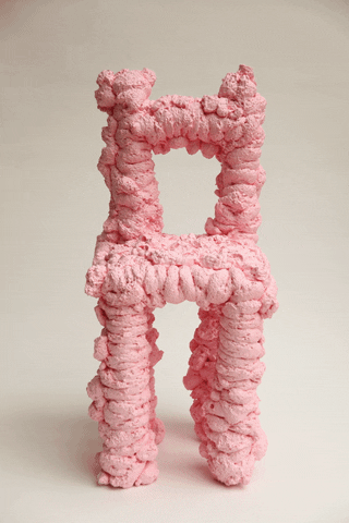
digital developments
I went on back to Maya to develop the tubular chair design I had. I tried out different ways and patterns of making the tubes.I stuck with the same chair as prior because of the simple shape - when I use the tubes to make the chair it is still clear and obvious that is a chair, despite looking very unusual. I had 3 new variations, where I tried using different pressure points, having huge lines, having lots of tubes, having a large gaps to see the background through. I also played around more with Maya's colours, and experimented with duo tone, orange and yellow, which made it look like the centre of the chair was glowing which makes me feel safe and makes the chair look rather inviting. I felt the most successful one was the last blue one that was full of swirls which made it most interesting to look at, however I felt like none of them had the right balance of swirling tubes and empty gaps. Even after producing developments I think the original one, the pink tubular one is most successful. It balances different sized tubes well, but also has gaps in the back for the user to look right through the intricacies of the chair.
I went back to the original tube chair, and changed the colour and the background to be brighter, pinker and sunnier, to match the aesthetic style of the pink foam chair in the garden. For the flower chair, I looked at some other chair types and didn't think any of them would fit well covered in flowers. This is because the current flower chair base is large and curved, it creates a bent and slightly enclosed area for the flower to grow collectively like a mini garden. I still asked for feedback on the flower chair from a peer who thought that the legs were weird as half covered with flowers but half not. I acted on this and developed the original chair by picking a grass brush and adding it to the legs, I wanted the legs to not have much flowers on them (that was for the seat), and also adding it as a filler to any empty spaces. I noticed that the chair seat and the legs actually look separate from each other, as if the seat is floating because the grass is blocking the users view of the connection. I think this is an interesting detail that isn't found in any chairs, it is impossible and makes the chair feel unreal. For the render I didn't want to put it in a garden as the chair would blend in, so I went for the opposite which was a snowy field. This juxtaposition is nonsensical, having a chair in full bloom, in a location where the trees are bare is ridiculous and it doesn't make sense, which makes it feel unreal and dreamlike.
final design set word association
Once I had all of my designs, I asked my peers, some who know my project well and some who have never seen my work before, to blindly react to my designs and name some words or phrases that instantly come to mind when they see each chairs. I gathered a collection of words that I will use when creating the names and descriptions for each of my chairs in my brochure. This was successful, I got a varied response of words that will be useful, some are obvious and some are interesting personal interpretations of my work.
brochure experiments
I began to create my brochure in indesign based off of my drawing plan. Since I was making this throughout the process of making all three physical models, as well as developing my digital designs I didn't use the best photos/ not the finished chair, instead I used what I had at the moment to act as placeholders.
Using the words I got from my word association previously I made up names and descriptions for each design. I had a lot of fun doing this, talking about the chairs growing, living, being dangerous, making some sound gruesome and others sweet. My favourite descriptions go to the creme de la creme chair (foam), which has a cake/ cream theme to it, naming it creme de la creme links to this, but also is fitting as "best of the best" as its the main chair. I also liked the flower chair's description, making it hypocritical by saying "mind the flowers", so that the user can't actually sit down without killing the flower. The descriptions are successful, I based some of the text off of IKEA's descriptions of their products but twisting it to become nonsensical. They are all silly and fun to read, the nonsensicality links back to the "Night is Short, Walk on Girl".
I found a tutorial on how to set up a trifold brochure on indesign, which got me started with all the guidelines. I was surprised by how thin and long each page actually was. I tried to recreate what I had planned, and played around with variations, and font changes to get the best outcome. It was quite tricky to get everything the same as I had planned. I especially struggled with the layout of the 4 chairs, the page was much slimmer than I had expected. I tested out moving them around, changing the positioning of the text to every possible location but I simply could not find the right layout. The pages were very difficult to work with alongside what I had. I should have made a brochure test in actual size on A4 paper so I would have been more prepared for the actual page proportions. This page was unsuccessful, I struggled and felt like I tried everything to get the layout to work, but nothing was working. There were too many chairs put onto a small area, it was too cramped and didn't fit together nicely.
Although the page of the featured main foam chair went perfectly to plan, it all worked perfectly and fit well. This was also probably because there was a lot more space, just for one chair. It was easier to work with, and I didn't have to cramp everything together. This page I think was very successful, there was a clear colour scheme that connected everything, and lots of space so the page was balanced not overcrowded. There isn't anything else on the page to distract from the main chair. I also figured out how to link my gif of the pink foam chair spinning into a scannable qr code. This is successful too as it's a fun interactive element for the reader to indulge in.
Half went well, and half went awfully. I asked for feedback to help decide how to move on. I asked my family members what they would think if they received this brochure advertisement. They agreed that the four chairs on the small space didn't fit well and the page wasn't properly balanced. I got a response that to improve I should change the entire layout, and choose a new advertisement style to use since the trifold brochure is too small. Some of the feedback was that the overall style was also a bit too much, they thought the title rings were odd, and they would prefer an furniture booklet that you can actually look through properly.
After showing them my research, they said I should have stuck with the minimalist theme that IKEA and similar furniture brands had, as it makes the work stand out more, and that would fit in with the research better as well as the familiar/unfamiliar concept that my work is built upon. The feedback helped me realise that I can give my work more space on the page, and actually even give them an entire page of their own instead of forcing them all together. I will create a mini booklet instead that will allow each design to have their own time. Since I do not have much time to plan out and design an entire booklet I will find a template that is suitable to the minimalistic aesthetic and edit this to suit my work.
final brochure
For the final brochure I used a booklet template from online and since I restarted my brochure I was running low on time. The reasoning behind switching the brochure layout/ advertisement type completely is above and from my feedback stating my previous layout was not working well to present my work, it was trying to be too compact, and further the aesthetic didn't link to my research on minimalist aesthetics that other furniture brands used, and wasn't best suited to the familiar/ unfamiliar concept my project is based upon. Due to this I found a brochure/ booklet layout that was similar to the minimalist aesthetics I discovered in my research. All the writing and the photos are my work but the layout design and the graphic design is not, it is a template. I chose a minimalist template to match the minimalistic aesthetic I discovered through my research brands like IKEA and MADE all use. I then began to put in my photos of all of my chairs into this booklet, as well as the text and titles for each. I did remove some parts of the brochure template, as well as some pages, that I didn't need/ like or were unnecessary.
Overall I am much more happy with this, it is successful due to the minimalistic and spacious layout. It is not busy and allows the user to take time to go through the booklet. It feels clean, clear and easy to read. The details in the writing / product descriptions I think also really make it what it is, they are odd and describe the chairs as cream and lovely, but also like intestines and grotesque. There are small details which are confusing and aren't how you advertise the product, things that don't really make sense which all again link to the familiar and unfamiliar. Using this minimalist template was good in enhancing this, and sticking to the minimalist aesthetic rather than trying something more experimental as I attempted prior, actually was a strong decision in helping the familiar/ unfamiliar concept of my project. The minimalist clean layout of the template makes it seem more normal, but the small changes in text and obviously the odd chairs contrast to the normal setting they are put in thereby confusing the viewer as to what they are seeing. The user expects basic furniture pieces made with wood and metal to accompany the template layout's aesthetic, but to see these unconventional more sculptural pieces doesn't make sense.
Overall the furniture pieces aren't really meant for use, e,g the flower chair you will kill the flowers if you sit on it, and the bumpy chair is uncomfortable. They are meant to be sculptural and be experiments that play around with surrealism and the familiar/ unfamiliar. I also didn't have a distinct user they are intended for, they are experiments in conceptual design, they would be for people interested in unique design pieces, or to be used as a sculptural piece in a room. The brochure would be intended for young adults to middle ages - people who would go and buy furniture pieces from places like IKEA, as this formed my research.
To improve on it I would design my own layout plan for this new type of advertisement. I will also try to print this out and assemble it into a A4 physical booklet.