About Me
I am Emelia Knarr, a Savannah College of Art and Design graduate with a BFA in Visual Communications. I am currently pursuing an MFA in Media Design at Full Sail University. My mission is to tell stories and make dreams come true.
Intention Statement
Over the next twelve months, my goals are to build my skills in professional branding, graphic design, and personal mastery in art.
Every week, I will release a "speed-painting" or time-lapse of my work on TikTok. The series will be titled Public Domain Friday and, as the title suggests, every Friday I will tackle a Public Domain character or property, the misconceptions about them, and ways artists might be able to use them for their own work. Each week, the property I choose will relate to what I will be learning about to keep track of my progress and a way to relate what I am learning to my personal artistic and brand growth.
In the actual journal entries themselves, I will express the difficulties in my current life and the struggles I have with attaining a state of Mastery, as well as any progress toward a thesis. In this time, one of my goals is to make progress toward finding a dream job and beginning a commissions or merchandise site, where I can sell items based on my original work such as my Swordtember 2023 series or fan work.
Other miscellaneous goals I have is to make progress in creating tutorials for others, showcasing my painting knowledge and process as well as my cartoonization and stylization knowledge for others to learn. I desire to begin building 3d sculpting skills and, possibly, rigging skills to add to my overall skills list. I would also like to learn how to create "PNG-Tuber" models, that is, 2D-animated models meant to represent different content creators. I would also like to finish several character designs and complete my "character vault" with detailed forms for their personalities, heights, quirks, and the rest. Finally, I wish to complete my long, long list of incomplete works-in-progresses so that I might start my post-mastery life with a blank page, ready to undertake new projects.
Week 2 - Inspiration | Alice's Adventures in Wonderland
Hello, everyone! Em here, and thus begins our first week of Public Domain Saturdays, where I'll pick a franchise or character from the Public Domain relating to what I've learned this week and I share what I've learned with you! This week has been about Inspiration. What causes it, what to do with it, how to manage it. We studied section five of Robert Greene's Mastery and wrote our first essay of the year about a figure that has achieved mastery in our field that inspires us (for me, the obvious choice was June Tarpé Mills).
This week, for our video, Alice's Adventures in Wonderland (that title specifically) seemed like an obvious choice. Alice is the basis for many artistic adaptations and interpretations, yet many people seem unfamiliar with a good portion of the source material. Wonderland was inspirational for me because I've loved it since I was a child (enough that I slogged through the 1800s story). It felt nice, coming almost full circle in a way, and talking about a franchise I knew very well to begin a series on the unfamiliar known and the unknown.
That's all on my part for now - see you guys next week! Have a good one, and let's keep chugging!
Works Cited
Greene, R. (2013). Awaken the Dimensional Mind: The Creative-Active. In Mastery (pp. 167–246). essay, Penguin Books.
Pausch, R. (2014, January 17). Really Achieving Your Childhood Dreams. YouTube. https://www.youtube.com/watch?v=q9fyfLEFnBA&t=1s
Week 3 - Communication | The Wonderful Wizard of Oz
Hello again! Em here and this week was all about communication - building our social network, having social and emotional intelligence, all that good stuff! This is familiar territory for me, as I’m a big psychology nerd and my folks are big self-help book nerds, so a lot of what we learned this week was excitingly familiar, as it was material I knew that was enhanced by further explanations and knowledge. As per my assignment, I grew my LinkedIn a little and have some screenshots below for you all. For this week’s Public Domain Saturday (PDS), I chose The Wonderful Wizard of Oz, specifically book one, due to its themes of miscommunication, misunderstanding, and networking.
The Wizard is a complicated figure - the witches and history of Oz, moreso. I didn’t even have time to expand on the Tin Woodman’s backstory (completely tragic and actually horrific) or the lost monarchs of Oz that came before the Wizard. However, in terms of communication, Dorothy is forced to network and expand her connections in order to try and find a way home, not knowing she was capable of doing so the entire time due to the magical silver slippers she acquired. She even has to deal with a workplace bully (Oz himself) in order to reach her goals, which requires a lot of social intelligence.
See you guys next week for PDS and our lesson of the week!
Work Cited
Greene, R. (2013). See People As They Are: Social Intelligence. In Mastery (pp. 125–166). essay, Penguin Books.
Week 4 - Personal Development & Leadership | A Christmas Carol
Here’s Em, checking in for my last week of Month 1: Personal Development and Leadership - the same theme as the week’s lesson! This week we made a plan (shown below) for what our Journey for the rest of the year will be like - our major goals, how we will attain them, etc.
One of my goals was to maintain my social media, so I will be doing so via my Public Domain Saturday series and whatever side projects I feel comfortable sharing (I doubt anyone wants to see my Dreamworks Trolls doodles, cute as they are!) Another was completing the novel I have been writing since high school - which, admittedly, has already been written once…by a seventeen year old. You can tell, too. Attached, I have a calendar of scheduled chapter rewrites with the eventual goal of publication (using my completed work and art as a pitch packet). Lastly, I have been accepted into the Disney College Program…I am hoping to find a position where I can expand my artistic and business skills, but I am mostly just happy to be included. I applied on a whim, for fun, and genuinely did not think I would even make it past applying…well! I am ecstatic for the opportunity…I am even thinking of reaching out to Full Sail for the possibility of walking the stage, since it means I will be in Florida at the time of graduation.
It’s with shaking hands and hope that I end this class - and take one more step towards mastery and a better future. See you guys next class, and have a real one.
Works Cited
Greene, R. (2013). See People As They Are: Social Intelligence. In Mastery (pp. 247-304). essay, Penguin Books.
Greene, R. (2013, April 7.) Mastery | Robert Greene | Talks at Google. YouTube. https://www.youtube.com/watch?v=J4v_34RRCeE
Mootee, I. (2013). Scene 03: Design Thinking to the Rescue, subsection “Every Future Business Leader Needs to Be a Good Design Thinker.” In Design Thinking for Strategic Innovation: What They Can’t Teach You At Business or Design School. essay, John Wiley & Sons.
MDM525 Week 1
Week 5 - Vision | Carnival of Souls (1962)
Vision
My life has always been about stories. My grandparents retelling feats of their life, my parents’ introduction to the family dog, my brothers’ wacky days at school – I’ve always been fascinated with those stories. I want to tell them and by doing so, bring others the joy that they’ve brought me. If I could have made even just one person happy, or know they aren’t alone with my stories – I will have been fulfilled at the end of my life. I have always had a gift for vision, for seeing a bigger picture and fulfilling it, even if that means trying new things and perfecting them first. It is part of my values, to work hard and persevere, while showing an appreciation for human experience so that my stories reach all walks of life.
Values
Three inspirational figures that help guide my work are: Chip Kidd, who is multi-faceted, unpredictable, and a fan. His work is varied – from graphic design to comics – and he always seems to come up with something new. He also loves the work he creates for and is passionate about his projects. Secondly is Skottie Young, who is imaginative, good-humored, and unique. His work is whimsical and speaks to a sort of emotional energy I cannot quite describe but is whole-hearted and sincere. Lastly is Morag Myerscough, who is empathetic, considerate, and bright. “Bright” may sound vague, but I mean it in the sense that she is full of life and determined to bring a light she sees into the world, along with a little hope. She is considerate of the environment in which she places her work, taking in opinions when she would not have to, and she is determined to make a point of accepting all walks of life. All of these things are deeply personal in terms of values for me – however, if I had to pick, I would choose multi-faceted, a fan, unique, good-humored, bright, and empathetic.
Mission Statement
My mission statement for my time as a student in the MDMFA program is that I want to become not only a better artist, but a better person across the span of this year. I want to do this to acquire security in a career and have better interpersonal relationships – I want to be known for my unique approach at work, talk to my family every day, I want to always be on time, and I want to build a better, more supportive community.
Design Challenge
This week’s assignment was to recreate versions of Alexander Girard’s prints, specifically his “New Sun” print from 1971. Additional challenges include his “Grid” print and a collection of his La Fonda del Sol prints. Transforming the old prints into vectors via Illustrator was meant to introduce us to the industry tool and strengthen our skills in it – I took a class on illustrator two years ago and am admittedly not the best at it, but I lacked the time to do the other challenges. The “New Sun” print, however, was very fun and was a nice way to get back into using the program. Even though I did not do the additional challenges, I watched the tutorial on how to move shapes around a circle in Illustrator, as I had never done or seen that before. It was very interesting and I was happy to add it to my digital toolbelt!
Public Domain Saturday
This week’s post is about vision – what personal vision is to you, your personal mission, your values, etc. This reference might be considered a bit more obscure, but Carnival of Souls (1962) is one of the fundamental horror films that fell to the wayside and between the cracks of obscurity. How this relates to vision is a bit metaphorical, but the literal visions Candace Hilligoss’ character experiences and the vision the townspeople might have been experiencing the whole time define something strange going on and reveals how unclear the world they are living in is. It shows Hilligoss’ character has failed her personal mission of surviving and moving on from the accident before her new journey – a mere illusion – even began.
MDM525 Week 2
Week 6 – Research | Snow White and Rose Red
The Duality of Research in New Media
Emelia Knarr
Professor Ryan McClung
MDM525-O
Full Sail University
February 18, 2024
Introduction
Research has become irrevocably tied to design – a designer fundamentally cannot have one without the other and expect to succeed. There are a multitude of approaches and methods of research in terms of design; focus groups are one example of this. They allow the surveyor to take in a wider variety of input and take in an external interpretation – a window into how your audience will react (Verma, 2023). However – many of these research methods have downfalls in their usage, which shall be explored through the lens of focus groups' weaknesses.
The Benefits
Focus groups are groups of individuals assembled so that an interviewer can survey their thoughts, feelings, and concerns about various pieces of media or concepts. The interviewer can be looking for many things and receive varied results – but whatever results that are attained will be key knowledge for the design team (Verma, 2023). They can be held online or in-person, each granting different results; for example, in-person focus groups yield varied new ideas or suggestions but might stray off-topic and talk at length, which could be difficult to record, sift through, and interpret. Alternatively, online focus groups can be much larger, easier to document due to the necessity of text to communicate, and will be concise – there will be more ideas per word compared to in-person focus groups (Richard, 2020). Designers might even be able to create psychographic demographics and interpretations early on, furthering their success as psychographic segmentation can increase success in design (Langford, 2019). This method can even be used to measure demographic effectiveness. A productive real-world example of the implementation of research into media design is Kai Kaspar’s 2019 study on the effectiveness of targeted ads on an audience – they found that ads targeted at the individual are more likely to be viewed longer and revisited, visually.
The Drawbacks
However, there are downsides outside of the minor flaws of focus groups. Academics such as Katherine Ryan ask questions like “How can we create the ideal focus group?” This question is not a bad one – at first glance, it holds the intent to acquire the most effective critique to improve the design process the most. It seems like a vie for increased productivity. However, upon closer examination, Ryan’s methods in her 2013 experiment seem more to imply the desire to rig the focus groups to give answers the designers want to hear, such as praises, rather than acquire genuine input. As the journal is peer-reviewed and published, it can be used by other academics to argue, “This method is approved of in academia,” When it is, at best, insincere and ineffective. Another dilemma is that it seems there is a massive divide between research and design teams, making miscommunication and frustration a common phenomenon (Zielhuis, 2022). This is not even to speak of the various forms of bias that can form from such surveys – observation bias, interviewer bias, and sample bias being only a few.
Conclusion
This is all to say that, while there is a large variety of research methods and benefits, it is proven in the industry that ineffective research (either by accident or design) can instead be a detriment to the overall integrity of design. To avoid this, it is best to perform as many research methods as possible, as the benefit of one method might negate the downfall of another. It is also best to ensure the research team is sincere in finding answers rather than cutting corners or making a profit, as insincere focus groups can be just as detrimental to design as no focus groups or research at all. In conclusion, it is not only important to incorporate design research into the design process but also to incorporate effective, sincere research into the process.
References
Kaspar, K., Weber, S.L., Wilbers, A.K., & Martinez-Conde, S. (2019, February 15). Personally Relevant Online Advertisements: Effects of Demographic Targeting on Visual Attention and Brand Evaluation. PLoS One 14(2), Article e0212419. https://doi.org/10.1371/journal.pone.0212419.
Langford, S. (2019, October 29). How Psychographic Segmentation Can Improve your Marketing Strategy. LinkedIn.
Richard, B., Sivo, S. A., Orlowski, M., Ford, R. C., Murphy, J., Boote, D. N., & Witta, E. L. (2020, November 3). Qualitative Research via Focus Groups: Will Going Online Affect the Diversity of Your Findings? Cornell Hospitality Quarterly 62(1), 32-45. https://doi.org/10.1177/1938965520967769.
Ryan, K.E., Gandha, T., Culbertson, M.J., & Carlson, C. (2013, December 3). Focus Group Evidence: Implications for Design and Analysis. American Journal of Evaluation 35(3), 328-345. https://doi.org/10.1177/1098214013508300.
Verma, A., Azad, R., & Qayyum, H.A. (2023, November 21). How Can You Use Focus Groups to Understand Print Design Preferences of Your Target Audience? LinkedIn.
Zielhuis, M. (2022, January). Making Design Research Relevant for Design Practice: What is in the way? Design Studies 78, Article 101063. https://doi.org/10.1016/j.destud.2021.101063
Design Challenge
This week’s assignment was another Alexander Girard’s print, and I loved the patterns and colors! I less-loved the actual creation of the print – I faced great difficulty this week in terms of attempting to get Illustrator to work with me, and then giving up and brute forcing it. The brute forcing method seemed to have worked, and I discovered a few shortcuts along the way. I assume this was to learn the pen tool and hone our skills on precision…The only thing honed was my patience and control over my temper. I have reached a state of Illustrator-rage-induced Zen that allows me to no longer be annoyed by the petty struggles of mere mortals.
Public Domain Saturday
Research has been the key theme of this week; therefore, it seemed only fitting that this week’s Public Domain story would be Snow White and Rose Red. This is because you might need to either be a Brothers Grimm expert or do some research to even know that this story exists. For this week’s video, an artistic interpretation (possibly not true to the original story) has been made. The girls, specifically, are designed with wood nymphs and plant fairies in mind, as the artist thought it could be interesting that the girls’ names were derived from the plants they were made of. This adaptation makes it so that the girls were created from the plants in the mother’s garden by magic. In doing so, I had to research the plants themselves, the story so that the descriptions could still match the characters while fulfilling my adaptation, and fashion of the era (and location) to have the best idea of what my own version of this story could’ve looked like. While I was unable to find digital copies of Karoline Stahl’s 1816 original print of Fables, Fairy Tales and Stories for Children, where the story seems to originate (outside of oral retellings), the earliest illustration I could find for this story or any of its variants comes from Josephine Pollard’s 1883 print of Hours in Fairyland, artist unknown. Based on the fashion choices in the illustration, we can assume the story takes place in the Middle Ages or Medieval times (specifically 14th century), around Nuremburg (where Stahl might have lived while writing the stories as a teacher). For example, both girls in the image wears a kirtle (one sleeveless and one long-sleeved), while the Snow-White character wears a perclose with a coin purse tied around her hips. This gives us a very clear idea of what fashion, architecture, and such could look like – even the topography of the area.
References
Forest, M. (2012, December 25). 14th Century Garments: A comparative Study of Extant Garments in North-Western Europe. Normal, Illinois; Society of Creative Anachronism.
Greenburg, H. (2005, August 3). Medieval Clothing: Some Links, References, and Keywords for Searching. Burlington, VT; The University of Vermont.
MDM525 Week 3
Week 7 – Client Needs | Aladdin and His Wonderful Lamp
The Inclination of the Client
Emelia Knarr
Professor Ryan McClung
MDM525-O
Full Sail University
February 25, 2024
Customer service is one of the trickiest skills in any industry. From the medical world to the creative one, at some level, you will always require customer service skills. However, due to the different way these interactions are phrased, one might not initially recognize those interactions are customer-service-based. One of the main interactions in the line of design work consists of a designer and a client, known as a customer, but not in the traditional sense. A client can be an individual, working for their brand, or an entire corporation, with representatives and marketing teams to consult. The key to working with the client, whoever they may be, is defining their needs, communicating with the client, and meeting the client’s needs – though each stage has its benefits and drawbacks.
Defining Client Needs
A client’s needs can be defined twofold: on one side, there is the literal deliverable, which could be a branding package or a simple advertisement. On the other is a deeper, emotional struggle: what is the company lacking? What needs to happen that is not already happening? Mark Anthony Camilleri defines a client’s needs as “A conscious feeling of deprivation in a person,” (Camilleri, 2017). In the case study provided, Margot Chase describes her journey with Chinese Laundry, a company that claimed to be in dire need of rebranding. A technique she used to attempt to assess Chinese Laundry’s needs was not only directly talking to the women who purchased C.L.’s merchandise about the items but also creating a persona that would be the ideal audience for the product to assess what would fit her needs (Chase, 2017). This came at the risk of over-personalizing the branding package but worked in Chase’s favor. In her 2022 study, Laxsini Murugesu oversees the outreach to patients with a low-medical-literacy level, meaning they are less likely to understand complex medical jargon. It is a struggle that affects many healthcare professionals to the point that they are not able to do their jobs as effectively, so they ask how they can more effectively reach their patients. To determine what she would need to communicate more effectively with patients (really, clients in their own right), she asked doctors what methods were more effective in getting their patients to not only follow medical advice but to follow it correctly (Murugesu, 2022). This came at the risk of bias in her sampling creating a misunderstanding of what her target audience needed, so she did an in-depth study to confirm her findings (Murugesu, 2022). Defining a client’s needs can be tricky – however, there are many viable methods for doing so. Airlines, for example, deliver surveys to assess consumer experiences and ask directly what would make it more enjoyable (Camilleri, 2017). Sometimes, to effectively discern what needs to happen for deliverables to be properly constructed, you might have to ask how the material will be physically presented (Janda, 2014). Sometimes, the actual need might not be defined by the client well, as the client themselves may not be sure what they want aside from a physical result (Adams, 2008). Other times, there may be methods of communication that you know would improve client interactions, but the organization you work for has unintentionally discouraged employees from using that method (Murugesu, 2022). Commonly, an employer will not believe that a customer service technique from another field will be effective in the organization’s field, despite most customer service techniques being the same universally (Hansberger, 2019). To properly define a client’s needs, however, one must have effective client communication.
Client Communication
Client communication is the interaction between the designer and the client. Whether that communication is between a designer’s team and a client’s team or an individual designer and client, the result is still the same. Margot Chase, in her interactions with Chinese Laundry, asks specific questions such as “What is one emotional word you wish to use to describe your business?” and “What are the emotions you want your clients to feel?” To better understand her client and their desired deliverables. She knew her clients likely would not understand her or her team’s thought process, so she broke her findings down into understandable, tangible things. Examples she used specifically for Chinese Laundry were market research that would most appeal to their target audience and ideation mood boards for potential directions they could take the project (Chase, 2017). In comparison, Laxsini Murugesu consulted medical professionals (in this case study, Murugesu’s actual “clients,” so to speak) on how they currently address their clients and what they feel is effective and what is not. She specifically focuses on low-health-literate individuals as the most complex clients to work with. The study she conducts is of the different methods of communicating with a client (such as giving instructions for a medicine to take or explaining a condition) and measuring the client’s understanding of the concept afterward. She even finds that there are ways that the medical professionals wish they could use to explain, as they know it would be effective, but the hospital policy prevented or dissuaded them from doing so under the guise of being “unprofessional” when the actual issue the hospital took was the doctors themselves seeming “uneducated” (Murugesu, 2022). Client communication truly should be simple and universal. The keys to this are not acting as if your client is omnipotent, not being heavy on career-specific lingo, and not participating in toxic workplace practices like drama (Adams, 2008). Chase herself uses visuals to replace heavy jargon-specific explanations, which sources like Golden, Adams, Hansberger, and Murugesu all confirm as an effective practice. However, a drawback is that communication will likely not be all at once; in fact, it is more likely to come in “rounds,” making it a perpetual, careful practice (Janda, 2014). However, those “rounds” and all the communication associated with them are paramount to effectively discerning a client’s needs and creating the deliverables to fulfill those needs.
Meeting Client Needs
Meeting a client’s needs can be defined as finally delivering the deliverables. It can also be established as fulfilling an end goal for a client. In Chase’s work with C.L., she discerned that not only did the clients keep the shoeboxes the company sold for storage, but there was waste being created by their packaging. In response, Chase engineered a package that was sturdy enough to be used as a storage device that also had a handle, so it could be used to carry the shoes like a shopping bag. She also created a branding package with individual illustrated assets that could be arranged for any given occasion, making the package and box design reusable, efficient, and appealing to the clients (Chase, 2017). In turn, Murugesu was able to solve her doctor dilemma by effectively creating her study on what methods were most effective for communicating with patients. The study was easy to read, following the advice she gathered from her research such as creating easy-to-understand visuals. She was able to publish it so that doctors who were struggling with such an issue would have better relationships with their patients and do better at keeping them healthy (Murugesu, 2022). Not only discerning a client’s needs but puzzle-solving one’s way into solving their problems and creating an effective deliverable is one of the best feelings. However, this comes with many complications outside of the design process. While surveys might tell you a client’s needs, these surveys can also have multiple forms of bias that would skew data and create misinformation, leading to not fulfilling the need at all (Camilleri, 2017). Sometimes, something as small as confusing whether an item is meant for printing or digital use can ruin an entire design package (Janda, 2014). Sometimes, deliverables are unable to be met, and the designer is forced to use their communication skills to instead inform the client of the bad news, which is complicated on its own (Golden, 2021). Communication and the expectation of delivery can also be a method by which a designer can be abused by a client (Janda, 2014). At worst, this can require you to fire a client (Adams, 2008).
Conclusion
Customer service is tricky, at best, and subjective at worst. There are many approaches just to one goal alone, and multiple could be correct or none of them could. Social interactions persist in a way one might do everything “correctly” or by the book, but an especially abusive or particular person can respond negatively regardless. The best outcomes, though, follow several universal laws of client communication, which lead to discerning client needs, which in turn leads to effectively delivering clients’ needs.
References
Adams, S. (2008, September 4). Running a Design Business: Selling Design to Clients. LinkedIn Learning. https://www.linkedin.com/learning/running-a-design-business-selling-design-to-clients/
Camilleri, M.A. (2017, December). Understanding Customer Needs and Wants. Travel Marketing, Tourism Economics, and the Airline Product, 29-50. https://doi.org/10.1007/978-3-319-49849-2_2
Chase, M. (2017, September 8). Margo Chase: Creative Inspiration. LinkedIn Learning. https://www.linkedin.com/learning/creative-inspirations-margo-chase-graphic-designer/introduction?resume=false&u=50813145
Golden, M. (2021, March 22). 4 Keys to Delivering Bad News to Customers. YouTube. https://www.youtube.com/watch?v=QEnvHY2MTVM
Hansberger, A. (2019, October 29). An Agency Guide to Communicating with Clients. Motto. https://wearemotto.com/designers-guide-to-communicating-with-clients/
Janda, M. (2014, February). Scoping the Project. In M. Janda Anatomy of a Design Proposal. Peachpit Press. https://learning.oreilly.com/library/view/anatomy-of-a/9780133830101/ch01.html
Murugesu, L., Heijmans, M., Rademakers, J., & Fransen, M.P. (2022). Challenges and Solutions in Communication with Patients with Low Health Literacy. PLoS One 17(5), Article e0267782. https://doi.org/10.1371/journal.pone.0267782
Design Challenge
The design challenge of the week was, thankfully, much more tolerable. We recreated Alexander Girard’s signature! This was with the intention of maintaining the integrity of paths with a specific direction and turning a line into an outlined shape. The optional challenge was to animate the assets to appear as if they were being written in real time, which I thought was awesome. That was the introduction of After Effects (the program I used for my lantern animations and for my videos), so I was happy to see a familiar program, even if I did not do the optional challenge.
Public Domain Saturday
While I know last week was research, it was impossible to resist deep-diving for this week’s video, as the story of Aladdin is so difficult to track down and discern, to the point historians argue the story’s origins! The closest I was able to find was that it took place in a region of northern or central China that had enough of a Muslim community that it did not seem out-of-place in an oral story told in Syria or even as far as France and it would still make sense. After further research, I determined the Uighur (or Uyghur) culture to be the best fit and also found that China has been attempting to suppress the aboriginal culture…so, it turned into an educational opportunity as well. The project also reminded me of a struggle from last year, where I had to fight with online databases to find historically accurate lamps…specifically for the Aladdin story, for which I was unable at the time. This was my redemption moment! (Said lamp assets from the design challenge and this can be found on my website, under “Concept Art” and “Game Assets”)
References
Cindy. (2022, November 17). Unveiling the Timeless Beauty of Xinjiang Nationality Clothes. Chinaadventure. https://www.chinaadventure.org/xinjiang-travel-guide/xinjiang-nationality-clothes.html
Rahayu, M., Abdullah, I., & Udasmoro, W. (2015, August). “Aladdin” From Arabian Nights to Disney: The Change of Discourse and Ideology. LiNGUA Jurnal Ilmu Bahasa dan Sastra 10(1):24. https://doi.org/10.18860/ling.v10i1.3030
Shim, S., & Margolies, J. (2018, April 10). Seven Fantasy Classics for Children | Aladdin. University of Michigan Library. https://apps.lib.umich.edu/online-exhibits/exhibits/show/seven-fantasy-classics/aladdin
Yang, Andrew. (1889). Aladdin and the Wonderful Lamp. The Blue Fairy Book (Lit2Go Edition). https://etc.usf.edu/lit2go/141/the-blue-fairy-book/3132/aladdin-and-the-wonderful-lamp/
MDM525 Week 4
Week 8 – Reflection | The Snow Queen
It’s hard to believe that an entire month has passed – with this being my last journal entry for my second class, it feels like time is flying by so quickly. Attached is my mastery journal post – a three-minute reflection on the month, what I’ve learned, and what I’ve done – and, as always, my design challenges and Public Domain Saturday entry.
Design Challenge
Our final design challenge was to enhance our previous design challenges, perfecting them based on our peers’ critiques. We also were supposed to complete a previous optional challenge – which, in my case, was animating Alexander Girard’s signature. I was unable to attach the video or .gif file of my animation, so unfortunately, that will be saved for my discussion post.
Public Domain Saturday
I thought a literal interpretation of the week’s theme would be fun – especially with a story as complex as the Snow Queen’s. Sometimes, reflections can be warped versions of reality, distorting the reality we saw as negative and bitter. I enjoyed this month so I couldn’t relate to that on this specific subject, but it was nice to acknowledge the variety of reflections.
MDM530 Week 1
Week 8 – The evolution of Branding | Trolls
The Breadth of Brands
Branding is complex. There is no one correct way to do it, as there are so many intentions and directions to take even one brand. Typically, a brand is considered more than just a logo or an advertisement, the things that may acquire your initial attention (Adams, 2015). It is also the brand’s connection to humanity and its personality. All three are required to not only be present but done effectively for a brand to be successful.
Branding for Attention
An important thing to consider when branding is attention – specifically, to garner the attention of the target audience. Southwest attempts this in various ways – the color scheme is a recognizable, bright, primary color scheme. Contrasting the blue primary color with attention-grabbing colors like red and yellow helps the brand seem visible while warm. The font is also specifically chosen to be recognizable (1.5 Case Study, n.d.). Heinz takes a similar approach – iconographic font choice and bright, attention-grabbing primary colors (Heinz, 2017). However, the difference between them is Southwest had a major rebrand in 2014, making these changes very new (1.5 Case Study, n.d.). Recognition for the symbol and font alone has not been able to build yet. However, the rebranding for Heinz holds the same font and iconographic features (the 57, the food association, and its polygon label shape) to effectively grab their familiar audience’s attention (Heinz, 2017). Studies show that the most attention-grabbing method of branding, where shopper’s choices are impacted, is made not by logos alone, but by subconscious mental associations (Yang, 2024). This, in theory, makes Heinz’s rebranding more effective. However, attention only goes so far. A connection can deepen the likelihood of brand loyalty (Adams, 2015).
Brand for Human Connection
This aim of branding is particularly tricky as there is no one “correct” way to do so. It is fuzzy, touch-and-go, and relies heavily on a brand’s target audience – the goal is to reach the audience on a deeper level and encourage a personal bond. Southwest, in its rebranding, chooses the heart icon to present a welcoming exterior. The colors also lend to this – however, their advertisements emphasize hospitality and comfort, which is important for a travel brand (1.5 Case Study, n.d.). In comparison, Heinz hones the commonness and renown of their brand. They are a household, everyday-use product based on one thing every human needs: sustenance. The product alone makes it easier to form a human connection, as it is something so common, whereas flights are not a concern for every human. To build a connection you must communicate with the community that is most relevant as an audience, considering factors like who is in the community, how to match their energy, what demeanor is most effective, as well as tone and voice (Graham-Tolsdorf, 2023). However, human connections can also rely heavily on the brand’s personality and how it ties into consumers’ values and lives (Smiddy, 2023).
Projection of Brand Personality
A brand’s personality is, in a way, the humanization of the brand. It is the traits that the brand wants to exemplify the most. Sean Adams, in his 2015 LinkedIn course, discerns that a brand personality is derived from values and emphasized by strengths and weaknesses (Adams, 2015). While Southwest, as a brand, seems to have a solid handle on personality (focusing on comforting, personal aspects), it is not as strong as one might think. Their overall personality is too new to seem sincere, even in their ads (1.5 Case Study, n.d.). However, to tell if a brand is successful in personalization, it can easily be categorized using the Aakar model (Paul 2022). Heinz, in comparison, falls into a combination of Sincerity and Competence as categories. The brand prides itself on being consistent and reliable, but also honest and realistic (Heinz, 2017). Southwest, on the other hand, cannot easily be categorized. It is too personable to be Sophisticated, too clean to be Rugged, too soft to be Competent or Exciting, and not charming enough to be Sincere. The visuals of the branding can dictate first impressions of a brand, but Southwest’s is vague and common (Leelayudthyothin, 2022).
Conclusion
Southwest, as a company, has been improving – its rebranding is effective for the industry it is in, even if the rebranding alone is not a signifier of its success (1.5 Case Study, n.d.). Brands are living, constantly evolving entities – instead of going through “cycles” of improvement, the pattern is more like a spiral…spinning in a cycle, but constantly moving forward (Neumeier, 2005). It is likely due to the fact the rebrand is so “recent” in comparison to other brands’ signifiers. Heinz has the benefit of history and consistency – their iconography relies primarily on their polygon shape and font, and that has worked for decades (Heinz, 2017). However, only time will tell how successful the rebrand is.
References
1.5 Case Study: Southwest Airlines. From MDM530-O. Full Sail Online. Retrieved from https://online.fullsail.edu/class_sections/194526/modules/698627/activities/4035879.
Adams, S. (2015, March 27). Branding for Designers. LinkedIn Learning. https://www.linkedin.com/learning/branding-for-designers/welcome?resume=false&u=50813145.
Heinz Master Brand. (2017, August 13). JKRGlobal. Retrieved from https://jkrglobal.com/case-studies/heinz-2/.
Leelayudthyothin, M. (2022, September). Effects of logo design toward brand personality perception: a study of logo elements in real estate business. Strategic Design Research Journal 15(1). https://doi.org/10.4013/sdrj.2021.151.08
Neumeier, M. (2005, August). Cultivate. In M. Neumeier The Brand Gap. New Riders. Retrieved from https://learning.oreilly.com/library/view/the-brand-gap/0321348109/ch05.html#ch05lev1sec1.
Paul, M. (2022, August 9). Brand personality: definition, examples, and how to define yours. The Branding Journal. Retrieved from https://www.thebrandingjournal.com/2022/08/brand-personality/.
Smiddy, M. (2023, March). Establishing human connection in your brand. Stratos. Retrieved from https://stratos.agency/blog/human-connection-in-your-brand/#:~:text=Listening%20to%20your%20audience%20is,bored%20after%20the%20first%20sentence.
Tolsdorf, J. (2023, February 22). How human connection can benefit your brand messaging. LinkedIn. https://www.linkedin.com/pulse/how-human-connection-can-benefit-your-brand-messaging-jessica-graham/.
Yang, X., Retzler, C., Krajbich, I., Ratcliff, R., & Philiastides, M. (2024, January). Attention to brand labels affects, and is affected by, evaluations of product attractiveness. Frontiers in Behavioral Economics 2(Sec. Neuroeconomics). https://doi.org/10.3389/frbhe.2023.1274815.
Design Challenge
The design challenge for this week was creating a vision board for a “locavore” eating establishment that focuses on local ingredients and sustainability! If using the Aakar model, it might be considered Rugged as well as Sincere. The exercise specifically was to organize various assets in InDesign, arranging text and adjusting the leading and kerning of the lettering to be the most visually effective. This was a very fun, useful beginner exercise to learn InDesign for the first time. I am already slightly familiar with the program, due to previously making my resume in it, but I was able to learn how to use the Smart Masking feature in Photoshop to cleanly cut a figure out of an image for the collage. I also learned a few new tricks (such as adjusting the visual quality in the program to review projects) in InDesign that I am definitely using for the future! I still prefer Microsoft Publisher, but this class might convert me into an InDesign lover yet…
Public Domain Saturday → Sketchbook Saturday
So…this is awkward. Last week, my video was flagged for unoriginal or low quality or “QR code” content…it never specified which, but I figured that would be a solid and abrupt end to my Public Domain Saturday series. Every other platform I used to scan for copyright materials or quality assured my video was fine, but I didn’t want to risk it with TikTok anymore. Instead, from now on, I’ll be doing a Sketchbook Saturday series! I’ll be doodling pop-culturally relevant or fun projects I want to do as a “break” from everything else. This week, I made fan art of Dreamworks Trolls! I’ve been wanting to draw them forever, but life always got in the way…so, for the first time since 2016, I can draw the cute, funny little guys!
MDM530 Week 2
Week 9 – Brand Development | Gotham Characters
Brands and Audiences
Several factors contribute to developing a brand – not just creating it. When one thinks of a successful brand, one might not first think of Pepperidge Farm – but that, in part, is what makes it such a success story. Pepperidge Farm is the dark horse of successful branding – They’ve determined their audience needs, defined their brand’s core, and connected to their audience in a meaningful manner more than comparable brands with the same product and demographic, such as Ferrero Rocher.
Determining Audience Needs
To determine an audience’s needs, a brand must first know who they are – what is perceived as important in life, how a brand could improve a life, and what niche a brand could fill. Pepperidge Farm thrives here – they identified their target audience as mothers who primarily did the grocery shopping for their families – across generations – and keyed into what made their product so desirable to them: serving-sized packaging, quality in the cookies, etc. (2.5 Case Study, n.d.). Comparably, Ferrero Rocher has a similar audience and packaging strategy – so where does the brand fall short? Despite having a wider multi-media marketing campaign and literal, flashier packaging, Ferrero lacks the specificity in its target audience that Pepperidge Farm has (Gokhale, 2023). Studies show that the older generations that are likely to pick the two brands are more likely to stick to established, solid brands (Lerch, 2021). With Pepperidge Farms being founded earlier, it already has the upper hand. This differentiation strengthens its appeal to the generation likely to be doing the shopping. This dynamic and knowledge Pepperidge Farm has makes it stronger in that it designs with purpose in brand identity, not a general aesthetic (Reid, 2013).
Defining a Brand’s Core
The brand’s core is not just a slogan or logo, but rather, the cumulative sum of its parts (Adams, 2015). Pepperidge Farm’s core is being a treat – a high-quality special snack meant just for providers of the home as a form of stress relief and joy. It is mundane but also special, feeding into its successful “never have an ordinary day,” and “save something for yourself,” campaigns (2.5 Case Study, n.d). Ferrero, alternatively, focuses on being an elegant, high-class treat (Gokhale, 2023). It uses the same techniques as Ralph Lauren of giving the illusion of being a bourgeoisie product at proletariat prices (2.5 Case Study, n.d). This, however, works as a double-edged sword for Ferrero. The high-class vibe makes it seem exclusive, only for special events – this limits consumption and audience purchases rather than being a daily household treat (Gokhale, 2023). While both brands have differentiated their cores from other snack products, one has limited itself while the other has specialized itself (Neumeier, 2005). These cores and identity systems are the things that most effectively communicate the brand, and therefore connect them meaningfully, to their audience (Adams, 2015).
Connecting to Audiences Meaningfully
Personal relationships formed with brands lead almost irrevocably to brand loyalty – making it of the utmost importance to connect with audiences in a meaningful manner. Pepperidge Farm did this by acknowledging how their products were consumed and by whom – and making it easier for them to do so. It not only embraces its audience but remains consistent, if not improving (2.5 Case Study, n.d). Ferrero Rocher, alternatively, should focus on connecting with women in the way Pepperidge Farm has. However, its branding remains a general audience family brand for special occasions, when the families that its branding targets do not necessarily prefer the product over others (Gokhale, 2023). Studies show storytelling can strengthen a layman’s audience with an unfamiliar brand or product (ElShafie, 2018). Storytelling can encourage empathy, especially when empathy is a key trait of the design (Powers, 2023). Designing with purpose in mind creates stronger pieces, especially when the purpose is directed at an audience (Reid, 2013). While both brands utilize this strategy, Pepperidge does so more effectively (2.5 Case Study, n.d). This is due to the fact Pepperidge segments its audience and differentiates itself to match every generation (Lerch, 2021).
Conclusion
Overall, Pepperidge Farm’s Branding is not only more effective but in turn becomes more successful through its effect on its audience. Brands that are similar in audience, packaging, and message like Ferrero Rocher are missing the key ingredient that comes with their casual, almost unspoken success while Ferrero desperately plays their ads on repeat every Christmas time. Pepperidge does not need to do so, as its success and effective branding speak for itself.
References
2.5 Case study: Pepperidge Farm & Ralph Lauren. From MDM530-O. Full Sail Online. Retrieved from https://online.fullsail.edu/class_sections/194526/modules/698628/activities/4035887.
Adams, S. (2015, March 27). Branding for designers. LinkedIn Learning. https://www.linkedin.com/learning/branding-for-designers/welcome?resume=false&u=50813145.
ElShafie, S.J. (2018, December). Making science meaningful for broad audiences through stories. Integrative Comparative Biology 58(6). https://doi.org/10.1093/icb/icy103.
Gokhale, N. (2023, September 18). The irresistible allure of Ferrero Rocher: a branding masterpiece. LinkedIn. https://www.linkedin.com/pulse/irresistible-allure-ferrero-rocher-branding-nivedita-gokhale/.
Lerch, T. (2021). Visual communication – a designer’s guide to reaching target audiences. Pp. 27 – 41. [Unpublished Master of Arts Thesis, Lindenwood University]. Digital Commons @ Lindenwood University. Retrieved from https://digitalcommons.lindenwood.edu/theses/47/.
Neumeier, M. (2005, August). Differentiate. In M. Neumeier The Brand Gap. New Riders. Retrieved from https://learning.oreilly.com/library/view/the-brand-gap/0321348109/ch05.html#ch05lev1sec1.
Powers, R. (2023, August 28). Designing with the heart: connecting with your audience on a deeper level. LinkedIn. https://www.linkedin.com/pulse/designing-heart-connecting-your-audience-deeper-level-rachel-powers/?trk=article-ssr-frontend-pulse_more-articles_related-content-card.
Reid, S., Kiefer, K., & Kowalski, D. (2013). Adapting to your audience. The WAC ClearingHouse. Retrieved from https://wac.colostate.edu/repository/writing/guides/audience/.
Design Challenge
The design challenge this week was to create a vision book! I’ve never seen anything like this, so I was excited about the concept. The intention was to expand our experience in InDesign, managing assets, and the like. It was also to inform students of what a vision book is and how to create one. I felt an appreciation for the guide, feeling as if I were a CEO looking for a rebrand, material like that would greatly boost my understanding of what the marketing team wanted to do. I did not, however, appreciate hand-spacing almost every single letter in the booklet to align them as best as I could with the template. I found it strange, as the default spacing alone seems adequate and it is uncertain as to why the spacing between letters is so strange and uneven in the template to begin with. I think I may have missed a few details, such as aligning the print on the cover page and adding a drop shadow to the silhouette figure, but by the time I realized my mistakes, it was too late to go back. They are useful notes, however, for when we have our critique and improvements during week 4.
Sketchbook Saturday
This week focused, for me, more on the personalities of figures and creating brief reference pages of these characters. Next week, in my free time, I will be coloring them – but I felt sketch and shadows were enough for this week. I had a lot of fun, and I did a lot of materials studies in preparation for it! I’m excited to color – but for now, my wrist feels like it will fall off and I have a family portrait to complete before I get to free time activities.
MDM530 Week 3
Week 10 – Brand Strategy | Avatar: The Last Airbender
Strategizing Brands
Once one has the ability to design and the recognition of brands, what makes a brand, and general knowledge of audience needs, it is time to proceed to working with an actual brand itself. There are three key steps to successfully designing for a brand: strategizing the design, collaborating with others, and adjusting said strategy for the brand’s audience.
The Role of Strategy in Branding
Strategy is a designer’s primary plan for executing their overall design in the most effective way possible for the client. Sean Adams explains that one of the most important aspects of strategy is doing research of the client – consumer opinions and daily lives, what has worked and what has not for the client. Then, after the qualitative material has been gathered, an effective execution method can be determined (Adams, 2015). Heinz created their first Masterbrand in 2017, leading to their first global ad campaign (Brewer, 2020). The campaign was successful enough and saw the unification of the corporation, but the JKR Global group had to strategize their intention before putting pen to paper to assure the aesthetic they aimed for truly represented the company (JKR Global, 2017). Alternatively - Kinecta, after purchasing Nix Check Cashing did not do this, which led to a simple rebranding that had catastrophic consequences – the company’s audience fleeing. It was only after they did their research and created a strategy centered around their audience, did they begin to not only succeed, but thrive (Full Sail Online, 2024). This change, however, would be unable to happen without the assistance of a branding company’s collaboration (FSO, 2024).
Collaboration in the Branding Process
Collaboration is essential to the branding process at large. Whether it is a designer collaborating with a marketing professional, or with the CEO, without collaboration there is no branding process at all. Statistics show that while direct collaboration might not be necessary to produce an output for design, collaboration is more likely to lead to design output that raises profits (Klijn, Nederhand, & Stevens, 2021). Heinz, in their branding, chose to collaborate with the JKR Global group – while the group is by no means without their own renown, it took a lot of trust and faith that the group would produce material that would accurately represent the company (JKR, 2017). The JKR group was nervous about working with such a large company but had faith in the capabilities of the designers (Brewer, 2020). Kinecta and Nix, on the other hand, had to trust the external branding company it worked with. If there was no solution fast, the company would be in grave danger. The branding company identified the problem that Kinecta had no clue about. Together, the groups created solutions that would not only draw their audience back in but increase it with services catered to their audience (FSO, 2024).
Adjusting Strategy for Audiences
A strategy is useless if the audience it is intended for is not considered. Steps like allowing users to generate input or content, surveying audiences, etc. Can be essential to adjusting a brand strategy to appropriately account for the audience’s needs (Allton, 2024). Things like the mode of approach and the media, style, and tone of the approach can also heavily impact audience perception (Dodds, 2022). The JKR group had to heavily consider the aesthetic, icons, and tone of Heinz before moving forward with their globalization (JKR, 2017). This was the first united Heinz brand, and confusion across different countries was not an option, making it important to consider Heinz’ previous branding, worldwide (Brewer, 2017). Meanwhile, Kinecta had made a grave error by not considering their audience. After further reconsideration, they changed their branding to not just be friendlier to their local audience, but the organization chose to provide services no banking service had ever provided before, but changed the lives of the company’s clients for the better (FSO, 2024). This was ultimately for the better and resulted in the company’s previous clients returning and bringing more clients along with them (FSO, 2024).
Conclusion
Without the three essential steps listed above, designing for a brand would be like shooting in the dark – futile. These steps that interconnect and weave together form the very method to designing for a brand at all.
References
Full Sail Online (2024). 3.5 Case study: Adjusting Strategy. In Brand Development. Full Sail University. Retrieved March 22, 2024, from https://online.fullsail.edu/class_sections/194526/modules/698629/activities/4035895.
Adams, S. (2015, March 27). Branding for designers – Strategy 101 [Video Series]. LinkedIn Learning. https://www.linkedin.com/learning/branding-for-designers/welcome?resume=false&u=50813145.
Allton, M. (2024, February 3). Understanding your audience: key insights for tailoring your marketing strategy. Retrieved from The Social Media Hat, from https://www.thesocialmediahat.com/blog/understanding-your-audience-key-insights-for-tailoring-your-marketing-strategy/
Brewer, J. (2020, June 10). Heinz gets first ever global masterbrand, served up by JKR. Retrieved from Its Nice That, from https://www.itsnicethat.com/news/jones-knowles-ritchie-jkr-heinz-masterbrand-graphic-design-100620.
Dodds, P. (2022, November 11). How to build a better content strategy for your brand. Retrieved from Harvard Business Review, from https://hbr.org/2022/11/how-to-build-a-better-content-strategy-for-your-brand.
JKR Global. (2017, August 13). Heinz Master Brand. Retrieved from Jones Knowles Ritchie Global, from https://jkrglobal.com/case-studies/heinz-2/.
Klijn, E., Nederhand, J., & Stevens, V. (2021, November 9). The necessity of collaboration in branding: analysing the conditions for output legitimacy through qualitative comparative analysis. Public Management Review, Taylor & Francis Journals 24(5), 664-682. https://doi.org/10.1080/14719037.2021.2000252. Retrieved from https://www.tandfonline.com/doi/full/10.1080/14719037.2021.2000252.
Design Challenge
The Design Challenge of the week was to edit a video together in Premiere Pro as an introduction to the program and the effects one can implement. It was a lot easier than I remember Premiere being when I was in high school, and I enjoyed looking for music to put to the video. For someone who previously hated the program, I actually wouldn’t mind working with it again.
Sketchbook Saturday
The Avatar: The Last Airbender franchise’s live action has come out! I figured it was time to make some fun memes to celebrate its release. I really hope I get some time to watch it – but between this week’s work and the family portrait and my family vacation next week, I truly am not sure. Here’s hoping for some free time!
MDM530 Week 4
Week 10 – Communicating Brand | Family Portrait
Final Project
Design Challenge
It was crit week this week, so I went back and corrected my previous design challenges! Enjoy.
Sketchbook Saturday
There was no sketchbook this week, as I was away from my workspace for the entire week. Rather, I was working on a family portrait as a gift to my family. The image to the side is my work in progress. We’ll be back next week with Disney’s Twisted Wonderland doodles!
MDM555 Week 1
Week 12 – Features and Benefits | How-To Comics
The Foundation of Ad Copy
Benefits versus Features
One method of approaching copywriting is turning features of the advertised product into perceived benefits for the client (S, P., 2023). Volkswagen did this in the 50s by emphasizing the fact that while its vehicle was smaller, it still fit four and its size made the vehicle more fuel-efficient (Fitzgerald, 2017). In comparison, Tesla advertises the fact that its electric vehicles are more environmentally friendly (Karamchandani, 2022). This, because not many know that the production method for Tesla far outweighs the environmental results of its electric vehicles, makes it a successful selling point and marketing point for overall positive corporate perception (Tesla Segmentation, 2022). The upside of turning features into benefits is that it becomes easier to appeal to an audience with specific “selling points” in mind. The downside, however, is that this advertising method can be turned against a brand if statistics such as Tesla’s production methods became more public, making those perceived benefits null and void.
Personas
Personas are created to help focus a brand’s marketing on what a perceived audience might want. All audiences have some sort of pain – vocalizing that pain and pinpointing a potential cause can increase client trust in a brand, as psychologically people assume that if a problem is brought up, a viable solution will be expected to follow (Edwards, 2019). Volkswagen, post-World War Two, was struggling to find its place in the market between boycotts against German brands and its association with Hitler and slave labor (1945 to 1949, 2017). However, due to its later association with Britain and its advertising team, they were able to break into the American market (1950 to 1960, 2023). The Volkswagen company hired a firm that knew the American people’s struggles – individuality in an age of conformity, fuel efficiency to pay for less gas in the long run, and a car that would break down less – and leaned heavily on emphasizing those traits and deals for Volkswagen, which heavily contributed to its success. Tesla, in its own way, does the same – its target audience are mostly upper-class males who desire prestige and individualism, which its products and its perception appeal to (Tesla Segmentation, 2022.)
Writing Ad Copy that Sells
There are rules about creating ad copies that are most likely to succeed – most of them involve using direct instead of passive voice, sounding confident, and soothing your viewers’ pains and fears (Post, 2011). Volkswagen’s work with the Doyle Dane Bernbach firm considered the pains of the viewer (Fitzgerald, 2017). It positively conveyed them, finding an optimistic solution in its car and using eye-catching visuals by emphasizing the small size of the car (Fitzgerald, 2017). The compositions were said to be so striking and innovative, that viewers outside of the target audience would look for the newest one (Fitzgerald, 2017). Karamchandani, in her approach for Tesla, went with a similar minimalistic route with a clear visual of the implied effects a Tesla had on its surroundings (Karamchandani, 2022). The visuals show a striking similarity to the 50s campaign technique, creating a similar effect that hooks the viewer in an age where all other advertisements seem so cramped and overloaded with information. This appeals to Tesla’s fast-moving, task-focused audience (Tesla Segmentation, 2022.) However, these techniques listed above are only effective if other information is not made available to the audience they have seemingly deceived.
Annotated Bibliography
Edwards, R. (2019, August). Chapter 2. In How to write copy that sells. Retrieved from O’Reilly, from https://learning.oreilly.com/videos/how-to-write/9781977350374/9781977350374-a00002/.
- Edwards describes in chapter two that the key to writing effective copy is by joining in the metaphorical conversation already happening in a client’s head – not to shame the client, but to accurately describe a pain the client already has. By doing so, one is more likely to trust that those describing the exact pain one is experiencing to have a more effective solution, creating a sense of trust and level of expectation in the copy. With further research, Edwards is arguably a prolific copywriter and has found success with instructing others, making this a career for himself. The advice given is sound, as it follows psychological principles without being as “manipulative,” as Edwards himself describes earlier in the chapter. This source will be used for the “Personas” section, as this advice helps clarify what to look for in a persona.
Fitzgerald, C. (2017, February 17). 45 years ago, an ad campaign made the beetle the world’s most popular car. Retrieved from Best Ride, from https://blog.bestride.com/news/entertainment/volkswagen-beetle-classic-ads/.
- This article is about the advertising strategy of Volkswagen after World War Two – detailing specific ads, the goals of said advertisements, and the team behind the ads. Fitzgerald has been writing about cars, their advertisements, and everything relating to such since 1966, having written for Forbes, the Boston Globe, and other big names. Best Ride seems to be a side gig – but the blog itself is nothing to sneeze at, either, despite its shoddy graphic design and layout making it seem like the type of place one would go to get a computer virus. According to its Indeed reviews Best Ride is a nice place to work, and its writings are credible, as they employ experts like Fitzgerald. This source will be used in all three sections of the paper due to relevance, and the selected ad to analyze for that section comes from this article.
Karamchandani, G. (2022, December). Zero Emissions. All Tesla [Digital Image]. Retrieved from Ads of the World, from https://www.adsoftheworld.com/campaigns/zero-emissions-all-tesla.
- Created by the S.I. Newhouse School of Public Communications and Art Directed by Gia Karamchandani, this ad campaign was submitted to Tesla for print use in December of 2022 with an emphasis on the environmental benefits of Tesla electric cars. This campaign, specifically, won a silver Graphis New Talen Advertising Competition award for its effectiveness – however, it is unknown whether it was officially used by Tesla or not. There seems not to be many digitally archived print advertisements for Tesla, which makes sense as most of their audience are finding their products online rather than, say, in a magazine or newspaper. This ad will be compared to the Volkswagen “Think small.” Advertisement analyzed throughout the paper.
Post, K. (2011, December). Part 2: Seven game changers that made the difference. Chapter 4: Game changer 1: Take Responsibility. Select the most effective voice for the brand. In Brand Turnaround: How brands gone bad returned to glory and the 7 game changers that made the difference. McGraw-Hill. Retrieved from O’Reilly, from https://learning.oreilly.com/library/view/brand-turnaround-how/9780071775281/ch04lev1sec6.html#ch04lev1sec6.
- This chapter talks about voice, though in a more literal sense, but also in appealing to the audience. Post details how different spokespersons have different effects and public perceptions, which will influence the perception of the brand. Post also suggests avoiding certain words in favor of others strengthens the testimony of others (i.e. “challenge” vs. “problem” and “I believe” vs. “I think”). Lastly, she recommends keeping the overall messaging positive as to not bog down the audience. Known as “The Branding Diva,” Karen Post holds a strong authority over branding and marketing – it is a consensus that most of her advice is strong and likely correct, applicable in many ways. For example, while this chapter was specifically for video and audio recording, the same advice applies to text and print-based copywriting. This source will be used in the “Writing Ad Copy that Sells” section.
S, P. (2023, July 7). The art of copywriting: crafting effective and compelling content. Tech Bullion. Retrieved March 22, 2024, from Nexis Uni from https://advance-lexis-com.oclc.fullsail.edu/api/permalink/d6cb24cf-79ce-42c4-8395-f59cee7faebd/?context=1516831.
- There are not many Full-Sail-Library-System-Sourced academic or professional articles highlighting the importance of Benefits vs. Features, but S. does a good job of pointing out that it is important to turn features of the product into benefits for the client to write convincing copy. Priya S. is a credible author, working in copywriting and advice for such for several years. This source will be used for the “Benefits versus Features” section.
Tesla segmentation, targeting, and positioning. (2022, August 5). Retrieved from Wondershare EdrawMind, from https://www.edrawmind.com/article/tesla-segmentation-targeting-and-positioning.html#:~:text=Tesla%20goods%20are%20thought%20to,is%20rich%20individuals%20and%20families.
- This source analyzes the target audience and strategy for approaching said audience in their advertisements. Specifically, Teslas are very expensive – more so than the average family can afford. Therefore, its target is more “rich, individualistic families.” It is aimed at middle to upper-class families (though, primarily men) who desire prestige with the façade of being more environmentally friendly than other brands (while the cars themselves are environmentally friendly, other sources report their carbon footprint in production outweighs the benefits of the cars themselves.) which, upon the annotator’s perspective, could be an appeal to the audience’s sense of moral superiority, considering the target audience’s personality profile is described as “determined and ambitious,” the same type that are likely to fall into the ”desiring moral superiority” category. While this analysis article is used to advertise EdrawMind’s features for branding and ideation, they use real statistics and data reports from Telsa Motors in recent years, as shown by their references. The data and analysis are well-thought-out and clear, making it useful data. This source will be used in the “Personas” section of the paper.
1945 to 1949 – The work of the British. (2017, June 16). Retrieved from Volkswagen Group, from https://www.volkswagen-group.com/en/volkswagen-chronicle-17351/1945-to-1949-the-work-of-the-british-17355#.
- Benefitting from being placed in West Germany post World War Two, Volkswagen was placed under British administration. Using its position under British control and Germanic origin to its advantage, it was able to export more cars to Central European countries such as the Netherlands, Belgium, and Switzerland. While American forces are charged with dismantling Volkswagen’s military factories and freeing the slaves forced to work there from Poland, Russia, etc. This aspect of Volkswagen history goes mostly unknown – and under the British association, there begins marginal success in America despite those protesting German brands at the time. This is an official Volkswagen site, and while Volkswagen misses the part where they stole the children of those slaves’ and killed around 400 children in their orphanages, this source is corroborated by other sources.
1950 to 1960 – Internalization and mass production in the era of Germany’s economic miracle. (2023, July 14). Retrieved from Volkswagen Group, from https://www.volkswagen-group.com/en/volkswagen-chronicle-17351/1950-to-1960-internationalisation-and-mass-production-in-the-era-of-germanys-economic-miracle-17356#.
- Due to its association with the British and Volkswagen’s work to change up their image, they are able to “break in” to American markets in the mid-50s. The advertising strategy described by Fitzgerald in BestRide is what breaks through the American audience and their boycott on German-made brands, especially after the factory in Newark, New Jersey opens. Once again, from an official Volkswagen site, making it a fairly reliable (if white-washed in terms of pleasantries) source. This source and the one previous will be used in the “Personas” section, as they detail the struggles with appealing to the American audience.
Design Challenge
I was so hyped for this week’s design challenge!! It finally feels like we’re getting into real work instead of doing a color-by-numbers or relearning Adobe Illustrator. Our goal this week was to create an advertisement for print for an imaginary animal shelter that serviced Central Florida as a rescue and rehabilitation center whose goals were permanent rehoming. I was uncertain if my initial attempt at the project was going to satisfy the goals of effectively writing copy for print, so I made a second version with a version of me (that, admittedly, I photoshopped a little so my skin didn’t look so crumbly and flushed) and my dog, Brownie! She, herself, is an adoptee after her previous owner became too old and sick to care for her. After that, however, I figured I might as well quickly do a third and do my very first voluntary optional design challenge! It was nice finally getting to be creative with a guideline. I miss creative projects a lot and greatly enjoyed this project!
Sketchbook Saturday
This week almost killed me, I swear – I ended up posting the timelapse at 3 AM last night, but that’s what I get for choosing something as ambitious as a 4-page comic for a SKETCHBOOK entry. Something-something, bit off more than I could chew. I’ll be coloring it this week in my free time since I had so much fun with it! You can find the full comic on my Instagram and you’ll find the colored-in version there, too!
MDM555 Week 2
Week 13 – Brand Voice & Tone | Coloring + Character Design
The Spoken Voice
Brand Voice
The voice of a brand is the personality – unchanging – that defines the characteristics and values of the brand; the traits that will, with intention, most likely appeal to a brand’s target audience (Forrester, 2020). Volkswagen, post-World War Two, struggled heavily with incorporating itself into the American Market – but with the help of DDB, was able to develop a sarcastic, witty brand voice that stood out from the peppy, in-your-face, larger-than-life ads at the time (Rogalle, 2022). This is in comparison to Honda’s initial lack of voice in an American market that saw no need for an additional, unfamiliar brand – however, after finding a place in the local dirt-biking community, Honda found just the audience they needed to adapt to (Yu, 2018). These brands made themselves a sort of “black cat” voice in the face of “golden retriever” brand voices, making them stand out from their competitors (Howe, 2024). Audiences can tire of seeing the same thing over and over – having a brand with a unique, human voice can make it stand out and appeal to that same bored audience and increase revenue, as well as brand awareness (Barcelos et al., 2018).
Writing for Radio
While the rules of writing copy are mostly consistent across the board, radio still has its own rules – brevity, vocal tone, and audience perception of the speaker are all factors to consider as they are all factors that can make or break a radio spot (Radio news, 2019). Steve White’s Volkswagen ad, for example, begins with a monotone, 80’s synth jingle that repeats his name in a way that is befuddling and unusual – but not repulsive to the audience (Steve White Volkswagen, 2010). It gathers the audience’s attention by being strange and keeps their attention while they figure out what the speaker is even talking about. This fits the Volkswagen brand with its borderline satirical nature that is both down-to-earth, self-aware, and goofy. Alternatively, Honda’s radio spot from 2016 uses a voice that is Arnold Schwarzeneggar-esque in a way that is instantly identifiable as the speaker uses a dramatic voice to describe his drive through the country – and his faith that his choice of car makes for a better environment (Ravi Kumar Dhuipala, 2016). This fits Honda’s simultaneously serious but unserious nature – a voice perceived as “silly” and “fun” to Americans, but serious in the literal content. (Yu, 2018)
Brand Tone
The tone that a brand uses varies from message to message – each one should have a tone that still fits under the umbrella of a brand’s voice that most effectively conveys the individual message (Forrester, 2020). The previously described radio spots are effective examples of their brand’s voice, both ads not taking themselves too seriously to fit the lax advertising nature of Honda and Volkswagen. For Honda, it matches their desire to connect and be serious but acknowledges their audience’s desire to take things easy (Case Study: Honda, 2018). Alternatively, the Steve White Volkswagen ad is a near parody of other auto ads, self-aware enough to acknowledge the tone it uses is ridiculous, but goofy enough to roll with the “vibe” nonchalantly (Steve White Volkswagen, 2010). However, veering from the brand voice (or not having a planned tone at all) can be a huge detriment to the brand. When Honda attempted to break into the American market without a tone in mind, they nearly failed (Yu, 2018). Eventually, they were able to amass an audience – the brand continues to make efforts to grow, such as digitizing its magazine and adapting it for virtual readers (Case Study: Honda, 2018).
Annotated Bibliography
Barcelos, R.H., Dantas, D.C., & Sénécal, S. (2018, February). Watch your tone: How a brand’s tone of voice on social media influences consumer responses. Journal of Interactive Marketing, 41, 60-80. 10.1016/j.intmar.2017.10.001. From EBSCOhost from https://web-p-ebscohost-com.oclc.fullsail.edu/ehost/detail/detail?vid=4&sid=cb33c7bc-a132-40c1-818e-a401a6a7d548%40redis&bdata=JnNpdGU9ZWhvc3QtbGl2ZQ%3d%3d#AN=127671486&db=bth.
- The study investigates how tone of voice in social media advertisements, specifically a “human” versus “corporate” voice, impacts the buying and engagement habits of the audience. While human voice creates a positive perception generally and can increase their perception of the brand via social media and increase their buying intentions, those things are also stronger when a consumer is intentionally viewing the page with a goal in mind. Negative comments on the same post negate this effect – in some specific situations, human tone of voice can decrease these measures. The study is conducted by a professor at the University of Quebec and several of his peers. This source will be used to strengthen the point of the case study in the “Brand Voice” section, as the social media aspect can be applied to radio, as well.
Case Study: Honda. (2018, May 15). Retrieved from Shorthand from https://shorthand.com/case-studies/honda/.
- The case study describes the challenge of translating Honda’s Engine Room project into a digital format that would effectively deliver the same content but retain a similar audience and brand awareness. Their transition was so effective that the business’s value and internet traffic rose by 32%. Average “dwell time” had increased by 85%, meaning audiences were arriving in higher numbers and staying longer. This is due, at least in part, to adjusting how their tone was used to adapt to the digital website format easier – it reached an audience that had not previously been considered and had not previously been able to consume the organization’s content. One thing of note about this source is that it is, functionally, an advertisement for Shorthand’s success in assisting the brand, but the usage of tangible statistics lends to the article’s credibility – it is not all hot air, in a sense. This source will be used to support the “Brand Tone” section, supporting that different mediums require different tones, as each medium has a different audience to appeal to.
Forrester, J. (2020, December 7). The importance of brand voice and tone. Retrieved from Forbes, from https://www.forbes.com/sites/forbesagencycouncil/2020/12/07/the-importance-of-brand-voice-and-tone/?sh=739b7f51d32c.
- Forrester elaborates on the differences between voice and tone (namely that voice is consistent and unchanging, and tone varies from message to message to most effectively convey individual meanings) and how they benefit brands. His ideas are supported by the MDM555-O textbook readings and lectures but come from an external source to corroborate the lecture material. This will be contextual support for defining both brand tone and voice in the “Brand Tone” and “Brand Voice” sections.
Howe, S. (2024, April 17). Why the viral ‘black cat vs golden retriever’ relationship theory works. Retrieved from Mamamia, from https://www.mamamia.com.au/black-cat-golden-retriever/.
- Howe tests the TikTok-developed theory of the “black cat, golden retriever” relationship dynamic. These two “energies” described are multi-faceted and are not just applicable to the dating world – the two vibes can be expanded to much more than people alone. The author of the MDM555-O essay argues that this same personality principle can be applied to brands, and the contrast of such brand voices could be used to attract or repel an audience. Howe describes the pros and cons of the relationship, possible pitfalls, and the appeals and cons of personality, which can all be applied to an audience. While this source is not an academic one, this is a dynamic personality study by an audience for an audience – these are dictations straight from an audience about how their perceptions work and what it means to them. Solid dating advice aside, this source will be used in the “Brand Voice” section to describe Volkswagen and Honda’s voice choices.
Radio news – the art of the written spoken word. (2019, December 10). Retrieved from the University of Westminster from https://www.westminster.ac.uk/about-us/our-university/outreach-for-schools-and-colleges/extended-project-qualification-epq-support/radio-news-the-art-of-the-written-spoken-word.
- Westminster produced a writing guide for students working with the radio medium – it describes the struggles of working with the limited audio space, as well as just how narrow the definitions of tone and voice become in radio. It specifically details radio bulletins, but radio ads follow the same principles with shorter amounts of time, increasing the challenge levels of producing a radio spot. Westminster is a prestigious university that provides numerous credible writing guides, making this article a source with credible advice from a scholarly source. This source will be used for the “Writing for Radio” section as textual support for the definitions and requirements radio spots face.
Ravi Kumar Dhuipala. (2016, September 17). Honda Radio Spot [Video]. YouTube. https://www.youtube.com/watch?v=8jyhQXxygtk
- The 35-second radio ad features an Arnold Schwarzenegger-like voice narrating his experience driving in a dramatic, anticipation-inducing way. He describes wanting to leave the world better than he left it, needing Honda and their fuel-efficient, green-friendly cars to do so. The ad was taken from the radio and posted by a random YouTube user, so there is no way to guarantee its authenticity or when the ad was posted. It is, however, effective in garnering user attention and seems to be an effective ad in its construction, brevity, and delivery. The ad will be compared with the provided Steve White Volkswagen ad, specifically in comparing their usage of “silly” (at least, to an American audience,) voices. It will primarily be used in the “Writing for Radio” section of the essay.
Rogalle, E. (2022). 2.5 Case Study: Brand Voice. Full Sail Online.
- This source details how Volkswagen would go on to define its brand voice post-WW2 with the help of Doyle Dane Bernbach (DDB). The intention was to feel down-to-earth, honest, maybe slightly sarcastic, and uncluttered – arguably using the stealth advertisement style, so that the reader would not recognize it was an ad and not turn the page as quickly. It opposed the bright, flashing, larger-than-life ads for cars at the time, drawing attention from the audience. The author of this case study is the directing professor of Full Sail’s Media Design 555 course, a doctor whose sources are clearly listed and sound – making it a reliable case study. This source will be referenced in the “Brand Voice” section in conjunction with a separate source for further support.
Steve White Volkswagen. (2010, April 26). Steve White Radio Commercial with Drivers Wanted Jingle [Video]. YouTube. https://www.youtube.com/watch?v=8jyhQXxygtk
- The ad immediately jumps into a tune reminiscent of the late 80s, a near-monotone voice “singing” about all of the things you could do with the various vehicles found at Steve White’s vehicle organization. The chorus features a compelling, raspy whispering of “Steve White” so that it is not a name that the audience will forget quickly. The ad is posted by Steve White’s own professional Volkswagen YouTube channel, self-declaring the “jingle” as “famous” in the video’s description. This audio ad spot is strange and immediately grabs the attention of the listener, whose attention is retained as the listener attempts to discern what is going on in their radio. It will be the primary analysis and ad to be compared to in the “Writing for Radio” essay section.
Yu, H. (2018, August 8). The revolutionary approach Honda took to rise above competition. Retrieved from LinkedIn, from https://www.linkedin.com/pulse/revolutionary-approach-honda-took-rise-above-competition-howard-yu/.
- Yu describes the fumble in assumptions Honda made about the U.S. market in the late 50s when they began to enter U.S. markets. They had no strategy and a minimal estimation of what would thrive, and immediately faced failure – however, their executives inadvertently discovered a niche that had not been filled yet in the form of off-road dirt-biking. This, and adjustments to their strategy, led to the company’s success. It was only after bonding with that niche sports community and appealing to that audience did they succeed. Yu is a successful, published author who educates others on creative endeavors and analyzes these types of marketing decisions regularly, making him a reliable source. This article will be used as a support for the “Brand Tone” section, with the idea that a lack of strategy and lack of tone can create havoc in a brand, driving the audience away.
Design Challenge
This week, we dove headfirst into the deep end of Adobe Audition to create a 30-second radio spot for Lucky Dog Rescue Orlando. I had never actually used Audition before, so this was a brand-new experience for me. I floundered for a few seconds but was able to pull through – it’s a neat, handy-dandy little program! I quite enjoyed it. I was able to record some dog barks and find some nice royalty-free music to overlay on top of it (Thank you, Kevin Macleod), but my audio recording was not at its best. The only microphone I have is my Surface tablet, and my voice was scratchy that day due to the pollen invasion here in Missouri. Overall, this might be one of my weakest assignments yet in the Media Design program, despite how I record my own videos once a week…But it was a good learning experience! I can definitely see myself using the program in the future, and this has been a strong convincing factor to invest in better recording devices.
Find the Video here, because Adobe Express doesn't like YouTube Shorts and any video under a minute is automatically a Short... : )....
Sketchbook Saturday
Just like last week, this week almost killed me after going to bed super late…I was able to color the comic and get two character designs done based on two Swordtember designs I did last year. I was wondering whether I should do more work on old, unfinished comics that I never got to show the true potential of, or whether I should do more character designs based on the sword designs. I asked the viewers, but what do you think, reader? What should I do for upcoming sketchbook videos?
MDM555 Week 3
Week 14 – Brand Trust/Writing Taglines | Swordtember Character Design
Brand Trust and Elements Thereof
Brand Trust
Without some level of inherent trust in the brand, the brand would cease to exist. At the very least, the consumer must have faith that the product itself the brand produces will serve a function, lest it become obsolete. There are a multitude of ways to build this – it is not an exact science, rather, something a brand must play by ear (Demuren, 2021). When Volkswagen lost trust from their audience, they were quick to take accountability and show that while there was a lapse in integrity, that they were actively working to rectify the error (Rogelle, 2022.) Alternatively, Tesla found that when their cars began to literally fall apart on their drivers, the company released statements blaming American the consumers, when the exact same issues had prompted a recall in China (Telsa blames drivers, 2023). Where Volkswagen slowly began to repair shattered trust in their audience, Tesla not only rubbed salt in their customer’s wounds, but stomped on the ego that their branding appeals to. Brands need trust to function; having brand personality traits such as “capable,” “integrous,” and “empathetic” help build that trust (Demuren, 2021). Lost trust can make or break an organization’s levels of success.
Taglines
The art of the tagline is not black and white – deciding to have a tagline at all is the tip of the iceberg. A tagline is at its most effective at its shortest while exercising three factors: meaning to the audience, motivation-inspiring, and memorable (Till & Heckler, 2008). Truly, a tagline can be anything, but the way it is used is the most important part, according to industry leaders (Faust, 2023). For example, in a semi-recent Volkswagen campaign for their larger vans, they debuted the tagline “Drive Bigger” with visual callbacks to their original post-World War II ads. The tagline while paired with the visual creates a nostalgic feel, which was the most relevant for the debut van that visually resembles their older, popular models of van (Volkswagen debuts, 2019). In comparison, Tesla’s “Accelerating the World’s Transition to Sustainable Energy” feels directionless and awkward, despite being more of a mission statement than a tagline (About, 2016). It does not reflect Tesla’s modern, edgy energy at all. Taglines are at their very most effective when they are short as possible, according to industry experts – at their best, they can even be used as dividers in body copy (Baluchova, 2023.)
Public Service Announcements
Public Service Announcements (PSAs) are short ads, typically recorded by nonprofits or government entities, to raise awareness and call to action. One of the most recent, jarring examples of viral PSAs is Sandy Hook Promise’s Back to School PSA – in which a faux back-to-school ad turns into a school shooting, revealing the nasty reality of the school shooting crisis (Sandy Hook Promise, 2019). In contrast – Sesame Street three years later produced an ad informing the public of the continued COVID-19 crisis and encouraging use of the vaccine (Sesame Street, 2022). While these two ads cannot seem further apart in similarities, they are closer than one might think. Both ads initially seem to target children – bragging about possessions or Elmo being on screen – but then address parents directly (by show of children in danger or through Elmo’s father reassuring them). It is shown that ads that stimulate more “digestion” are more memorable, like the Sandy Hook Promise PSA (Donohew et al., 2017). However, studies show that negative PSAs are more likely to incite defensiveness, making the message unheard (Liu & Bailey, 2018). This undeniably makes the Sesame Street PSA more effective with its empathy.
Annotated Bibliography
About. (2016, July 16). Retrieved from Tesla, from https://www.tesla.com/about.
- Tesla’s “About” page on their official website features the tagline “Accelerating the World’s Transition to Sustainable Energy,” which centers focus on its goals for sustainability and “green” energy while producing fast, “cool” cars. This slogan is from the official Tesla website and is therefore a credible source for Tesla slogans. It will be used in the “Tagline” section of the essay.
Baluchova, E.W. (2023, April 11). How to write a killer headline and tagline that will get you the candidate attention. Retrieved from LinkedIn, from https://www.linkedin.com/pulse/how-write-killer-headline-tagline-get-you-candidate-eva-baluchova/.
- Baluchova insists that the most efficient taglines are as short as physically possible, possibly even one word, that hooks the reader in. She claims they should be a summary of your content, conveying the central message of the article or campaign – they can even be used as “dividers” in copy. Baluchova is considered a “Top Voice” on LinkedIn with an M.Sc in Sociology. She has also worked in talent acquisitions for agencies, consulting firms, and in-house for over a decade, showing she not only has a strong understanding of human behavior over time, but in marketing and media, showing her as a credible source. This source will be used in the “Tagline” section of the essay.
Demuren, T. (2021, April 21). What brand trust means – and why it matters. Retrieved from LinkedIn, from https://www.linkedin.com/business/marketing/blog/brand/what-brand-trust-means-and-why-it-matters.
- Demuren dissects the meaning of trust in terms of a corporation and how to achieve it – the answer is not consistent across the board. He declares that every brand is different, and transparency is not the same as trust. Trust is difficult to build with an audience and it takes different brand personality traits like “capability traits” or “integrity and empathy” to even be possible – even those are not permanent solutions to creating trust. Demuren is the Global Head of Advocacy Marketing and has received awards for his work in arts and media, making this fairly sound advice. This source will be used to strengthen the definition and case study analysis in the “Brand Trust” section.
Donohew, L., DiBartolo, M., Zhu, X., Benca, C., Lorch, E., Noar, S.M., Kelly, T.H., & Joseph, J.E. (2017, June 16). Communicating with sensation seekers: an fMRI study of neural responses to antidrug public service announcements. Health Commnication, 33(8), 1004- 10.1080/10410236.2017.1331185. From EBSCOhost from https://web-p-ebscohost-com.oclc.fullsail.edu/ehost/detail/detail?vid=0&sid=f92bf583-e01e-4c7e-ac6a-7b1a7872d83b%40redis&bdata=JnNpdGU9ZWhvc3QtbGl2ZQ%3d%3d#AN=28622027&db=cmedm.
- This study engaged with high vs low-messaging sensation value (the degree to which a message elicits sensory/affective/arousal responses) antidrug PSAs effected individuals who craved sensory experiences (HSS) as opposed to those who avoided them (LSS). The results were while high-sensory PSAs attracted HSS’s attention and PSAs that made their audience think were perceived as more believable by each group, more visual elements on their own detracted from the effectiveness of the PSA in both groups. This knowledge that ads that require more cognitive processing to digest being more effective will be used in the “Public Service Announcement,” where this study’s findings will support my analysis of both PSAs.
Faust, B. (2023, April 19). To tagline or not to tagline? Retrieved from LinkedIn, from https://www.linkedin.com/pulse/tagline-bill-faust/.
- Faust dissects various organizational taglines and what makes them work – what makes them memorable in the eyes of consumers. He finally argues that in the end, there are no strict rules to taglines, in the same way that anything can technically be a logo or a mascot. He argues that how the tagline is used is the most effective part of it. Faust himself is the president of a branding and marketing agency that has seen success – his witty, joking banter in the article engaging the audience. His writing style alone shows how effective he is as an author and marketing professional, keeping his audience engaged and focused on the topic. This source will be used in the “Taglines” section of the essay, assisting in the analysis of the taglines in that section.
Liu, J., & Bailey, R.L. (2018, March 10). Effects of substance cues in negative public service announcements on cognitive processing. Health Commnication, 39(9), 964-974. 10.1080/10410236.2018.1446251. From EBSCOhost from https://web-p-ebscohost-com.oclc.fullsail.edu/ehost/detail/detail?vid=0&sid=643a8c5b-ea2b-4a73-badc-d3c3d13b9c48%40redis&bdata=JnNpdGU9ZWhvc3QtbGl2ZQ%3d%3d#AN=29521531&db=cmedm.
- This study measures the effectiveness of using substance cues, the item or concept that the PSA is warning against (in this study’s specific case, drugs) in negative-toned PSAs. The results determined that instead of being effective, they elicited a defensive response – which not only made the viewer less likely to fully consume the content and its meaning, but also to interact negatively with the PSA and anything associated with it. Both individuals in charge of the study work for Washington State University and the study was published under Health Communication, a peer-reviewed journal with a fair amount of academic authority. This source will be used to support the claim that the Sesame Street PSA was more effective toward communicating empathetically with an adult audience in comparison to the Sandy Hook Promise PSA in the “Public Service Announcements” section of the essay.
Rogalle, E. (2022). 3.5 Case Study: Brand Trust. Full Sail Online. https://online.fullsail.edu/class_sections/163183/modules/658033/activities/3809155
- Dr. Rogalle, in MDM555-O’s Week 3 case study defines an incident where Volkswagen lost trust from their audience after lying to the EPA about their vehicles’ emissions. To regain it, they not only recalled the vehicles to improve them, but they issued public apologies via their brand and their advertisements, promising to their audience to make it up. The sources in this case study are listed and credible, as well as the professor herself writing out the material, which is trustworthy. This source will be used in the “Brand Trust” section to compare with Tesla.
Sandy Hook Promise. (2019, Septmeber 17). Back-to-school essentails | Sandy Hook Promise. [Video]. YouTube. https://www.youtube.com/watch?v=b5ykNZl9mTQ.
- The PSA begins with a bright, stereotypical atmosphere associated with department store back-to-school sales, but quickly deteriorates when children are seen running in the background. Children are then seen using the supplies as weapons, tools, and first aid supplies during a school shooting. The PSA ends with a girl sending seemingly her final text to her mother, saying she loves her, before the PSA declares that it is “back to school season” and “you know what that means.” Its grim message is directed at parents, rather than the kids. Children are acutely familiar with the school shooter protocols used in the video, however parents are not so much – The ad is likely meant to prompt the parent into claiming the video is unrealistic, only for their child to confirm this is what they are taught to do in a school shooter situation (The A.L.I.C.E. protocol and first aid given in health is a clear reminder). The ad was created by Sandy Hook Promise, an organization that raises awareness and helps with the victims of school shootings. The author personally worked with a chapter associated with the organization called The Children’s Grove and remembers the first time this ad aired on TV – the reaction described above being the one her parents had and is the first thing that comes to mind when someone says “PSA” after. This PSA will be used in the “Public Service Announcement” section of the essay.
Sesame Street. (2022, June 28). Sesame Street: Elmo gets the COVID-19 vaccine | PSA [Video]. YouTube. https://www.youtube.com/watch?v=bwimt9n2JEk.
- This PSA starts off using iconic characters from Sesame Street, one of the longest running children television shows in existence, and seemingly is meant for the kids. However, Elmo’s father in the ad stops addressing the children entirely and instead addresses the adult audience, confirming that it is ok to be afraid and to have questions about how the vaccine will effect children – but his soft tone of voice and vulnerability leaves room for adults with similar feelings to relate and feel heard, encouraging them to get the vaccine for their child. Sesame street has been an authority on conveying messages to children in a healthy, patient way that fosters an efficient learning environment since 1969. This PSA will be used in contrast with the Sandy Hook Promise PSA, with evidence from (Liu & Bailey, 2018) to show that this ad might have been more effective in empathetically connecting with an adult audience. It will be used in the “Public Service Announcements” section of the essay.
Tesla blamed drivers for failures of parts it long knew were defective. (2023, December 20). Retrieved from CNBC, from https://www.cnbc.com/2023/12/20/tesla-blamed-drivers-for-failures-of-parts-it-long-knew-were-defective.html.
- Tesla has had many issues in the past with their cars – the cybertruck being the largest concern in public opinion, but not the only vehicle they produce with faults. This news articles details the “premature failures of suspension or steering parts,” and how these failures in production have been chronic. It even details how parts have been recalled in China, but not the U.S.. Yet, despite such issues, no apologies or statements indicating shame or guilt have been made. On the contrary, the company has continued to blame user error and “driver abuse” instead of taking accountability. This article directly uses faces from a Reuters review – giving it somewhat credibility – these statements can also be found in other sources in interviews and reviews of service center memos. This source will be used to juxtapose the Volkswagen case study, showing how a lack of accountability can hurt public perception – while also further enmeshing their loyalist fanbase, who double-down on Tesla holding no wrongdoing, with their insistence it is driver error. This source will be used in the “Brand Trust” section of the essay.
Till, B., & Heckler, D. (2008, October). Chapter 39. The three M’s of taglines: meaningful, motivating, and memorable. In The Truth About Creating Brands People Love. Retrieved from O’Reilly, from https://learning.oreilly.com/library/view/the-truth-about/9780136064336/ch39.html.
- As the title suggests, this Till and Heckler in this chapter explain how every tagline should be meaningful, motivating, and memorable – and what, precisely, this means. These three factors – whether it is an inside joke with the audience or an action statement – will create a closer connection with an organization’s audience, as they will likely associate it with themselves, personally. Till is an associate professor and department chair of marketing at Saint Louis University while Heckler is a brand strategy executive and motivational speaker who has worked globally to spread the message, so to speak. Between the two of them and being published by Pearson, an authority in educational texts, makes this source solid and arguably foundational to learning about marketing and branding. This chapter will be used to support the definitions in the “Tagline” section of the essay.
Volkswagen debuts a new direction for the brand in America. (2019, June 5). Retrieved from Volkswagen US Media Site, from https://media.vw.com/en-us/releases/1163.
- This shows the official taglines used by Volkswagen in different 2019 ads, as well as an explanation for why those taglines were used and the intention behind them. “Drive Bigger” will be the tagline analyzed in the essay. As this is an official Volkswagen site, it is a reliable source. This will be used for the “Tagline” section of the essay.
Design Challenge
I had more fun than I thought I would with this week’s design challenge. This week, we were meant to record and edit a visual + audio ad for Lucky Dog Rescue Orlando, using given assets like the end card while also creating our own assets, editing said assets for effectiveness, then compiling all assets into an effectively edited video. While I am familiar with compiling videos, I actually got to experiment with transitions and play around with effects, which I haven’t gotten to do yet in Adobe Audition. It came out better than I expected!
Sketchbook Saturday
More Swordtember-inspired character designs! This week I got to be a little self-indulgent with the second pair, as they’re designs I’ve wanted to do for a while (they’re the picture for this week, because I’m biased) …Next week I hope to do some more designs. After next week, though, I have to change up how I do videos because the contract with Disney means that they own everything I make while employed by them – so I’m only making work from then-on that I’m ok with them keeping! I’ll be doing a literal sketchbook – so they’ll be in real life, physical sketchbook timelapses of me drawing…I’m going to have to find a way to record all of that, but I’m sure I’ll think of something!
MDM555 Week 4
Week 15 – Writing For New Media | Swordtember Designs Pt. 3
Final Project
Design Challenge
This week was Crit week, so I made some minor adjustments towards audio and some visuals to previous ads for Lucky Dog Rescue Orlando!
Sketchbook Saturday
This is the last sketchbook that will be like this one for the rest of the year...I'm going to be participating in the Disney College Program, and I will be bringing a physical sketchbook to continue character design prompts. Next up is an entire line of Pokemon Gym Leaders, then it's classic animated Barbie movies...I hope the new recording process goes smoothly.
MDM565 Week 1
Week 16 – Text | Bug Gym Leader
Typographic Analysis
X-Height
The above is known as a fundamental aspect of the anatomy of a font – typographically, it is one of the things a designer must consider when choosing a font. First of all, this is due to the fact that to an extent, this increases legibility. Designers have concluded that an x-height that comprises of 67% - 69% of the font’s total height increases legibility (Hermann, 2012). However – this does not mean that just having a large x-height is key to having a legible font – it must be proportional to the font size in a reasonable manner – anything above that recommended 69% can decrease legibility in a font (Hermann, 2012). It is for this reason that one cannot blindly tamper with x-height on a whim – the specific height must be considered and specifically chosen for a reason for it to be considered efficiently designed. Many font designers fail to consider this, instead opting on hyper-focusing on the “personality” of the font.
X-heights can have a drastic impact on a font’s perception – its “personality” or “vibe,” so to speak. Many of the original fonts constructed hold a more “equal” view of x-height proportionality to a font’s height. This has caused an unintentional, implicit association in human minds with “proper” speech and a classical writing style; it may evoke a sense of tradition, elegance, and tradition (Perera, 2024). Conversely, having a taller x-height is evocative of eras where experimentation with typography was commoditized and a distinct, new font could make a brand stand out – shape language to manufacture softer feelings could be engineered. These fonts can, thus, evoke a sense of being straightforward, approachable, and modern (Perera, 2024). Thus, to consider x-height is not only to consider potential legibility, but also to consider the potential personality and perception of a font.
Visual examples of this only further emphasize this conclusion – in the Wikimedia Commons, an anonymous user submitted an image demonstrating the contrast of x-height using similar fonts visually – similar weight, serif styling, the same word (Al12si, 2023). The top word, with a shorter x-height, feels restrictive and formal, whereas the bottom example with a taller x-height has easier to distinguish lettering but could also feel “childish” in its visual styling. Neither of these examples is wrong – simply have different purposes in design. Confirming this is Allen Haley’s example of the same principle: similar fonts with differing x-heights (Haley, 2012). The results are the same, further emphasizing this conclusion – however, these comparisons can only truly be made to show their effectiveness in the same “font family.”
Font Families
Font families are groups of fonts with similar or the same bases with variances in things such as width, weight, and x-height – even outlining and effects. This idea did not always exist in typography – the limitations of book binding and the eventual printing presses limiting the usage of font. However, as technology advanced, these unique options and differentiations grew. The choice of font family is not only a simple design choice, but an acknowledgement of the history that has enabled this choice to exist (Bil’ak, 2008). This progression from pure utility, to increased choice in design, to modern artistic expression is a visualization of our sociological journey through this world – and every choice in font family, font grouping – is a reflection of this evolution.
Font families grew in their unique qualities due to branding, more specifically, brands wanting to differentiate themselves due to their brand association (Bil’ak, 2008). This truth is reflected even in modernity, with the Google font families and their association with the company and its brand. As late as 2014, Google made alterations to several of their key iconographic font families – Roboto and Noto being the most notable of the two. They made alterations to x-height and weight of the fonts to increase legibility in a mobile or electronic format (Weiss, 2014). Font families are not just set in stone or strict – they grow and change to adapt to the needs of their users.
There is a group of individuals who hunt down “lost fonts,” that either fell with the dissolving of a foundry that produced exclusive fonts or fell out with lack of use – Stephen Cole’s digital reproduction of The Headliner’s International copy of David L. Burke’s font, aptly titled “Burko” from 1977-79 (The Headliners International, 1977-1979). Groups like these – and the specified documentation shown in their findings – show not only the importance of font families and their history, but also their purpose and role in history, even if it is only the history of a specific brand. To boot, as technology and design advances, these font families will likely become less and less utilitarian and more expressive as these innovations allow.
Expressive Typography
This concept is not purely artistic as one might think. The expressive nature of a font can include examples like the solid, structured font choice of the Artists at the Field group’s branding package. One such piece of branding draws its expressive nature from the textures of artistic rendering of various animal features and surface layers and the artistic adaptation of an E to include the skull of a tyrannosaurus rex (Full Sail Online, 2024). The expression in the type is not just a font choice itself – but an artistic, expressive addition that lends personality to what could otherwise be considered a dry, boring font. What becomes simple and dull shifts to stable and structured, but simultaneously wild and creative.
Some typography specialists dictate that a font choice can actively contradict a physical message or phrase in order to distract the reader rather than transform the message. Consider a swear-word of choice in a sans serif, bold font on one hand and calligraphic, decorative font choice on the other. The perception of the word is changed or even lost on the reader – depending on the level of dramaticism of the font choice, the intended message could be lost entirely to the viewer simply admiring the aesthetics of the font choice (Knight & Glaser, 2012). The feelings these fonts can evoke are surely part of expressive typography – because an elegantly put swear word would be more visually impactful than the blunt and bold depiction of the same word. The double-edged blade of expressive typography is then presented: the expressive visuals can assist in conveying a point, or the choice in expressive visuals can detract from the intended message (or obscure it in a cheeky manner, in the examples listed above).
There is no better example of this than Chris Piascik’s depiction of the Milton Glaser quote, “Accuracy is the least significant part of drawing.” Aptly put, as the words are contorted in a seemingly random and twisted manner (Piascik, 2012). However, despite the severe degree of contortion, the print is surprisingly legible. It properly conveys the message of the quote and brings the art into design. Simply put, it toes the line of legibility, design practicality, and art – a paramount example of expressive typography.
References
Al12si. (2023, April 23). Effect of x-height on perceived type size [Diagram]. Retrieved from Wikimedia Commons, from https://commons.wikimedia.org/wiki/File:Effect_of_x-height_on_perceived_type_size.svg.
Bil’ak, P. (2008, January 31). Family planning, or how type families work. Retrieved from Typotheque, from https://www.typotheque.com/articles/type-families.
Full Sail Online. (2024). 1.4 Case Study. In Design Research. Full Sail University. Retrieved May 14, 2024 from https://online.fullsail.edu/class_sections/194593/modules/722164/activities/4166792.
Haley, A. (2012, June 11). Antique Olive (left) and Gill Sans (right) set solid [Diagram]. Retrieved from MyFonts, from https://www.myfonts.com/pages/fontscom-learning-fontology-level-1-type-anatomy-x-height.
Herrmann, R. (2012, April 9). Does a large x-height make fonts more legible? Retrieved from Typography.Guru, from https://typography.guru/journal/does-a-large-x-height-make-fonts-more-legible-r16/.
Knight, C. & Glaser, J. (2012, April 13). When typography speaks louder than words. Retrieved from Smashing Magazine, from https://www.smashingmagazine.com/2012/04/when-typography-speaks-louder-than-words/.
Perera, R. (2024, March 4). What is x height in typography? Retrieved from Design Shack, from https://designshack.net/articles/typography/what-is-x-height/#:~:text=The%20x%20height%20can%20contribute,with%20a%20smaller%20x%20height.
Piascik, C. (2012, June 11). 200091013-accuracy-insignificant [Digital Art]. Retrieved from Flickr, from https://www.flickr.com/photos/chrispiascik/4007687678/in/photostream/.
The Headliners International. (1977-1979). Burko Font Family [Diagram]. Retrieved from Flickr, from https://www.flickr.com/photos/stewf/15345389210.
Weiss, T.R. (2014, July 21). Google updating font family for wider mobile device use. eWeek, 3-3.1. From EBSCOhost from https://web-p-ebscohost-com.oclc.fullsail.edu/ehost/detail/detail?vid=4&sid=491c59bb-0fb7-466f-89d7-3d79c1a17a71%40redis&bdata=JnNpdGU9ZWhvc3QtbGl2ZQ%3d%3d#AN=97218211&db=bth.
Design Challenge
There was a net negative amount of time to dedicate to this assignment, which is a SHAME because I need to improve and love to improve my typography…the assignment this week was to pick three holidays from a list and for each holiday, choose 12 fonts (ranging from predictable and practical to artistic and abstract) and then create 3 unique compositions of the holiday and quotes about the holiday. It was a wonderful exercise in demonstrating typographic hierarchy and forcing us to consider what truly goes into a font choice and why certain fonts for specific purposes and others do not – I definitely learned a lot in my critique, even if I wished I could have engaged with the content in a more dedicated manner.
Sketchbook Saturday
I still haven’t figured out how to record timelapses of my notebook! It’s just as well, since I’m able to work on my designs from the go. For this week and the next 17, we’re going to be designing Pokémon Gym Leaders based on epic hair art styles that visually fit the Pokémon universe. This week’s leader is the bug type leader, focused on spiders! I’m looking forward to this series – but I’m really worried about being able to keep up with it all. I might have to skip a Saturday or two to be able to keep afloat, unfortunately…
MDM565 Week 2
Week 17 – Imagery | Break
Determining Design
Art vs. Design
The age-long debate about what differentiates design from art is long and has been expanded upon to death. There are many key points that most agree on, but the debate has been nearly rendered moot. Even academically acclaimed sources use examples and mindsets set in the classical rather than modernity – such as Bryant & Stratton College’s belief that design is set apart from art in that design has a direct intention and is created for a client. In constrast, art does not do this (B&SC Blog Staff, 2023). However, this is blatantly untrue – even when the classics are taken into account. Artists like Michaelangelo, who had never painted before, decided to give it a go after receiving a hefty paycheck from the church, which resulted in the beloved masterpiece that is seen today – but those paintings weren’t self-expressive and Michaelangelo himself even hated the pieces, if art history classes at the Savannah College of Art and Design are to be believed.
Many modern artists follow this example, as well. Even when professionals in both fields come together to debate the topic, the answer is unclear. Artists argue that art cannot exist without effective design, and that purely expressive art is for personal use – that professionals rarely are so expressive and single-minded or frivolous. Designers counter that art does not necessarily need to fulfill a purpose like design does (Philips, 2018). This, it seems, is the defining differentiation between the two creative tracks. Design needs to fulfill a purpose while art does not – but can.
Even graphs made by professional sites to differentiate the two get it slightly wrong. The graphic from the Interaction Design Foundation is incorrect in that graphic desingers can use unconventional methods and artists do consider design principles. Almost every box is something both designers and artists must consider – especially if they are professionals working for freelance or commission for art (ID: Art vs. Design, 2024). This is to say, in conclusion, the most correct statement might be, from this author’s personal and professional experience working as both an artist and designer, “Not all Design is Art, but all Art must be Designed.”
Design Decisions
The decisions that go behind designs are not simple ones – if designs are creations with explicit intent, each decision must have a rationale and an intention. However, design is not so rigid as this. Though what is known as the design process, steps can be followed to make a design effective. What researchers find, however, is that the most effective designs are made when those steps are followed out of order or revisited through the process of the design (Hyunjung & Hyunju, 2016). As a design evolves, it is important for the designer to revisit these steps to check whether or not they are still meeting their intended goal and message – even something as small as a body copy font change can alter the message of the entire design!
That said, it is also key for the designer to know what end goal they intend to communicate regardless. If a designer is given vague instructions and let loose, the possible outcomes are limitless – and not in a good way, an ineffective way. This is shown by multiple “design” challenges where designers are given a single aspect, such as a feature length film titled “Blind,” and told to design a poster – the results differed drastically from each other (Full Sail Online, 2024). In addition to revisiting steps in the design process, designers must also have a direction and end goal to produce an effective creation.
There are several questions that designers can ask themselves to find their direction – not just an end result or desire, but a process and certain “moods” to keep in mind, and what is feasible for the designer to accomplish in a given time (Birambole, 2020). These factors can all contribute to the effectiveness and quality of the design. The diagram below shows these factors as compared to what the previous key factors to consider in design were. Together, these three principles (revisiting design, having a direction, knowing your parameters) will lead to making the most effective design decisions.
Types of Visual Hierarchy
To create effective designs, a designer must incorporate the use of effective visual hierarchy. The biggest aspects of visual hierarchy are scale, color and contrast, type, spacing, and composition (Canva, 2014). These factors can be used in reference to image assets, text, blocks of color, etc. The idea of header fonts support this theory – the larger, typically centered, distinctive font is typically the first thing viewers look at if there are no pictures of human beings on the copy. From there, a “visual path” is created intentionally for the viewer to follow.
However, there are pitfalls into creating visual hierarchy and effective composition that many designers must avoid. For example, if one is not careful, a designer can leave “holes” in the spacing or lean towards extremes in their piece that take too much or too little space, creating a lack of balance in the piece (Malamed, 2015). To avoid this, it is helpful to use various types of grids to align text and assets. The rule of thirds and golden ratio are also effective in addressing these errors – using this and acknowledging visual weight, font alignments, and justifications can make a design more effective (Malamed, 2015). Both of the above concepts can be expanded upon to hyperfocus on specific points of critique in a design.
Some argue that there are up to fifteen principles of visual hierarchy to reference rather than just five – though, those fifteen principles can just as easily be sorted into the five like categories (Brown, 2017). There are also specific visual “paths” that designers can spire to, such as the F path and the Z path, as shown in the Interaction Design Foundation’s graph on the topic of visual paths (ID: Visual Hierarchy, 2021). Using all of these principles and techniques, a graphic designer is never to fail in creating the most effective visual design.
References
B&SC Blog Staff. (2023, December 7). Graphic design vs. the arts: visual, fine, and digital. Retrieved from Bryant & Stratton College, from https://www.bryantstratton.edu/blog/2023/december/graphic-design-vs-the-arts-visual-fine-and-digital.
Birambole, A. (2020, March 25). New design thinking lenses for innovation [Diagram]. Retrieved from LinkedIn, from https://www.linkedin.com/pulse/new-design-thinking-lenses-innovation-avinash-birambole/.
Brown, E. (2017, March 9). 15 Golden principles of visual hierarchy [Diagram]. Retrieved from DesignMantic, from https://www.designmantic.com/blog/infographics/15-golden-principles-of-visual-hierarchy/.
Canva. (2014, December 1). The ultimate guide to visual hierarchy Retrieved from Canva, from https://www.canva.com/learn/visual-hierarchy/.
Full Sail Online. (2024). 2.4 Case Study. In Design Research. Full Sail University. Retrieved May 19, 2024 from https://online.fullsail.edu/class_sections/194593/modules/722165/activities/4166799
Hyunjung, K. & Hyunju, Lee. (2016, June). Cognitive activity-based design methodology for novice visual communication designers. International Journal of Art & Design Education 35(2), 196-212. From EBSCOhost from https://web-p-ebscohost-com.oclc.fullsail.edu/ehost/detail/detail?vid=0&sid=df81c0be-25e3-4fa1-b345-6544aeb1d2f1%40redis&bdata=JnNpdGU9ZWhvc3QtbGl2ZQ%3d%3d#AN=EJ1104577&db=eric.
ID: Art vs. Design. (2024, March 31). Key differences between graphic artists and graphic designers [Diagram]. Retrieved from Interaction Design Foundation, from https://www.interaction-design.org/literature/article/graphic-artist-vs-graphic-designer-what-s-the-difference.
ID: Visual Hierarchy. (2021, April 27). F-Pattern and Z-Pattern [Diagram]. Retrieved from Interaction Design Foundation, from https://www.interaction-design.org/literature/topics/visual-hierarchy.
Malamed, C. (2015, April). Chapter 4 organizing graphic space in Visual Design Solutions: Principles and Creative Inspiration for Learning Professionals Retrieved from O’Reilly, from https://learning.oreilly.com/library/view/visual-design-solutions/9781118864043/c04.xhtml#c4.
Philips, M. (2018, May 8). Art vs design – a timeless debate. Retrieved from Toptal Designers, from https://www.toptal.com/designers/creative-direction/art-vs-design.
Design Challenge
The design challenge this week was to create three unique event posters with no text for the three holidays we experimented with last week using only free “clip art” assets from the Adobe Stock and one consistent asset across all three posters – all with a target audience in mind. I had a lot of fun putting everything together! It was super neat and it felt like getting back into work I was familiar with.
Sketchbook Saturday
Due to catching up to workload, this week has been cancelled…in the meantime, enjoy the Design Challenge edit! Thank you for your patience.
MDM565 Week 3
Week 18 – Stylization | Break
Analyzing Design
Combining Text and Images
To have an effective design, one can have text or can have images – but a truly skilled designer can combine the two to create something new and visually impactful. There are a multitude of methods in doing so – but ultimately, this technique is like drafting poetry or creating a visual “cause and effect,” (Skolos & Wedell, 2006). Some images can be combined with a textured font, the contrast creating a visual interest and mending together. Other times, text can be literally incorporated into the image itself.
A designer can combine text and image by overlaying it on a transparent shape – still showing the entire image, but also providing a solid background for the text to become visible and effective. Another time, one can choose an image with low contrast to begin with and set a highly contrasting-color-or-value text against the image to create visual interest and unity (Taei, 2015). Designers typically incorporate this technique in inspirational images, but the same techniques can be incorporated into UX design, advertisements, and more. A designer can even use a variety of shapes and textual alignments/justifications to create a more unique composition.
Designers can also, literally, incorporate the image into the text. Some designers can manipulate the image into “warping” around the texture background or manipulate the image into fitting inside the text, but another great way of combining image and text is having a primary figure “weave” through the text (Dansky, 2016). If the figure is human, the face will lead the viewer through the text and the figure simultaneously, creating a clear focal point and visual path for the viewer to follow.
The Elements of Visual Design
These ideas are the building blocks of design. They are the vocabulary and syntax a designer must build to receive critique effectively as well as describe their intentions or build critical understanding of how their piece works (Poulin, 2011). Some artists claim that there are up to twenty-six elements and principles combined to build a proper vocabulary (Poulin, 2011). However, others claim that up to one hundred and twenty-five such terms exist to assist in the defining of work and the visual effects one can achieve (Lidwell et al.2010).
The primary elements can include line, shape, negative/white space, volume, value, color, and texture (Siang, 2022). While negative/white space is not a factor considered often (most designers preferring to fill all “empty” space) sometimes the usage of negative space is more effective than filling the space needlessly. If an artist can effectively turn that negative space into a valuable part of the image, they can effectively communicate their idea without wasting the effort of trying to find more “pieces” to shove into an already completed piece.
Experts like those from Paper Leaf agree – line, color, shape, texture, size, space, and value are all portions of an image that can be successfully manipulated to create a new, effective design. These categories are separated for a reason – though many laymen would be confused on why things like “size” and “space” or “color” and “value” are separated. The truth of the matter is all these factors must be considered separately. Color is the hue and saturation of an asset, whereas the value is how “light” or “dark” an asset is. While hue and saturation are important, they are primarily supporting factors. In contrast, value is more of a key component and is a more immediate visual effect in creating a focal point. Such principles are important to consider when manipulating elements.
The Principles of Design
While there are many factors to consider when manipulating a design or planning it out – arguably one hundred and twenty-five – the primary factors to consider are balance, contrast, emphasis, pattern, unity, movement, rhythm, repetition, proportion, and variety (Hare, 2015). These are not the only things to keep in mind when designing – chunking, orientation sensitivity, and visual effects such as the cathedral effect are all factors that can play into a visual design (Lidwell et al., 2010). There are so many that it is nearly impossible to keep all of them in mind while actively designing (there would simply be too many, the design would be too chaotic), picking a handful of visual effects and keeping those main ten principles in mind will generate the most effective design.
This is shown in Full Sail Online’s Week Three Case Study on posters featuring The Go-Go’s, arguably one of the greatest bands of all time and therefore requiring some of the best designs. The first example is simple text – no flavor, just pure information with minor stylization. One would not even notice The Go-Go’s without paying close attention to the lineup. The second example, on the other hand, is a headache-inducing clash of neons and vague figures meant to represent the disco era The Go-Go’s were from without half of the charm. The over-stylization without consideration for aspects like value or unity makes the poster a failure. The final example, though, is the perfect blend of principles. There is repetition in the patterning of the poster, the colors are not overwhelming, and neither are the values, and there is a rhythm and movement in the shifting of each shape featuring the band members and name.
These principles are complex and difficult to define without a visual example and description. They can be easily confused or conflated, such as pattern and rhythm when the two are clear and distinct (a pattern being consistent throughout the entire image whereas rhythm can be one asset repeated a few times). Balance and unity are also often confused – but balance is the entire image having a justification and being “evenly distributed” through an image (Hare, 2015). Each of these principles are the stepping stones to creating the most effective design possible.
References
Archibald, J. (2011, February 7). Elements of design quick reference sheet [Diagram]. Retrieved from Paper Leaf, from https://paper-leaf.com/insights/elements-of-design-quick-reference-sheet/.
Dansky. (2016, August 8). How to combine text & imagery in photoshop [Thumbnail]. Retrieved from YouTube, from https://www.youtube.com/watch?app=desktop&v=9AQgFWrfD1I.
Full Sail Online. (2024). 3.5 Case Study. In Design Research. Full Sail University. Retrieved May 25, 2024 from https://online.fullsail.edu/class_sections/194593/modules/722166/activities/4166807.
Hare, T. (2015, December 24). The elements of art [Diagram]. Retrieved from The Art of Education University, from https://theartofeducation.edu/2015/12/3-helpful-elements-and-principles-downloads/.
Lidwell, W., Holden, K. & Bulter, J. (2010, January). Introduction in Universal principles of design, revised and updated. Retrieved from O’Reilly, from https://learning.oreilly.com/library/view/universal-principles-of/9781592535873/xhtml/ch00_fm07.html.
Payman, T. (2015, January 29). Learn how to combine text and images to improve communication. Retrieved from Visme, https://visme.co/blog/learn-how-to-combine-text-and-images-to-improve-communication/.
Poulin, R. (2011, April). Introduction (1/2) in The language of graphic design. Retrieved from O’Reilly, from https://learning.oreilly.com/library/view/the-language-of/9781592536764/chapter-04.html.
Siang, T.Y. (2022, September 29). The key elements & principles of visual design. Retrieved from Interaction Design Foundation, https://www.interaction-design.org/literature/article/the-building-blocks-of-visual-design.
Skolos, N. & Wedell, T. (2006, June). II. Fusion: type and image merge into one entity (1/9) in Type, image, message: a graphic design layout workshop. Retrieved from O’Reilly, from https://learning.oreilly.com/library/view/type-image-message/9781592531899/chapter-16.html.
Design Challenge
I loved the design challenge this week! Oddly, uploading the images into FSO distorted the color, but it looks fine everywhere else I send it. Oh well, beggars can’t be choosers – I’m happy to be on time at all this week. The assignment was to design lamppost banners for a town celebrating various holiday events. We began in photoshop altering assets and text to fit into the shapes, keeping in mind the eventual divide in the banner. Next, we moved to InDesign to separate the images cleanly – then pasted them into the banner template for a clean mockup.
Sketchbook Saturday
Another break, as this week was focusing on purely getting caught up on necessary schoolwork. For fun, take the family portrait I finished! I’m hoping to get back into the sketchbook next week now that I am officially caught up!
MDM570 Week 1
Week 20 – What’s That Sound? | Dark Gym Leader
Audio Engineering
Sonic Branding
Much like how images can be mentally associated irrevocably with a brand or idea, sound can be the exact same. Many brands will specifically engineer a sound that is evocative of their brand’s personality and emotions they wish to evoke in an audience. However, sometimes these associations can fail if there are changes made to the brand that no longer match the sounds used (Kingsley, 2023). For example, when Snapple changed their bottles from glass to plastic, their distinctive bottle-opening sound no longer fit the brand – thus, their usage of the previous sound failed, as it no longer embodied a distinctive trait of the brand. Below is an example of a sonic branding soundbite that is still in usage by the Hulu company (Zelig Sound, 2022).
To create an effective brand, it is important that one must know not only what traits they wish to convey with the sounds, but which emotions they wish to evoke from their audience. Music, specifically, triggers the part of the brain that is also utilized when building long-term memory and emotions (Peralta, 2021). This is the reason that music is so easily memorable to humans and holds such a drastic emotional impact – thus, making it a strength to utilize for advertisers (Taylor, 2023). It also increases the likelihood of an audience member to make an emotional impulse decision when hearing the sound associated with the brand. Specifically, brands that utilize Sonic Branding are likely to see as high as a “400% increase in sales.” (Taylor, 2023). One of the companies that have been utilizing this mental association is TikTok, according to industry experts.
TikTok began as a dancing app that quickly evolved into so much more – cooking tutorials, DIY progress, animators, and comedians found home on the platform. However, one thing that never changed, were the usage of “Sounds.” Sounds were a feature on the app that enabled users to create or use a soundbite (not just speech, but music and sound effects as well) and create trends, dances, or imitations of the sounds. They became associated with the platform, and while other brands attempted to copy the success, none quite made it like TikTok (Krasniak et al., 2023). These sounds became associated with not just the trends, but the app itself – several of the trends being referred to as “a TikTok meme” or something similar. They became branding itself – naturally growing their own Sonic Branding for free.
Three Categories of Sound
One of the types of sound is music – while music seems like something that is luxurious due to its associations with the arts (which one typically only has “time” for with enough resources), it is actually an art that all walks of life share globally. Once again, music activates the portion of the brains that are used to emote and create long-term memories – something advertisers need in order to successfully “manipulate” an audience into “buying in” to their product, service, or idea (Peralta, 2021). Thus, music, in and of itself, is a powerful tool for designers to use.
Another type of sound belongs in the category labeled “Sound Effects.” Various sound effects have instant mental associations due to their presence in daily life, such as glasses clinking together being evocative of the consumption of alcohol (Bolshakova, 2015). Researchers found that when ads were stripped of their music and voiceovers, the majority of audience members could actually still discern what the ad was meant to convey (Bolshakova, 2015). This implies that sound effects alone are powerful enough to convey intention and command the intention of an audience, making it a significant tool for advertisers.
The last type of sound are ones we can instantly recognize – human voices. Humans are naturally drawn to visuals or sounds that imply the presence of other humans – this is a fact, one recognized in the art world (beginner artists are often warned that human eyes will immediately become the focal point of any piece, as that is what eyes are instantly drawn to due to human instinct). However, it is not just the presence of human voice one must consider when designing a compelling spot, but also the voice used. A study by Adweek showed that Spotify listeners were much more likely to engage with an advertisement using not just a human voice – but a human voice they could relate to, as non-white voice actors appealed to non-American and non-white audiences more than white voice actors did (Keller, 2021). But, voice can be used for much more – such as music and sound effects, bringing the three types of sound together in harmony. The Walt Disney Company knew this and have utilized it since its conception as shown below (Thomas H. Smith, 2022).
Audio Logo
Audio Logos are specific soundbites that use Sonic Branding to become associated with a brand like visual logos do. Unconsciously, these sounds become associated with the brand regardless of where they’re recreated, altered, or how they’re made (Bonde & Hensen, 2013). Studies show that sounds can indicate a perceived personality – such as the level of sophistication or ruggedness of a brand via the smoothness or roughness of its timbre (Melzner & Raghubir, 2023). This implicit association can vastly change the impact of a brand on its audience, making the specifics of audio logos and their design decisions much more important. For example, Taco Bell’s audio logo is a distinct, clear bell noise – but the tone of the bell implies something adventurous and south-western American, associating that energy with the brand (Meme Sound FX, 2022).
These associated sounds are also likely to be recognized despite alterations, if there has been a strong enough mental association built in their audience. Studies show that while timbre, pitch, rhythm, and “Reduced Articulation Form” can impact the perception of an audio logo, these logos will still most likely be recognizable (Bonde & Hansen, 2013). Ultimately, it’s the “melodic distinctiveness” that holds the most impact over audio logo recognition. The sound pattern itself is held in the memory of the audience, and things like pitch or timbre changes would not affect that much – but something like rhythm could impact it drastically (Bonde & Hansen, 2013). An example of this is Arby’s “We Have The Meats” slogan – which is instantly recognizable even without its background music due to the intonation of voice, emotive delivery, and the voice actor – though most would recognize the audio logo even if the voice actor were to change (Anti-Garrett League, 2023).
Audio logos are, in reality, a fairly new practice. While some brands had jingles or songs associated with them, the idea of a short, distinct soundbite that was unique to a brand is a recent evolution in branding (Here are, 2023). The shorter and more distinct a melody or soundbite, the more likely an audience will recognize it and have it stored in their long-term memory (Here are, 2023). This art is still growing – but one of the most globally recognized sound bites adopts all of the above discussed techniques. McDonald’s originated their “I’m Lovin’ It” audio and visual logo from a collaboration with Justin Timberlake in 2003 that took off and became wildly successful (Here are, 2023). From there, the “bah-dah-buh-buh-bah” sound that is recognizable, even written here, became an icon in and of itself – no matter who sang it, whether it had human voice or not, whether it was music or sound effects being used to create the melody (DaOCHO, 2019). In the end, it is the penultimate example of sonic branding, sound usage, and audio logos.
References
Anti-Garrett League. (2023, May 10). Arby’s – we have the meats (Sound Effect) @liamthrasher [Video]. Retrieved from YouTube, from https://www.youtube.com/watch?v=g5KL83zenIY.
Bolshakova, N.F. (2015, May). Sound Codes in Advertising. Mediterranean Journal of Social Sciences 6(3). DOI:10.5901/mjss.2015.v6n3s4p75. Retrieved from https://www.researchgate.net/publication/277971759_Sound_Codes_in_Advertising.
Bonde, A. & Hansen, A.G. (2013, December). Audio logo recognition, reduced articulation and coding orientation: rudiments of quantitative research integrating branding theory, social semiotics, and music psychology. SoundEffects – an interdisciplinary journal of sound and sound experience 3(1-2), 112-135. DOI: 10.7146/se.v3i1-2.15644. Retrieved from https://www.researchgate.net/publication/330587811_Audio_logo_recognition_reduced_articulation_and_coding_orientation_Rudiments_of_quantitative_research_integrating_branding_theory_social_semiotics_and_music_psychology.
DaOCHO. (2019, July 31). Mc Donald’s – I’m lovin’ it [Video]. Retrieved from YouTube, from https://www.youtube.com/watch?v=ca5S85mhFbE.
Here are the sound logos you won’t forget – find out why. (2023, August 24). Retrieved from the Sonic Minds, https://sonicminds.dk/here-are-the-sound-logos-you-wont-forget/.
Keller, S. (2021, March 31). Research shows why audio advertisers need to diversify their voice talent. Retrieved from the Adweek, from https://www.adweek.com/partner-articles/research-shows-why-audio-advertisers-need-to-diversify-their-voice-talent/.
Kingsley, M. (2023, October). 81 Sonic branding in Universal principles of branding. Retrieved from O’Reilly, from https://learning.oreilly.com/library/view/universal-principles-of/9780760378212/xhtml/086_Chapter081.xhtml.
Krasniak, M., Zimmerman, J., & Ng, D. (2023, October). Chapter 4: TikTok(ing) around the clock in Social media marketing all-in-one for dummies, 5th edition. Retrieved from O’Reilly, from https://learning.oreilly.com/library/view/social-media-marketing/9781119696872/c28.xhtml.
Peralta, L. (2021, September 6). The relationship between music and advirtising. Retrieved from the Save The Music Foundation, https://www.savethemusic.org/blog/the-relationship-between-music-and-advertising/.
Melzner, J. & Raghubir, P. (2023, October). The sound of music: the effect of timbral sound quality in audio logos on brand personality perception. Journal of Marketing Research 60(5), 932-939. DOI: 10.1177/00222437221135188. Retrieved from EBSCO Host from https://web-p-ebscohost-com.oclc.fullsail.edu/ehost/detail/detail?vid=0&sid=7ed0607d-31d1-418d-88e6-7b0bc0bc8a64%40redis&bdata=JnNpdGU9ZWhvc3QtbGl2ZQ%3d%3d#AN=171588164&db=bth.
Meme Sound FX. (2022, October 14). Taco Bell bong sound effect (Jimmy MacDonald) [Video]. Retrieved from YouTube, from https://www.youtube.com/watch?v=kLvGB3Ol2p4.
Taylor, C. (2023, July 31). The need to be heard: why sonic branding is growing importance. Retrieved from Forbes, from https://www.forbes.com/sites/charlesrtaylor/2023/07/31/the-need-to-be-heard-why-sonic-branding-is-growing-in-importance/.
Thomas H. Smith. (2022, September 10). Old Disney sound effects | side by side comparison [Video]. Retrieved from YouTube, from https://www.youtube.com/watch?v=20UISl1e81U.
Zelig Sound. (2022, May 16). Hulu Sonic Branding [Video]. Retrieved from YouTube, from https://www.youtube.com/watch?v=kTv01nMVQjc.
Design Challenge
This week’s challenge was WAY out of my depth. I have barely any experience sound designing apart from that one Month-3 exercise, and this was NOT a piece of cake…it was like…maybe a wedding cake. Maybe even a tres leches wedding cake, with how badly it was falling apart. Even the cake was in tiers...something like that. Enough cake – it was still important to branch out of my comfort zone and ultimately, this was an important challenge. We were supposed to use Adobe Audition to engineer audio logos for distinct holidays chosen in the previous month. I am happy with the results, all things considered – they didn’t turn out too badly! I definitely think I have a distinct, not exactly effective but distinct, style of sound designing…I’m hoping I can evolve it into something more effective and grow my skills in the medium!
Sketchbook Saturday
By thunder, we are BACK and better than ever! While ya girl adjusts to being down in Florida and starting a new class, as well as having to take Disney classes on the campus, I’ve found that those in-person classes are the best opportunity to get some sketching done. This week, I was a bit frustrated with my work, as I wasn’t particularly inspired by the muse in the thread (I thought that her “vibe” was a tried and tired character archetype), I stuck with it and I think it turned out pretty OK for not doing anything for three weeks! I’m already getting started on next week’s, so here’s hoping we stay on track!
MDM570 Week 2
Week 21 – Interpretation. Intellect. Intuition. | Dragon Gym Leader
Time, Time, Time…
Selective Attention
This concept was discovered by renowned psychologist, Donald Broadbent in his experiments based on his experience in air traffic control. He found that those on the ground crew were able to filter through mass amounts of information in a short time period to find the most important pieces and act on them – and he wanted to know how. Through his research, he determined that human brains hyper-focused on given tasks at hand and threw out any external information that was not relevant to the task at hand for efficiency (Benson, 2015). He determined that this was likely an evolved trait and developed what was called the “Broadbent Filter Model,” which would go on to inform the concept of Selective Attention in psychology (Benson, 2015). This concept would go on to be used in brain teasers, magic tricks, and of course, cinema in the years to come.
Glass Onion (spoilers abound) is a modern murder mystery – except, it is obvious who the murderer is. The villain is clear from the beginning; but the mystery is not who-dunnit but rather, how-dunnit…how was he able to get away with it? One of the key plots of the film incorporates Selective Attention and how Miles Bron was able to use that to gaslight his friends into thinking someone amongst them poisoned their mutual friend Duke – when it was him all along. The “flashback” in the film after Miles “speculates” what happened even shows a false recollection events, effectively not just showing the other characters’ misremembered interpretations, but also tricking the audience into second guessing their own recollection (Johnson, 2022). It is later revealed in the film that this is false – and even on rewatch, you can clearly see what happens the first time, but because the viewer is so distracted trying to puzzle things together themselves, they miss the reality of the situation upon their first watch, which this author checked themselves after their first watch (Johnson, 2022). This turns Selective Attention from a psychological concept to an active cinematography tool to trick your audience.
This concept does not just apply to film, but effects our waking reality through mediums such as the virtual world and its presentation of media. While it is typical to find one’s self scrolling endlessly through the interwebs, our brains must undertake a large input of information and filter out everything the brain finds “useless” – however, studies find that opposing viewpoints online are not in that category automatically. While users tend to try to avoid a piece holding an opposing viewpoint to dissuade cognitive dissonance, studies find that Facebook users spend an equal amount of time on both “sides” of whatever issue they are researching (Sülflow et al., 2018). However, despite this, the readers are unable to recall nearly any specific information present in those articles after reading – just their take-aways from it. A visual example of all of this being put to use is a Selective Attention Test run by Marissa Web on YouTube, shuffling cups with increasing additions to the chaos (Marissa Web, 2018). For the maximum visual effect, Web uses a steady rhythm in her motions so that the viewer is not focused on the motions themselves, but the cups as intended.
Rhythm
This is a trait that many experts in the industry comes with intuition – and this is tried and true for most who decide to become editors. However, the question about how to build that intuition, many claim boils down to “practice.” But without knowing what specifically to look for in practice, how is one to grow? In art, if one wishes to build anatomical skills, they can do hand or eye studies from different dynamic angles and poses. For editing, one cannot exactly do the same – experts like Karen Pearlman investigate this and dive into the specifics of what create intuition for rhythm – principles like expertise, implicit learning, judgment, sensitivity, creativity, and rumination (Pearlman, 2015). Primarily, one must not just experiment with editing cuts, but reflect on these decisions, why they were made, and what they achieved at the end of the project. This, in addition to working with a sense of movement and fluidity will guarantee progress in building rhythmic ability as an editor (Pearlman, 2015). It is also important to keep the genre of film in mind when making these decisions.
Different cuts can convey different things for different genres. While fast cuts and motions are frequent in film genres like horror, action, and sci-fi, slower cuts and more pensive energy is better suited for romantic, biographical, or documentary-style films. Even then – these cuts can convey different things depending on the genre – a fast cut will mean something different for a horror and action film, but a slow cut right before that fast cut can build tension in anticipation for the action (Harding, 2018). This is true not just in film, but for content creators on sites like YouTube delivering informative or creative content. (Harding, 2018). It is not just about individual cuts themselves, to add, but how they interact with the cuts made around them.
The Film Look corroborates this – the indie company has been learning from execution themselves and confirm this. Setting smaller cuts in groups of three can communicate a larger intention while still maintaining the energy and mood of the scene and they explain this using one of their own short films (The Film Look, 2018). On the other hand, experts like DeGuzman explain that the type of cut can manipulate the feeling of the scene overall – slower cuts with long pauses will slow the flow of the movie whereas short, fast cuts speed it up (DeGuzman, 2024). This makes the concept of rhythm in video inextricably tied to the concept of pacing.
Pacing
One cannot expect a program to do editing for them – though it can make editing easier. Programs like Final Cut Pro can ease the process of cutting and rearranging footage, but one must still keep in mind the principles of pacing. Pacing is not, itself, perceived implicitly and rather is determined by the unconscious mind (Macbryde, 2024). In addition, a pace cannot persist an inordinate of time in a film, lest it bores the audience (for a slow pace) or it overwhelms and confuses the audience (for a fast pace) (Macbryde, 2024). This makes it essential to “change up the pace,” of one’s pacing in a film, lest their editing decisions become ineffective and confusing rather than constructive.
The editing decisions made in a film can actually alter the human perception of time passing. Studies found that when viewers saw three versions of the same film – one without editing, one with minimal edits, and one with continuous edits – of the same length, the viewers consistently reported that the first film was the longest (Kovarski et al., 2022). The neuroscientists and psychologists that conducted the study were able to replicate the results and concurred that those slow, continuous cuts of film pushed the viewer to perceive that more time had passed than when the film was appropriately edited.
One way to build the ability to appropriately pace is heed four principles: pattern, symmetry, flow, and timing (Pacing for, 2014). When an overall flow is determined for a film, variations in flow can be made to draw emphasis to these scenes and mark them as visually important for the viewer (Pacing for, 2014). These changes can actually effect viewers physically – when a scene slows, so too does their heartrate, and vice versa for faster scenes (Pacing for, 2014). Narrative flow can also be built by using longer, quieter scenes to allow the audience to reflect and digest the actions in the film, but shaking up that pace will keep the audience interested and allow for appropriate highs and lows to be established (AMattBlackFilter,2018). Overall – pacing is essential for rhythm, which is also required to utilize selective attention and create illusions and interesting visual films.
References
AMattBlackFilter. (2018, January 11). Scene pacing [Video]. Retrieved from YouTube, from https://youtube.com/shorts/9d28iaIXmwA?si=VgUAs4vGzMWSqC2W.
Benson, N. (2015, February). Cognitive psychology – the calculating brain in The Psychology Book. Retrieved from O’Reilly, from https://learning.oreilly.com/library/view/the-psychology-book/9781465439291/OEBPS/xhtml/PSYBOO178WELIS.xhtml.
DeGuzman, K. (2024, April 16). Set the pace with this guide to film rhythm editing. Retrieved from Backstage, from https://www.backstage.com/magazine/article/film-rhythm-editing-guide-77147/.
Harding, J. (2018, May 30). Editing, rhythm, and emotion: How film and video editing works. Retrieved from ARTtouchesART, from https://www.arttouchesart.com/editing-rhythm-and-emotion-how-film-and-video-editing-works.
Johnson, R. (2022). Glass Onion: A Knives Out Mystery [Video]. T-Street Productions. Retrieved from Netflix, from https://www.netflix.com/watch/81458416?trackId=255824129&tctx=0%2C0%2Cc635c54f-03dc-43de-ab2c-e5aa81686cda-5251371%2Cc635c54f-03dc-43de-ab2c-e5aa81686cda-5251371%7C2%2Cunknown%2C%2C%2CtitlesResults%2C%2CVideo%3A81458416%2CminiDpPlayButton.
Kovarski, K., Dos Reis, J., Chevais, C., Hamel, A., Mafowski, D., & Sperduti, M. (2022, November 22). Movie editing influences spectators’ time perception. Scientific Reports 12, 20084. https://doi.org/10.1038/s41598-022-23992-2. Retrieved from Scientific Reports, from https://www.nature.com/articles/s41598-022-23992-2.
Macbryde, B.G. (2024, March). Chapter 5: refining the rough cut in Edit without tears with final cut pro. Retrieved from O’Reilly, from https://learning.oreilly.com/library/view/edit-without-tears/9781804614921/B19240_05.xhtml#_idTextAnchor145.
Marissa Web. (2018, January 11). Selective attention test [Video]. Retrieved from YouTube, from https://www.youtube.com/watch?v=_bnnmWYI0lM.
Pacing for video and cinema editors: timing and types of cuts (2014, July 22). Retrieved from Peachpit, from https://www.peachpit.com/articles/article.aspx?p=2233986.
Pearlman, K. (2015, December). Chapter 1: Rhythmic intuition in Cutting Rhythms, 2nd Edition. Retrieved from O’Reilly, from https://learning.oreilly.com/library/view/cutting-rhythms-2nd/9781317516422/xhtml/Ch01.xhtml.
Sülflow, M., Schäfer, S. & Winter, S. (2018, September 3). Selective attention in the news feed: An eye-tracking study on the perception and selection of political news posts on Facebook. New Media & Society 21(1). https://doi.org/10.1177/1461444818791520. Retrieved from Sage Journals, from https://journals.sagepub.com/doi/10.1177/1461444818791520.
The Film Look. (2018, August 26). How to give your film visual rhythm | the film look [Video]. Retrieved from YouTube, from https://www.youtube.com/watch?v=ovrmhaJ4Few.
Design Challenge
Again, we stepped out of our comfort zones, but this project was pretty interesting! We created what was called a cinemagraph in Photoshop by finding videos, making one frame still, and utilizing layer masks to “erase” portions we still want to move and overlaying the image on the video. I deviated a little in the first example because I had an idea for a previous design challenge I couldn’t get out of my head, but we got there anyway! Super neat stuff – I can definitely imagine needing this skill in the future.
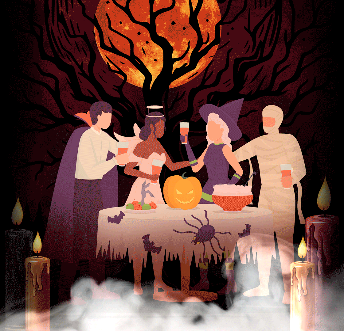
Sketchbook Saturday
We’re still on it!! This week I deviated from the thread a little because I saw this submission when it was still in the decision process and had to choose these beautiful beads along with Dragonair, because how could I not?? What can I say…I had a vision! Hopefully we can keep the pace and stay on time!
MDM570 Week 3
Week 22 – Design in Motion | Electric Gym Leader
Graphics in Motion
Motion Graphics
The concept began with animation – film enabled the piecing together of individual “photos” to create a moving image, what would become known as a video. From this practice, animation was eventually born in the same way – shapes could be moved around and documented to seemingly make the shapes move and still frames could be painted on to make the paintings seem as if they were moving (Krasner, 2013). The first true example of motion graphics would present itself in title slides for movies, portraying the title being revealed or animated to intrigue the audience and label the film (Krasner, 2013). It would later evolve into show titles, broadcast brand labels, and eventually advertisements – UX design being one of the most recent evolutions of motion graphics’ usages (Krasner, 2013). It has forever changed how media and visual communications are designed. Motion graphics are so omnipresent in the human media-sphere that they have begun to blend into the background. The best motion graphics blend in so seamlessly that the viewer likely does not have to think about the amount of work put into creating the visual, as it seems so natural and logical.
Many viewers have their assumptions about a media – humans have a natural ability to intuit movements and “patterns,” and as many have at least basic levels of media literacy and experience, there are “patterns” that the human brains expects for media to follow (such as the hero’s journey in literature). Studies found that motion graphics can accelerate the process of this intuition, as it eases the process of visual communication (Barnes, 2017). However, an overload of information can actually detract from the visual communication process, as shown in the same studies (Barnes, 2017). Videos communicating a surplus of information while viewers were given a task can be digested by the human brain – but things like complicated and detailed graphics can overload the brain (via visual clutter) with information and make the viewer less effective at retaining the information and completing the task (perhaps, the reason for selective attention) (Barnes, 2017). This said, there is no one “correct” way to execute a motion graphic.
There are many ways to accomplish an effective motion graphic in the modern era, where they are used for every genre and intention imaginable and making a motion graphic itself in concept quite limitless in possibility (Maselli & Panadisi, 2012). It has complicated the education and explanation on the topic, as there are so many approaches to creating a motion graphic and there are so many ways even a “bad” motion graphic can be used effectively (Maselli & Panadisi, 2012). This does not help the fact that animation has recently became confused with motion graphics – ever more, the two grow closer and closer intertwined. Portfolio reels such as those from PlayStudy seven have a clear narrative and communicate a clear story with clean visuals and inspiring color palettes but are so clearly motion graphics that it confuses the idea of whether motion graphics and animation are two different arts at all (seven, 2023).
Difference Between Animation and Motion Graphics
It is commonly known that animation and motion graphics might seem similar – both involve the movement of previously still images. However, the two still have clear aspects that define them from the other. While animation is allowed to be experimental and story-driven with clear characters and expressive artistic direction, motion graphics are more disciplined and are more used in advertisements and broadcasts (Blazer, 2015). The two almost function as the urban legend of the “left” and “right” brains with one being more creative and looser, the other being more informative and rigid (Blazer, 2015). Considering all of this, it is evidently true, based on the work of those like PlayStudy seven, that animation and motion graphics can learn much from each other in order to be elevated as individual arts (Blazer, 2015). Other designers, on the other hand, disagree with this perspective.
The Rocky Mountain College of Art and Design argues that motion graphics are nearly the same as animation – that, like how all chihuahuas are dogs but not all dogs are chihuahuas, all motion graphics are animation but not every animation will be a motion graphic (RMCAD, 2024). That animation is more a verb than a noun, animation is what one does when creating a motion graphic. This contrasts with other types of animations, such as narrative or experimental animations (RMCAD, 2024). While this perspective agrees that motion graphics are more fact/information-dependent than other forms of animation, it maintains that they are one and the same.
Of course, these perspectives’ arguments take place in the theoretical void – they only consider the psychology and theoretical of such creations in an abstract plane. While they make for great academic debate, perspectives like the Squideo company’s perspective on the debate hold the most realism. Squideo acknowledges both perspectives but concludes that the reality is that a client must choose between the two practices based on what is best for their needs (Squideo, 2022). Cost, time to produce, audience, reusability, and branding are all factors that must be considered in the professional world (Squideo, 2022). At times, animation can be used for advertising and be just as effective as motion graphics, but others, the communication and “so what?” can become muddled and confused to the audience. Motion graphics, alternatively, clearly and effectively communicate this (Motion by Videopost ca, 2020). It is those five pillars previously listed as well as other, more technical factors, that will determine the effectiveness of a motion graphic.
Language of Motion Graphics
There is much to consider when constructing a motion graphic from the ground-up. Things like key frames, velocity, the principles of animation, and the masks used in the digital program (at least in the modern day) are all things that will shape the end visuals (Meyer & Meyer, 2013). From a technical perspective, many experts agree with the RMCAD perspective that animation is an action that must be done to create a motion graphic and that the two practices are irrevocably tied (Meyer & Meyer, 2013). The physical aspect of moving and creating the video itself is not the only things to consider.
Things like visual effects and transitions, color theory, the art/graphic style used, the typography, the consistency of the styling, and the brand’s identity are all things that complicate the matter (Rohilla, 2023). It is important to keep a consistent styling and visual voice for the motion to become associated with the brand identity so that it is more strongly and immediately communicated. But other factors such as the exaggeration of a pace or transition can add “feeling” to the visual by building anticipation and captivating visual interest from the viewer (Rohilla, 2023). Even apart from the technical and design aspects, motion graphics seem to take on a whole life of their own by becoming a visual language.
During the COVID-19 pandemic, many schools went virtual and many students’ grades went down due to factors like depression and the lack of ability to encourage students to engage with the material – or a lack of ability to communicate certain lessons online. In Indonesia, an experiment began due to this to measure methods that could be effective in raising students in their English grades (Indrawati et al., 2021). It was found that motion graphics were not only effective in “fixing” the students’ grades, their grades surpassed their previous grades and were more effective than video learning methods previously implemented by schools (Indrawati et al., 2021). This is because the motion graphics became a visual language all their own, and this foreign technique built an intrigue that captured their audience’s attention and encouraged engagement in the material. This was not even one in one exact method – many types of motion graphics were used in the experiment to determine what was most effective, and several proved effective, proving the point that there is no one approach to motion graphics (Motion by Scott, 2024). Branching out and experimenting with the motion graphics and visual styles used will only elevate the visual communication.
References
Barnes, S.R. (2017, November 23). Studies in the efficacy of motion graphics: the relation between expository motion graphics and the presence of naïve realism. Visual Communication 18(1). https://doi.org/10.1177/1470357217739223. Retrieved from Sage Journals, from https://journals.sagepub.com/doi/full/10.1177/1470357217739223.
Blazer, L. (2015, November). Introduction in Animated storytelling: simple steps for creating animation and motion graphics. Retrieved from O’Reilly, from https://learning.oreilly.com/library/view/animated-storytelling-simple/9780134133812/pref03.html.
Indrawati, D., Perdani, Y.D., Nadelia, F., & Moloney, M.J. (2021, October). The effectiveness of motion graphics in improving students’ English ability during the COVID-19 pandemic. ICETC ’21: Proceedings of the 13th International Concerence on Education Technology and Computers, 347-353. https://doi.org/10.1145/3498765.3498819. Retrieved from ACM Digital Library, from https://dl.acm.org/doi/abs/10.1145/3498765.3498819.
Krasner, J. (2013, January). Part 1: motion graphics: a perspective in Motion graphic design, 2nd Edition. Retrieved from O’Reilly, from https://learning.oreilly.com/library/view/motion-graphic-design/9780240809892/010_9780080887326_part1.html.
Maselli, V. & Panadisi, G. (2012, August 23). Motion design and visual communication in the era of ‘diffuse design’ paradigm: analysis and evaluation of didactic experiment. Design Science 8, e22. doi:10.1017/dsj.2022. Retrieved from Cambridge University Press, from https://www.cambridge.org/core/journals/design-science/article/motion-design-and-visual-communication-in-the-era-of-diffuse-design-paradigm-analysis-and-evaluation-of-a-didactic-experiment/9B0BDE3B59A09EF6678886558E184081#.
Meyer, C. & Meyer, T. (2013, February). Creating motion graphics with After Effects, 5th Edition. Retrieved from O’Reilly, from https://learning.oreilly.com/library/view/creating-motion-graphics/9780240814155/xhtml/front01.xhtml.
Motion by Scott. (2024, January 17). HOW to learn motion design in 2024 from zero [Video]. Retrieved from YouTube, from https://www.youtube.com/watch?v=UQtOde5--ak.
Motion by Videopost ca. (2020, October 17). Is there a difference between motion graphics vs animation? [Video]. Retrieved from YouTube, from https://www.youtube.com/watch?v=V0m6v_UW7sQ.
RMCAD. (2024, April 16). What is the difference between animation vs motion graphics vs graphic design. Retrieved from Rocky Mountain College of Art and Design, from https://www.rmcad.edu/blog/whats-the-difference-between-animation-vs-motion-graphics-vs-graphic-design/.
Rohilla, A. (2023, July 8). Illuminating the soul: the enigmatic language of motion graphics. Retrieved from LinkedIn, from https://www.linkedin.com/pulse/illuminating-soul-enigmatic-language-motion-graphics-ashish-rohilla/.
seven. (2023, June 23). “I’M LOST.” motion graphics [Video]. Retrieved from YouTube, from https://www.youtube.com/watch?v=zn1WRcQb4vI.
Squideo. (2022, December 19). Motion graphics vs animation: what is the difference?. Retrieved from LinkedIn, from https://www.linkedin.com/pulse/motion-graphics-vs-animation-what-difference-squideovideo/.
Design Challenge
This one was a doozy! It’s been a while since I’ve designed logos and it shows – however, I find myself quite fond of my logo design style, which while simplistic relies more on iconography and breaks it down to its most simple components. Visual clutter is a personal pet peeve that should be reserved for illustration. It has no place in branding or graphic design (a practice typically defined by geometric forms and minimalism, according to sources used for the above essay. Anyway – I LOVED getting back into the animation uses of After Effects!! The last time I did so was in my lantern asset assignment (refer to my portfolio, under the asset design tab!) where I made my melting wax fairies float and their wings flap. Good times – that experience helped me a LOT, even though most of that was self-taught. My old professor used the “throw the baby in the deep end of the pool” method, which I hate, but I got it done…I appreciated the sources listed here for a refresher and reminding me of ways to more easily use the program!
Sketchbook Saturday
I hate that I don’t have my scanner here and that I have to take nasty, low-quality photos that don’t fully captured how my final product looks. I miss it a lot – but this will have to be good enough for now. I’m also thinking of entering a design contest for Harry Potter: Magic Awakened! I play whenever I can, which isn’t much, but the art direction for the game is to DIE for. I’ll update any progress I make! So far, though, I just have a Pinterest board of my references and inspiration.
MDM570 Week 4
Week 23 – Imagine the Possibilities | Fairy Gym Leader
Course Reflection
Design Challenge
We refined our Week 3 designs and then also animated them as well!
Sketchbook Saturday
This entry is one of my favorite so far – I really wish I’d reconsidered some of the color placements, but it’s a bit late for that. I loved the hairstyle and I really can’t wait for the next prompt! Let’s hope our first thesis month goes well….
MDM615 Week 1
Week 24 – Brand Messaging | Contest Design
Thesis Application
The brand chosen to be represented is Mandy Madison, an up-and-coming hard rock/metal singer that can achieve the raw vocals of Disturbed but has the charm of Izzy Hale. She is going on her MADMANZ tour to celebrate her new album of the same name – it is her debut tour, the first time she won’t be just an opener or playing an individual concert.
The benefit being promised is Diversion.
This is being promised to active fans of the rock community, perhaps listeners of SiriusXM’s Octane and Alt Nation channels.
They should believe in this promised benefit from Mandy Madison’s MADMANZ tour due to her deviation from her typical music style – the album was her first chance for true self-expression, so sounds different from her previous singles or covers.
Design Rationale
According to Mark Anthony Camilleri, needs are defined as “a conscious feeling of deprivation in a person,” (Camilleri, 2017). The specific feeling of what is missing might not be known, but the client will always understand that something is missing or wrong (Camilleri, 2017). Studies from the University of Southern California show that women actually have not made much progress in the music industry, contrary to popular belief. In the time where the music industry and many of its branches are believed to be conquered by female artists, as they are the primary source of media attention, this cannot be further from the truth – as shown in the graphic below (Smith, 2021). Rock, in particular, as had a large disdain for female artists due to the belief that it is a “masculine” genre – this stood true even in the face of revolutionary artist breakthroughs in the 60s and 70s (John, 2023). However, in modern scenes and younger audiences joining, the draw to female artists is undeniable – the success of Izzy Hale, Maria Brink, and Dorothy Martin in the rock/metal scene is proof enough. And yet – in local communities, there have been women despairing in forums looking for a specific voice. One that can growl like Disturbed or Five Finger Death Punch but is still distinctly feminine – ignoring the bellowing screams of Maria Brink, this has not yet been found. This deprivation of a specific voice – one that would be so expressive and “scratch the brain just so,” is a distinct niche begging to be filled in the market. While the primary need of “Diversion” covers the concert series, a voice like Mandy Madison’s would also offer aspects of needs like Novelty, Individuality, Stimulation, and Succorance (assuming her music covers many modern female issues). This primarily addresses our consumer-based reasoning.
As stated above – not only are female voices lacking, but countless forums are also filled with questions of “what are some good feminine rage artists?” and the bemoaning the lack of rock-specific artists. A simple Google search for “Feminine rage in music” yields subpar results – from rap, pop, and indie musicians, but only ever one or two rock examples like The Pretty Reckless or the artists listed in the paragraph above, which each have their own grievances and never “scratch the itch,” according to many forum commenters. Even Spotify-promoted playlists seem fairly…tame…in comparison to many albums made about male rage – no one matches the energy, tone, or vibe. No one really “gets it.” This need is not created in a background – with the popularity of Paris Paloma’s “labour,” women have come to realize they strongly desire to express feelings of modern sociological issues, such as weaponized incompetence and psychological manipulation in relationships that is normalized by society. This lack of expression leads a generation of women in frustration, unable to express the core of these feelings. However, with Paloma’s release, many were finally able to pinpoint “this is it, this is the feeling,” and were able to share it to coax understanding and empathy from others. The emotional release, social commentary, and communication that yields understanding that Mandy Madison could bring this audience not only fulfills a need but could greatly improve quality of life simply from that emotive release. This is primarily effect-based reasoning.
While the music itself could fulfill these needs, the live tour series can allow those to get up-close and personal with the artist and experience the music in a visceral way that the consumer has been unable to previously experience. They can more easily find merch, often sold at concert venues, and connect with others who enjoy the music and the emotive experience it brings in person. It provides time for the artist to make personalized comments to the audience, explain her own choices in the music, and connect with them in a way that virtual album sales alone cannot. The tour can also travel to more obscure or small-town regions, bringing tourism to their towns and financial success as well as provide access to this town, where satellite radio or internet might not be as common but that Mandy Madison might have fans in anyway (this comes from a personal experience, when an up-and-coming band named I Prevail visited a small no-name town in Missouri in a dingy dive venue, but allowed my family and I, big metal fans, to experience them in-person in 2016. We were fans before, but became die-hard life-long fans after). This is our product-based reasoning (the product being the tour).
References
Camilleri, M.A. (2017, December). Understanding Customer Needs and Wants. Travel Marketing, Tourism Economics, and the Airline Product, 29-50. https://doi.org/10.1007/978-3-319-49849-2_2
John, A. (2023, March 13). The role of women in rock music: breaking down barriers and stereotypes. Retrieved from Girls Rock Camp Foundation, from https://www.girlsrockcampfoundation.org/the-role-of-women-in-rock-music-breaking-down-barriers-and-stereotypes/.
Smith, S.L. (2021, November 17). Women are missing in popular music [Graphic]. Retrieved from University of Southern California Annenberg School for Communication and Journalism from https://annenberg.usc.edu/news/research-and-impact/annenberg-inclusion-initiatives-annual-report-popular-music-reveals-little.
Sketchbook Saturday
We’re taking a break just for this week – but not for no reason! We’re workshopping ideas and concepts for a Harry Potter design contest I’m entering. I’m entering two different outfit designs (following the rules of the competition). One will be inspired by the 1920s aesthetics and fashions but focus on the obscurial-traits presented in the Fantastic Beasts series – the design is titled “Optimistic Obscurial.” The second design is inspired by the African school of magic, Uagadou, which is located in Uganda – however, I chose to focus on Kenyan fashions to show that not just Ugandan students attend (I always begrudged the lack of Celtic culture and mythos in the SCOTTISH school of magic…) and that she would be an archeology student, as there hasn’t been any representation of the profession yet in-universe. The outfit’s name is “Uagadou Digs” as a play on words…dig, like an archeologist student might, and digs, as in clothing. These are the finalized outfit designs overall! The next step is to create overall compositions/designs and receive peer critique on them.
MDM615 Week 2
Week 25 – Brand Voice & Tone | Fighting Gym Leader
Thesis Application
The brand chosen to be represented is Mandy Madison, an up-and-coming hard rock/metal singer that can achieve the raw vocals of Disturbed but has the charm of Izzy Hale. She is going on her MADMANZ tour to celebrate her new album of the same name – it is her debut tour, the first time she won’t be just an opener or playing an individual concert.
Name of the Product or Service: Mandy Madison’s MADMANZ Tour
Core Message: We need to fight back against our oppressors – it’s time to be honest. (Explanation: more leaning towards feminist, LGBT+ and racial oppression, as well as what the American Government is currently doing to destroy the system – except it’s not just spewing buzzwords, it’s insightful critique being bluntly spoken instead of gently tiptoed around)
What benefit is being promised? Affiliation
To whom is it being promised? Metal fans who might not have the words to explain how they’re feeling in the current social climate
Why should they believe you? Others who feel the same and enjoy Madison’s work will be attending the tour – and likely will engage with each other in things like mosh pits, singing along, etc.
Theme/Style: (Color Scheme: Red, Purple, black/white) Rebellion, revolution (rough imagery, primarily geometric in design, based on leather and metal embellishments.
Brand Personality:
1. [is] Blunt / [isn’t] Dishonest
2. [is] Raw / [isn’t] Insincere
3. [is] Wild /[isn’t] Out-of-Control
Potential Taglines:
1. Get Mad!
2. Stay Mad!
3. Mad? You Should Be.
Positioning Statement (Narrative): They said that metal was dead – that the meaning had been lost, that the intention had become blurred. Songs about drugs, money, and sex seem to overwhelm an industry built on rebellion – built on anger and hope. But there’s someone who still believes in what metal was made to be. The whole world is being smashed open by Mandy Madison and her radical new album, MADMANZ. Her new, raw style has shaken the music industry, and her raw vocals, blunt message, and wild style has reminded us what rock was really about from the beginning – and you can join her on her MADMANZ tour across America’s heartland.
Design Rationale
The name of the product that has been chosen reflects the messaging in that Madison is making a political commentary that the world we are currently living in is mad and that the world is going wild – MADMANZ is a play on her name, thus tying back to her brand – all while reflecting the energy of the album and tour. It’s implied that we’re all mad anyway, living in a mad world, so we might as well make the best of it and fight back.
In Edwards’ How to Write Copy That Sells, he claims that the key to writing effective copy is by chiming in to a metaphorical conversation that is already happening in a client’s mind – commenting on something already present in the client’s mind and concerns (Edwards, 2019). This is not to shame or alienate the client for having these thoughts, but to accurately describe a pain the client already has; this creates a sense of trust and level of expectation, in that the copy seems to know their pains and sympathize, automatically placing them on the viewer’s side. It allows the copy to garner attention and a positive association without “manipulating” them – remaining genuine. The taglines suggested all tie back to this intention. With the album primarily focusing on that political/sociological discourse and headache, it ties back to how so many people are tired of the way things are and are commenting on it in a way that many brands are shying away from. It is an ode to the original heavy metal bands that would speak to rebellion, like Black Sabbath’s “War Pigs” and Twisted Sister’s “We’re Not Gonna Take It” that metal seems to have forgotten (MasterClass, 2021). The slogans also call back to the album and tour title, specifically using the word “Mad” to tie them all together.
The narrative was difficult and fickle. Metal has historically been blues-y, focused on dark themes, and held rebellious visual elements that most authoritarian structures held disdain towards (MasterClass, 2021). It has almost always been about standing out from the crowd and speaking an unspoken truth that “sheep” are too afraid to say ([Black Sabbath], 2009). However, conveying this genuinely is difficult. Every time someone talks about being real, it almost always comes across as ingenuine because if you must tell someone you’re being real, most will not believe you – you must show that you’re being real. The vibe of metal is clear – shown by Rolling Stones’ composite image of great rockers (Paul, 2023). However, the work is going to have to do some heavy lifting in proving sincerity – and her existing wardrobe is going to have to reflect that classic metal vibe to show that Madison is not bluffing. This marketing will have to rely on Madison’s work speaking for itself, which is a gamble, but in this made-up world I decide will easily work. It will have to be the job of the visuals, marketing, and taglines to support her work and back it up.
References
[Black Sabbath’s “War Pigs” Lyrics signed by Ozzy Osborne]. (2009, March 2). Retrieved from Gotta Have Rock and Roll, from https://www.gottahaverockandroll.com/Ozzy_Osbourne_Signed_Black_Sabbath__War_Pigs__Lyri-LOT13212.aspx.
Edwards, R. (2019, August). Chapter 2. In How to write copy that sells. Retrieved from O’Reilly, from https://learning.oreilly.com/videos/how-to-write/9781977350374/9781977350374-a00002/.
MasterClass. (2021, July 15). Heavy metal music guide: a dive into heavy metal music. Retrieved from MasterClass, from https://www.masterclass.com/articles/heavy-metal-music-guide.
Paul, N. (2023, March 13). The 100 greatest heavy metal songs of all time [Photograph Composite]. Retrieved from Rolling Stone from https://www.rollingstone.com/music/music-lists/100-greatest-heavy-metal-songs-1234688425/.
Sketchbook Saturday
Back again! I’m hoping to digitize the contest material next week, so we might take another break, but for this week I’ve designed our Fighting Type Gym Leader! I struggled a LOT with this one – determining the best poses, finding reference…in the end, my mom’s bodybuilder friend came through and the references she sent over were a life-saver. I genuinely don’t think this would’ve turned out nearly as good without them. We’ve got this and we’re chugging along! Do we know which design we’d like to see digitized first, between our 1920s-themed outfit or our Kenyan-themed outfit?
MDM615 Week 3
Week 26 – Look & Feel | Descendants Character Design
Thesis Application
Design Rationale
Color Palette
The initial basis of the palette for Madison’s branding had to be red. The theming is based around rage and madness, with the name of the tour itself and the tagline “Mad? You should be.” Emphasizing this choice. Red has always indicated rage and anger psychologically, and it has a side effect of physically raising blood pressure and heart rate (Susanto et al., 2020). The more pink-ish tones indicated femininity (though that association is a new one historically) and would tie in better with an analogous color scheme – though, there is definitely room for more saturated, bold, pure red tones here. This specific color also aligns with the color association formed in 2016 with the controversial “pussy hats” that would go on to flood the streets of Washington in 2017 amongst political controversy (Falconer, 2018). The trend would go as far as Boston, featured in the Women’s March there (Kennedy, 2017). This strengthens a subconscious political connection with Madison’s work and makes it clearer what she stands for.
The inclusion of purple tones (not violet, as those have more blue-notes) was a necessary one due to the fact that purple has historically been associated with power (via royalty) and spiritual prowess – It is the intention that the inclusion of this is to indicate Madison, herself, in her rebellion rises above power and authority and can be a source of power for her listeners to draw from. The darker value of the color gives the palette value range and is a good off-black variant for visual interest. The same logic applies to the off-white pink at the beginning of the palette – this is to avoid use of direct black and white, as usage of such has been artistically criticized in the past.
The blending of these colors would naturally lead to the conclusion of an analogous-based palette – it would lead the colors into a gentle gradient that would make sense and none of the colors would clash harshly. While Madison’s brand is about sticking out and rebelling, it is not senselessly or grossly so – everything is for a reason in her work. It is a reasonable and measured reaction, and her branding must fit – so while those neon, pink-ish reds stand out and the palette colors individually are bold, they all blend seamlessly and communicate harmony amongst themselves.
Line Quality
The initial line choice, which could be considered a pattern, is a barbed-wire design. The design was specifically chosen for its association with war and violence, with rebellion and its base intention to keep something out of a given area. It is a symbol of the establishment attempting to keep others out as well as protection in the case of livestock – barbed wire itself can be a controversial imagery for its cliches, but the meaning goes deeper. The rugged implications match the themes of rebellion, revolution, and violence being depicted in the work.
The second version of the barbed wire lines holds a rougher quality – with a texture being applied to the linework that matches the pattern in the chosen fonts and in the Textures acquired for Madison’s branding. The initial barbed wire would best be used for borders or “underlines” of headers, while this example would best be used as an artistic overlay, a larger detail.
The final line designs chosen were a claw-marks-slashing design that fit the aforementioned implication of violence, as well as the idea that the revolution-goers are wild – but these claw marks are not wild or without abandon, they are intentional and deliberately placed – there is still an order to be observed. It is an intentional message, which aligns with the idea of a deliberate message being sent to the public and institutions.
Imagery
The first four images are self-explanatory – most of them are pictures of someone who could be Madison (a visual representation of her, perhaps) or of the theoretical concert themselves – while mostly aligning with the given color scheme. The inclusion of fire, mist, and special effects allude to the appeal of going to the concert while the images primarily focus on the crowd to show that the focus is on the audience – this is about them. The intention of the branding is to make the concert-going experience memorable and show potential concert-goers that the experience would be desirable and convince them that, if they are not fans of Madison, they might have fun at the concert still.
The left-side image is of a microphone overlaid on a red background. The microphone itself holds a print-like quality, which ties into the ripped-paper texture chosen in the “textures” section. It is a symbol not just of the concert, but it speaks of rebellion itself through the aesthetics used to communicate – the red chosen is reminiscent of wartime propaganda and evocative of wartime imagery, which fits the overall aesthetic of the concert and the color scheme chosen.
On the opposite side, there is a dark red fist on a dark background, also indicative of rebellion iconographically – the colors tie into the chosen palette and are, themselves, indicative of violent struggle. The imagery contributes to the idea of rebellion and could easily be used on a concert poster or as an asset in Madison’s branding.
References
Kennedy, M. (2017, January 19). Group of women at the Boston Women’s March, wearing pink pussy hats, carrying signs, and showing their support [Photograph]. Retrieved from Alamy, from https://www.alamy.com/group-of-women-at-the-boston-womens-march-wearing-pink-pussy-hats-carrying-signs-and-showing-their-support-image223286024.html.
Falconer, B. (2018, February 28). What is the perfect color worth? Retrieved from the New York Times, from https://www.nytimes.com/2018/02/28/magazine/what-is-the-perfect-color-worth.html.
Susanto, R., Nurahmah, E., Mediawati, A.S., & Hasatono, S.P. (2020, January 1). Effects of blue, red and green colors on blood pressure and heart rate. Department of Biostatistics and Population Studies 12(1), 893-895. Doi: 10.31838/ijpr/2020.12.01.170. Retrieved from Universitas Indonesia, from https://scholar.ui.ac.id/en/publications/effect-of-blue-red-and-green-colors-on-blood-pressure-and-heart-r#:~:text=It%20was%20concluded%20that%20compared,rate%20while%20red%20increases%20both..
Sketchbook Saturday
We took a break from our usual – though next week, we are going to have to buckle down and focus on digitizing the contest entries, lest we run out of time to submit. In the meantime, the new Descendants movie is AWESOME and I created a fan character for them! I put a lot of thought into the design and it was refreshing using the design decisions mentality to create this character.
MDM615 Week 4
Week 27 – Brand Vision Presentation | Break
Vision Board
Sketchbook Saturday
Again, we’re taking a break from our usual – this is because over this next week, while school is out of session, I will be working on my contest entry submissions. So far, my progress has been good! But I should be able to give a followup next week on the submissions (and if you want to vote for me, I might have a link…wink wink nudge nudge…)
MDM620 Week 1 – Logo Concepts
Week 28 – It Starts With The Sketch | Contest Entry
Thesis Application
Design Rationale
The logo design for the MADMANZ tour was a difficult one to design – first of all, the decision to stay focused on the fact it was a logo for the tour itself rather than Mandy Madison and her brand bothered me. As someone who likes to follow the “rules” of a process, my brain kept screaming at me that this is not how this process typically goes – if this were a real-world job, I would have a creative brief of Madison’s previous branding, including color palettes, iconography, fashion preferences, and “vibes.” However, the past few months, none of the above has been provided – we, as design students, were expected to build a brand from the ground up, which worked well for the toy store and hockey team examples (which were up-and-coming or one-off) but did not work well with the Madison option due to the fact that branding for music requires all of these previous factors. No artist goes into the industry with nothing – most have, at the very least, their own sad t-shirts and logo sketches or ideas. Without any of this – I struggled to focus on a logo for the individual tour series and not dive into making an entire brand for Madison in order to make a more effective, relevant logo for Madison and later the concert series.
This all said, concepts for a logo initially were scarce – without the previous history of iconography related to Madison to go off of, the design decisions had to be made solely off of the knowledge of the tour (again, not good decision for making an effective and relevant logo generally). The logo had to scream “rebellion” as that was a key trait of the tour and what “vibes” it gave off. Iconographically, the first concept that came to mind was tattoo-style art and icons. Tattoos have, historically, been known as a symbol of rebellion despite some of their previous association with military and establishment (Phoenix, 2024). In fact, they became heavily tied to the rock and punk scenes as a visible rejection of societal norms post the 1950s (Phoenix, 2024). American Traditional style tattoos, specifically, came to mind due to their simplicity, easy-to-read nature, and visual language that “gelled” with the Look and Feel determined the previous month. The association between the art style and the navy and military is not lost here – if anything, it ties further into the idea of militarism and radical action for a cause (“The art of,” 2023). Though with previous associations, the visuals of this icon might draw in those outside of the psychographic group as well, as to not be too exclusionary and hyper-focused on a modern liberal aesthetic (Langford, 2019). Below is an example of classic and iconographic American Traditional tattoos (Aratehortua). Overall, the intention was to go with a grittier line quality and instantly recognizable iconographic appeal.
The next step was to consider specific symbols used in the logo – as microphones, barbed wire, and hands were previously featured as key shapes in the “Look and Feel” boards, this felt like a step in the right direction. The font featured in the logo would be the header font, perhaps modified to better suit the shape of the logo or to “fit in” with the logo’s shapes, though is not represented well in the rough thumbs. The personal favorite of the designer is currently number 17, which features a fist clutching barbed wire like a grudge. It ties into the barbed wire imagery from the “Look and Feel” while tying into the war imagery and the fist from the “Look and Feel.” Overall, it is the closest to what “feels” right for the individual tour series. Other favorites were the hand holding the knife (number 15) because the knife in the American Traditional style feels feminine while still being bold and aggressive, fitting the desired aesthetics of the concert brand – the knife through the hand (number 8) is considered for the same aesthetic reasons, with the addition of being more visually brutal and feeling more symbolic of rebellion and the lengths willing to go for a cause than the others. More tame variation would be a combination of 11 and 6 – the microphone of 11 surrounded by the letters/lightning of 6 being more cute and quirky than brutal like the other examples. Another thumb heavily considered is number 24, the broken bird cage, because the visuals felt compelling and fitting for the brand.
References
Langford, S. (2019, October 29). How Psychographic Segmentation Can Improve your Marketing Strategy. LinkedIn.
Phoenix, R. (2024, January 14). Rebellion to mainstream, and why not having one is the new trend. Retrieved from Medium, from https://medium.com/@elijahwilliams9557/the-changing-face-of-tattoos-from-rebellion-to-mainstream-and-why-not-having-one-is-the-new-35baf133707a.
The art of American Traditional tattoos: exploring the legacy of an iconic style. (2023, November 1). Retrieved from The Honorable Society, from https://thehonorablesociety.com/posts/american-traditional-tattoos-style/.
Aratehortua. Set of old school tattoo designs [Image]. Retrieved from Adobe Stock from https://stock.adobe.com/images/set-of-old-school-tattoo-designs/317106375?prev_url=detail.
Sketchbook Saturday
I was only able to finish one of the contest entries unfortunately, but there’s high hopes here!! I was hoping to post my work on LinkedIn because I’m especially proud of my work to style-match and design this turn-around…I feel like this exemplifies my progress at character designing using design principles and design decision-making. I’m still hoping to finish the second one in my free time because I love it…but we’re hoping to return to business as usual, which might be more difficult with party season coming around. I’ve been working 39-41 hour weeks recently and it’s been very taxing and difficult, but I’m doing my best to balance everything…
MDM620 Week 2 – Logo Refinements
Week 29 – Revise and Evaluate | Fire Gym Leader
Thesis Application
Design Rationale
The designs above are logos that will represent Mandy Madison’s MADMANZ Tour – specifically, the tour itself, and it is being designed with the artists’ look and feel for the tour and the audience in mind. The need being fulfilled is Affiliation and its purpose is to let others know they are not alone in their anger at the current state of affairs. Each iteration of a logo concept was conceived with the intention to convey this anger but also tie back to the “look and feel” and vision boards constructed previously – the logo had to be iconographic and clear while still utilizing the visuals previously decided upon. The logos at the end of each row indicate the strongest design choices to represent the tour per the designer’s thoughts.
Line 1
A. The logos of Line 1 have the focal point being the microphone at the center. B./C. The original concept was already strong compositionally and recognizable iconographically, making it a strong contender, but the desire for a more personalized look was strong. While representative of music, rock, and rebellion – it did not tie back to the MADMANZ tour specifically. Various microphones were experimented with due to their shapes and possible compositions using research of various mics used in recording studios (Fowler, 2017.) From there, various American Traditional style tattoo icons were referenced for reasons listed in the original concept (iconography of rebellion, association with militarism) (Aratehortua, “Set of”). D. The designs communicate vocal rebellion and energy due to the microphones, naval stars, and lightning bolts. This is likely a universal interpretation, as the visuals used are so iconographically universal that they are near instantly readable. E. The design is closer to Madison’s tour with the lettering and ties together with the look and feel by using a similar microphone to one of the gathered assets. F. The design works for the target audience, as the inclusion of the eye feels more dreamy and distinguishes it from a design that might read more as “conservative.”
Line 2
A. Line 2’s Logos feature a focal point of an open hand being impaled by an American Traditional dagger. B./C. The dagger from the initial concept represents the frivolity of the current society – with its hilt decorated elaborately and the strange shape of both the hilt and blade constructed more for decadence than function. The American Traditional art style ties the ideas behind the logos to rebellion due to their history and symbolism (“The art of,” 2023). Critique from the initial sketch that the open hand seemed too “weak” was appreciated – as the intention behind the original was to show helplessness of those struck by the current society – however, this does not match the fighting spirit of the MADMANZ tour – so the hand became clutched, showing a fighting spirit even when wounded. The final iteration showed the “pieces” of the logo almost separated – representing the degree of separation between the upper class and the working class, while the wound still remains – harm is done in spite of the degrees of separation (“Wealth Inequality,” 2024). D. The design now communicates, as previously stated, a fighting spirit in the face of adversity and direct harm. This message is understandable in the basic sense, but could be difficult to read due to the abstract concepts and interpretation. E. The logo might not connect to the brand in a direct visual manner like other examples, however with further rendering, the graphic quality of the work could match the other assets in the “look and feel” and more closely match the brand’s visual aesthetic.. F. The design has potential to be popular with the target audience due to the marketability of the design – this is something that can go on t-shirts, mugs, and other merchandise items without seeming “strange” and could appeal aesthetically to the desired audience.
Line 3
A. Line 3 focused primarily on typography – when further rendered, spray paint would be the desired effect. B./C. The original concept was to just have the header font from our “look and feel” (pictured as the title of the logo refinements) as the logo for the concert tour. However, a colleague’s commentary in the critique (Jeff) was compelling enough that there was an enticement to attempt a graffiti lettering art style. This would be extremely effective visually for the tour as graffiti has been a method of expressing rebellion and political discourse since the 1970s (Novena, 2023). In addition, typographic logos could be key to building association with a brand if the same or a similar font is used for branding (“The role of,” 2023). If this option is selected, further studies and stylizations will be made, but the focus of this branch of refinement was on composition. Typography is a whole other complicated matter and thumbnails are not typically used to explore this. Instead, general shape language communication and various orientations/compositions are considered and measured in their effectiveness. Ultimately, 3E was considered the most effective due to its rougher nature matching the aesthetics of the MADMANZ tour and the letters bending into each other in a manner that lends to the creation of a visual path. D. Readability is the top priority of this design – and while most are legible, the rebellious and rough nature of the MADMANZ tour translates from the shape language used in each design. E. The roughs of this design actually mimic the Subheader font in the MADMANZ branding package, making this an effective design decision. F. The design might not work well with the target audience, being perceived as “boring” for a lack of pictures. Only bands with extremely compelling design strength like the band Ghost succeeds with a typographic logo alone – and even then, the band has visuals to back the logo up. Not many of the examples in this line do. Consider developing the font and combining it with one of the other lines’ logos.
Line 4
A. Line 4 features the return of the dagger! This time, in a closed fist B./C. The origin of the raised fist icon is unknown but has historically been associated with political movements (“The raised fist,” 2023). The dagger holds the same symbolism as the previous dagger design, however there is more agency in the hand this time. In this iteration, the hand clutches the symbol of power and strangles it, in spite of the damage being done to the hand. The original execution of this design was rough and difficult to read, but the icon became more legible as it was developed in each iteration. The final iteration was the fist instead being impaled. While being a powerful visual symbol, it does once again remove agency from the hand, which lends doubt to the strength of this iteration compared to others in the line. The dagger depicted in the American Traditional art style is one that would be more commonplace in the renaissance, bejeweled and inlaid with precious metals – something that was more of a status symbol to represent wealth and strength than an actual weapon (Singh, 2023). D. The communication from this branch of design is much like that of Line 2, but feels more aggressive and raw on both the part of the dagger and the fist, communicated by the tight lines and the clenching of the fist. E. These designs might tie into the MADMANZ tour with the utilization of thr fist iconography, included in the branding package already. F. This design works for the target audience for much the same reasons Line 2 does, but does lack a visual grace that Line 2 possesses. Similarly, fist and hand-based iconography in general has appealed heavily to young metal fans with liberal-minded ideologies in cases like Green Day’s iconography and similar.
Line 5
A. Another hand logo…this time featuring barbed wire! Though this time holds iterations including a microphone with barbed wire and clutching versus being tied in barbed wire. B./C. Barbed wire, it can be argued, has historically symbolized oppression from its conception. While it “liberated” the American wild west by protecting farmland and livestock, it symbolized the claim on land that was once free for all and spelt the end for the American cowboy (Zaretsky, 2008). It would also become a symbol of concentration camps, fascist establishment, and other oppressive entities in the years to come (Zaretsky, 2008). Meanwhile, the typographic decisions incorporated dictate the personality associated with the iconographic imagery. The sharp, rough lines and serif of the font in the design showcase a hostility and aggression (Lundin, 2023). D. The design reads clearly as a spiked string and a fist – however, there might be a slight confusion as unless rendered further, the barbed wire possesses a visual similarity to thorns – which would become a more Christianity-related ideology. Consider methods to further visually communicate barbed wire specifically. E. The design is closer to Madison’s tour with the lettering and ties together with the look and feel by using a similar microphone to one of the gathered assets. F. The design shows potential, as similar graphics using barbed wire has been successful, being considered “raw imagery” by Millennials and Gen Z in the liberal metal scene.
Line 6
A. This logo deviates the most from the others, arguably, but inspired variants of the others – the eye, four-point star, and nail imagery is not typically associated with metal but has a unique “vibe” to it that feels compelling visually. B./C. This specific visual was inspired by an artist regularly seen on Twitter/X but that the designer can no longer find on the website. Specifically, the method in which they render the eye gives it a painterly texture. This iteration, ideally, would feature a spray-painted appearance and retain the sharp visuals. As iconography, typically the eye is meant to represent the establishment and represent that they are watching – statistically, eye iconography simply being present has reduced the likelihood of antisocial behaviors occurring by about 35% (Dear et al., 2019). However, the anger in the eye and more humanistic depiction of the eye (including the tear ducts, eye lids, etc.) creates a more humanistic interpretation and is intended to, instead, represent the common person bearing witnesses to the atrocities and wrongdoing of those in power in the hopes that they know they are being seen and will cease – a reclamation of a symbol. As for the nails, symbolically in the modern day, they are a symbol of Christianity as the nails that bound Christ to his crucifixion (“The nail,” 2024). Symbolically, they have also been a symbol of status due to the difficulty it took to make them and representative of donations or blessings (“The nail”, 2024). However, if we are to take it as a symbol of wealth due to its previous rarity and oppression as it was used to crucify others, the nails in this logo can represent an establishment causing pain upon those viewing the weight of their crimes. D. While the eye portion of this is visible, it might be difficult for the viewer to decipher why those nails are in the icon and what they represent – the meaning requires abstract extrapolation, which might be unreasonable to expect out of simple iconography. E. While a compelling, raw image and a strong composition with high readability, this icon does not tie much into Madison’s personal branding (not that we know much about that as it does not exist) or the existing MADMANZ look and feel style guide. Editing would have to be done to tie it further back to the brand.
References
Aratehortua. Set of old school tattoo designs [Image]. Retrieved from Adobe Stock from https://stock.adobe.com/images/set-of-old-school-tattoo-designs/317106375?prev_url=detail.
Dear, K., Dutton, K., & Fox, E. (2019, May). Do ‘watching eyes’ influence antisocial behavior? A systematic review & meta-analysis. Evolution and Human Behavior, 40(3), 269–280. https://doi.org/10.1016/j.evolhumbehav.2019.01.006. Retrieved from ScienceDirect from https://www.sciencedirect.com/science/article/pii/S1090513817303264.
Fowler, M. (2017, November 14). The 13 most common mics you’ll find in a studio, and why engineers rely on them. Retrieved from Flypaper, from https://flypaper.soundfly.com/produce/the-13-most-common-mics-youll-find-in-a-studio-and-why-engineers-rely-on-them/.
Lundin, K. (2023, September 19). The psychology of logo design: how fonts, colors, shapes, and lines influence purchasing decisions. Retrieved from Crowdspring, from https://www.crowdspring.com/blog/logo-design-psychology/.
Novena, S. (2023, September 27). Street art and graffiti: expressing culture, creativity, and rebellion. Retrieved from Medium, from https://medium.com/@nienovena/street-art-and-graffiti-expressing-culture-creativity-and-rebellion-bb16aaf924c9#:~:text=It%20was%20a%20form%20of,vibrant%20colors%20and%20social%20messages..
Singh, M. (2023, July 9). The world of daggers: exploring the history and significance of small blades. Retrieved from Shree Amritsar Sword, from https://shreeamritsarsword.com/the-world-of-daggers-exploring-the-history-and-significance-of-small-blades/.
The art of American Traditional tattoos: exploring the legacy of an iconic style. (2023, November 1). Retrieved from The Honorable Society, from https://thehonorablesociety.com/posts/american-traditional-tattoos-style/.
The nail: patriotic symbol or humble tool? (2024, August 2). Retrieved from The People’s History Museum, from https://phm.org.uk/blogposts/the-raised-fist-a-history-of-the-symbol/.
The raised fist: the history of the symbol (2023, September 4). Retrieved from Suffolk Latch Co., from https://www.suffolklatchcompany.com/blogs/news/the-nail-patriotic-symbol-or-humble-tool.
The role of typography in logo design. (2023, May 1). Retrieved from The Logo Company, from https://thelogocompany.net/the-role-of-typography-in-logo-design/.
Wealth Inequality in the United States. (2024, July 15). Retrieved from Ineqality.org, from https://inequality.org/facts/wealth-inequality/.
Zaretsky, R. (2008, March 25). Barbed wire II. Retrieved from The Engines of our Ingenuity, from https://engines.egr.uh.edu/episode/2352.
Sketchbook Saturday
Let’s goooo! We’re back and I’m super proud of how this one turned out. I’m hoping to get back into my chapters for the novel as well as continue this, but everything has been incredibly busy. With party season here, I’m working 39-41 hour weeks…I’m scared to give away shifts, because what if I need the money? What will I do? I’ll just have to figure it out – in other news, I’ve officially gotten 50.6 hours at Flamingo Crossings’ academic center…that’s halfway to a Goofy Graduate diploma, and a Ducktorate acquired! I’m hoping that my effort for all of this will pay off – not just for the classes, but for the sketchbook and the novel…if I can manage all of it, maybe it will pay off. At least, that’s what I keep telling myself. This got away from me and isn’t so much about the sketchbook alone anymore, I guess, but it was helpful to get this onto paper, so to speak!
MDM620 Week 3 – Logo Refinements
Week 30 – Evaluate and Refine | Album Cover
Thesis Application
Design Rationale
The refinement stage of logo design is not an easy one – there are many factors to consider. When one choses the main six logos to move forward with to redesign, the designer might think (like in this case) that this is their peak work for the individual project. They are often surprised to find that their work can be improved on and elaborated – but this was all for the better in this case.
Step 1
While these designs were the best of the previous round of refinements, there were still aspects that made them weak – whether it be their generic nature or, in the case of number 6, the awkwardness of the microphone. Others had potential, but shapes could use reorganizing, as was the case with number 4. Upon picking the logos for this step of the assignment, it was determined that the textual aspect and iconographic aspect should be separated. This is because the textual aspects all seemed similar – curvaceous, roughly-penned sharp letters were consistent across nearly every design and fit the theme well. The icons, however, needed individual development away from the text. The text became too much to focus on when the individual icon needed isolation for further development. It was decided two textual logos would be further developed and explored, and those developed textual logos would be combined with a picture logo of choice for result of the final logos.
Step 2 and 2.5
The refinements were initially made in Clip Studio Paint utilizing pen, pencil, and paint brushes to attain a rougher line quality. The rougher line quality typically gives various assets a rugged nature and indicates a raw and natural feeling – in addition, the thicker, curved, primarily diagonal lines lend to communicating chaos and energy. (Lundin, 2023). The intention was to appear effortless while being rough, deliberate, and angry. The lines were also altered to deliberately resemble graffitied art stenciled on a wall, so most aspects would have lines connected or a strange final rendering to look as if the stencil was quickly cut and applied to a surface, giving a sense of urgency and desperation. Being the symbol of rebellion that graffiti is, this would contribute to the implicit messaging instantaneously in the viewer (Novena, 2023). Columns 1, 4, and 6 focused primarily on the imagery of microphones – indicating this is once again a concert tour and communicates music or speech, as actual industry-standard microphones are referenced (Fowler, 2017). Columns 2 and 3 focused on typography, as mentioned in Step 1 – the focus on establishing the typographic personality desired for communication was key (“The role of,” 2023). These rough-lined pointy fonts would indicate, like with the logos, chaos and rebellion from the standard (Lundin, 2023). This would further support the message of whatever logos they were combined with when the time came (“The role of,” 2023). Rows 4 and 6 deviated from standard iconography by incorporating barbed wire as literal wire to make the microphone function. However, it is shown to be harmful in both logos despite being a fundamental, necessary-for-function aspect of the microphones. This is to show that the oppression being experienced has been a fundamental building block in making the audience and singer who they are. Barbed wire, the symbol of oppression, hurts but life persists in spite of it, coming out stronger for it (Zaretsky, 2008). Column 5 focused on the hand and dagger’s iconography. Column 6 showcases a rebellious fist, an icon known for centuries to be a symbol of rebellion against establishment (“The raised fist,” 2023). Contrary to Column 6, Column 5 showcases an open, clutching hand being pierced with a degree of separation by an ornate dagger. This is representative of the upper-class and those in control hurting the common man, represented by the clutching hand (Singh, 2023). The hand still clutches, however, as no matter how grave the situation is, they keep fighting – like many modern Americans currently facing poverty and struggles caused by the upper-class and establishment (“Wealth inequality,” 2024).
Ultimately, it was decided that 6A, 5B, 4B, and 1A were the strongest icons for their rougher nature and utilization of negative space and contrast. Their graffiti-like appearance were the strongest choice for the icon. Typographically, 3A, 3B, and 2A were crowd-favorites among the peers consulted for their painterly and dynamic appearances. For Step 2.5, these four icons were combined with these three fonts to crate twelve complete logos, two of which would be picked for the final logos.
Final
Logos 3A and 2A of step 2.5 were ultimately chosen to be the most visually impactful and representative of the brand. Their utilization of American Traditional iconography and painterly quality showcased the full rebellious nature of the brand (Aratehortua, n.d.) The utilization of this iconography is a direct signifier that ties to rebellion and a rougher, raw nature. Between the two, 3A is likely the stronger of the two as the microphone imagery pushes the music aspect to the forefront, however 2A with its symbolism mentioned in Step 2’s rationale is compelling enough that it competes fairly evenly with 2A. The two were placed onto the mockup album cover that the tour would be for and 3A also works better, compositionally, with the painting (recognize the shapes? Fun fact, one of the previous logo iterations were used as the sketch for the cover!). Ultimately, 3A is likely our best bet.
References
Aratehortua. (n.d.) Set of old school tattoo designs [Image]. Retrieved from Adobe Stock from https://stock.adobe.com/images/set-of-old-school-tattoo-designs/317106375?prev_url=detail.
Fowler, M. (2017, November 14). The 13 most common mics you’ll find in a studio, and why engineers rely on them. Retrieved from Flypaper, from https://flypaper.soundfly.com/produce/the-13-most-common-mics-youll-find-in-a-studio-and-why-engineers-rely-on-them/.
Lundin, K. (2023, September 19). The psychology of logo design: how fonts, colors, shapes, and lines influence purchasing decisions. Retrieved from Crowdspring, from https://www.crowdspring.com/blog/logo-design-psychology/.
Novena, S. (2023, September 27). Street art and graffiti: expressing culture, creativity, and rebellion. Retrieved from Medium, from https://medium.com/@nienovena/street-art-and-graffiti-expressing-culture-creativity-and-rebellion-bb16aaf924c9#:~:text=It%20was%20a%20form%20of,vibrant%20colors%20and%20social%20messages..
Singh, M. (2023, July 9). The world of daggers: exploring the history and significance of small blades. Retrieved from Shree Amritsar Sword, from https://shreeamritsarsword.com/the-world-of-daggers-exploring-the-history-and-significance-of-small-blades/.
The raised fist: the history of the symbol (2023, September 4). Retrieved from Suffolk Latch Co., from https://www.suffolklatchcompany.com/blogs/news/the-nail-patriotic-symbol-or-humble-tool.
The role of typography in logo design. (2023, May 1). Retrieved from The Logo Company, from https://thelogocompany.net/the-role-of-typography-in-logo-design/.
Wealth Inequality in the United States. (2024, July 15). Retrieved from Ineqality.org, from https://inequality.org/facts/wealth-inequality/.
Zaretsky, R. (2008, March 25). Barbed wire II. Retrieved from The Engines of our Ingenuity, from https://engines.egr.uh.edu/episode/2352.
Sketchbook Saturday
Another short break! I’m working on a tattoo design for my aunt, so the physical sketchbook was set aside – in between this, I also painted the quick album cover after our design discussion group meeting and I’ve been working on a character sheet for a Percy Jackson-universe character. You’ll have to tell me what you think about the two iterations of the cover! Until next week…this is Em, signing off for now!
MDM620 Week 4 – Style Guide
Week 31 – Them’s The Rules | Constance Belinda
Thesis Application
Design Rationale
Sketchbook Saturday
No gym leader, but we have a character I’ve had since I was 16 and never really once drew. This character is at least 8 years old, that I can remember, and I’ve doodled her maybe a few times, but never really sat down and decided what she’d look like. It was a lot of fun! My goal was to depict a disabled character that wasn’t really “the norm” like a character in a wheelchair. I also wanted her to have visual scars that weren’t considered “conventionally attractive” and that she covered them up as a means to avoid them. She’s a character that seems like she’s always lost in her own little world and losing track of time…but maybe someone will draw her back into the real world soon enough.
MDM650 Week 1 – Media Plan
Week 32 – Finalize Brand and Media Plan | Tattoo Design
Thesis Application
Design Rationale
Research
Many of the items on the media list were things previously encountered by the artist – they were fairly straightforward and had been designed before by the artist. However, one or two items stumped them. To differentiate, one of the goals for the Swag portion of the thumbnails was to stand out by having unique merch opportunities. T-shirts and Stickers were a given, and fairly obvious to include – sticker designs could easily double as patch designs if need-be. However, things not previously considered were water bottles, jewelry, or guitar picks (Ķempele, 2023). While the thumbnails do not have some of these, in the future, guitar picks and jewelry will be included with the Swag materials and a water bottle, as well as a lanyard, bandana, and patches will be included in the Ticket Package. Speaking of, Ticket Packages were somewhat unknown to the artist, but made the most sense to include in the branding package. After a fair bit of research, the artist determined to create a package that would include a ticket holder, ticket, lanyard, water bottle, bandana, stickers, and patches. These packs would be for VIP special seating or would be for large group ticket purchases (5+ tickets), as according to research this is a fairly common practice in the industry (N., 2024).
Solving Problems
The design process was straightforward – first, research would be done to determine how best to incorporate pre-developed assets into merchandise or alternative media. Bands such as Five Finger Death Punch were considered for this process – such as their 2015 album, Got Your Six (Five Finger Death Punch, 2015). Merch for the concert tour after the album’s release featured art from the album cover altered to best be shown on the merchandise itself, such as a t-shirt where the green-toned zombies were absent (NewVintageNY, 2024). While dissuaded from directly including the logo too many times – variations on the logo were considered and variations on the album cover were considered for the media being developed.
Collaboration
Peers were questioned as to how ticket packages worked – as the artist herself hadn’t ever had any, nor could she find much explanation of what a ticket package contained online, and several of her peers from the Savannah College of Art and Design’s alumni group were able to share their experiences both as a consumer and designer with such packages, as well as offer suggestions towards design ideas.
Acquiring Competencies
Ticket packages, as previously stated, were a foreign idea to the artist – however, from collaboration with peers and further research, a deeper understanding of the product was gained. Further development past thumbnails has been planned to reflect this.
References
Five Finger Death Punch. (2015). Got Your Six [Album Cover]. Retrieved from Amazon. https://www.amazon.com/Your-Explicit-Finger-Death-Punch/dp/B010DY5AHK.
Ķempele, S. (2023, April 27). 26 novel band merch ideas + examples. Retrieved from Printful. Retrieved from https://www.printful.com/blog/band-merch-ideas?srsltid=AfmBOoqiTu1-kklPb-vkDcy9rLpjz7oJHPFbB5q41KoVB8Piklo_Ym3A.
N., N. (2024, July 26). 11 event ticket types (and why you should use them). Retrieved from Zoho Backstage. Retrieved from https://www.zoho.com/backstage/thegreenroom/event-ticket-types.html.
NewVintageNY. (2024). Five Finger Death Punch Got Your Six album men’s black t-shirt size medium [Image]. Retrieved from eBay. https://www.ebay.com/itm/163430179621.
Sketchbook Saturday
Due to everything else going on, I was only able to work on a tattoo concept for my aunt…She really loves it, and is moving forward with the design! I was happy that she loved the design so much.
MDM650 Week 2 – Column A Assets
Week 33 – Prototyping Begins | WIP
Thesis Application
Design Rationale
Research
For this week’s work, we knocked out the assets from Column A – arguably the heaviest column to work from. Beginning with the letterhead, critique was taken from the professor to make the envelope and letterhead itself more legible, mailable, and printable. The business card, on the other hand, was not reconsidered due to the idea that there would not be many who would possess the card – perhaps the bandmembers themselves or their manager – thus, the editability of the card would be enough for so few individuals. However, this expectation might not be as realistic as the artist originally thought. Next, the social media aspect was designed. It is recommended for musicians to follow trends, focus on short-form video or demand audience engagement, implying interaction with fans directly (Keyes, 2022). This is done with a direct call to action encouraging the viewer’s presence at the concert in the post concept. It is also encouraged to share backstage, personal, and slice-of-life moments (Keyes, 2022). To accomplish this, several Instagram story categories were created for moments with the band. Finally – the logo needed to be animated. The desired visual effect was known since its conception and helped form the logo’s conception itself – it was always going to be a sketchy stop-motion style logo. Stop motion stands out from the crowd due to its rarity, but also holds a specific home-made character that charms viewers and feels more personal – it’s a story that directly reaches the audience in the implications of how it was made (Malone, n.d). To accomplish this, wiggle paths and posterize time effect – this gave the Adobe-Illustrator-Generated vectors life and made them appear as if animated when paired with rotation and position shifting.
Solving Problems
The first problem was the artist injured her ankle the Sunday before this week began – it put everything off to a bad and slow start. The letterhead was simple enough to develop and modify with critique – however, the social media and animated logo were more complicated. On the part of the social media mockups, making a social media would be easy enough as the rules of social media are uncomplicated and fairly straightforward – however, the mockups available did not possess the correct font-form and needed heavy modification for accuracy and editability, which took time and a lot of research. For the logo, the artist did not know how to achieve the stop-motion sketchy effect desired for logo development. It was a choice inspired by the Spider-Man: Far From Home end credits, as the home-made vibe and personality could appeal to the brand if modified to fit the metal genre better (PERCEPTION, 2019). This required further research, and it was fairly surprising that the solution was so simple.
Collaboration
A peer who specializes in graphic design and making fake social media posts for fandom endeavors (i.e. Han Solo from Star Wars posting on Twitter: “How warm is the inside of a ton-ton? Luke-warm.” And Luke Skywalker replying “Not cool.”) what fonts to use and how to modify the mockups received – this aided greatly in the creation of the assets. Professor Kratz’ critique of the letterhead brought up the legality of the envelopes and their ship-ability, which the artist had not considered in the slightest and did further research to accommodate.
Acquiring Competencies
The artist learned that nothing will go according to plan, and that one just has to work with the cards they’re dealt. She also learned how to use wiggle paths and the posterize time effect, much to her delight.
References
Keyes, D. (2022, April 19). Social media for musicians: 14 key tips for 2022. Retrieved from DK. Retrieved from https://www.dk-mba.com/blog/social-media-for-musicians.
Malone, E. (n.d.). Stop-motion creativity in branding: a breath of fresh air. Retrieved from Venture. Retrieved from https://www.venturevideos.com/insight/stop-motion-creativity-in-branding-a-breath-of-fresh-air.
PERCEPTION. (2019, October 23). Marvel Studios’ Spider-Man: Far From Home – end credits main on end title sequence [Video]. Retrieved from YouTube. https://www.youtube.com/watch?v=hEhdhicsmZI.
Sketchbook Saturday
AAaaannd I got hurt. Again. This has put a MASSIVE damper on all of my plans and everything has been set back. However, I’ve been working on a piece…I’ll explain more when the time comes.
MDM650 Week 3 – Column B Assets
Week 34 – Prototyping Continues | “Change” Painting
Thesis Application
Design Rationale
Research
Most of the research for this aspect of the thesis work was done at the beginning of the month – in researching what a ticket package was and how music bands create them (N., 2024). However, further research into common pieces of Swag for metal bands was conducted via survey of concert and music enthusiasts in the artist’s personal circle and various web sources, such as TicketMaster (“What is,” 2021). From there, it was a matter of assembly.
Solving Problems
Firstly, the artist did not know how to make mockups for several items – including patches (though this is resolved in the Acquiring Competencies section), water bottles, lanyards, or ticket holders – or even what ticket holders were. After comparing the two visually, it seemed the only difference between a lanyard and ticket holder was the size of the “badge holder” section of each piece. Next, it was a mixture of physically painting assets (the jewelry) or adjusting it until it appeared just right (everything else).
Collaboration
Several weeks back, there was a lecture at Flamingo Crossings Village (the Disney College Program Dorm) with an employee with the title of “Character Artist.” However, he does not just draw characters – he designs assets with the express purpose of them being used in mockups, t-shirts, ads, and the like. I was able to get into contact with him last month, first in an attempt to get help applying a painterly effect to achieve the desired logo appearance. This month, however, the artist sought advice from him on what to look out for when creating mockups and applying designs to items such as merch. It helped a lot in making the merchandise look more realistic and thought-out rather than just slapped on. The artist was also able to provide feedback for a peer on changing the shadow color in her website mockup to draw more attention to the black on the page.
Acquiring Competencies
A struggle this week was creating mockups for patches – the artist did not know the first thing about approaching a task such as this. However, she was able to follow Robert Loyale’s video tutorial on how to create a permanent file for patch mockups (Loyale, 2017). The only hurdle in this was not possessing the key texture Loyale used for his effect – which the artist believes lowered the quality a bit.
References
Loyale, Robert. (2017, August 21). How to make a realistic embroidered patch badge mockup in Photoshop tutorial [Video]. Retrieved from YouTube. https://www.youtube.com/watch?v=MNwwDB-fA5A.
N., N. (2024, July 26). 11 event ticket types (and why you should use them). Retrieved from Zoho Backstage. Retrieved from https://www.zoho.com/backstage/thegreenroom/event-ticket-types.html.
What is a VIP package and how do I purchase one? (2021, November 19). Retrieved from TicketMaster. Retrieved from https://help.ticketmaster.com/hc/en-us/articles/9785984155409-What-is-a-VIP-package-and-how-do-I-purchase-one#:~:text=Packages%20vary%20from%20artist%20to,or%20experience%20a%20sound%20check!.
Sketchbook Saturday
I’ve got an appointment with an orthopedic specialist Tuesday…I’m hoping they’ll say I won’t need surgery, but it turns out this week I learned that two of the ligaments in my ankle were completely severed in the fall…talk about bad luck. I’ve been on crutches, but I had time to finish the painting! Next week, I’ll hopefully have some character concept sketches for a sea-slug-inspired character.
MDM650 Week 4 – Column C Assets
Week 35 – Prototyping Completed | Sea Slug Character Concept
Thesis Application
Production Schedule - Week 1
"Column A" Assets - Week 2
"Column B" Assets - Week 3
"Column C" Assets - Week 4
Design Rationale
Sketchbook Saturday
This week is the beginning of a character concept - I wanted to explore the idea of a candy-maker that isn't quite as he seems and explore unique body types. I wanted this character to be spindly but also slightly chubby - he doesn't take care of himself, but he isn't exactly unhealthy either...just neutral. I also wanted the anatomy to be uncanny and slightly unsettling to give a sense that he is distinctly not human, slug head aside...hopefully next week he'll be completed!
MDM640 Week 1 – Research Component
Week 36 – What is a Playbook? | Slug Man, Continued
Thesis Application
Previous Class Feedback
Design Integration
Week 1 (Vision Board Reviews) – Fix palette boxes. Stylized in a way that speaks to rebellion and being home-grown and put together. “Solid vision, much more focused.” Elaborate on the specifics of what is effective and ineffective of each logo. Avoid talking about personal favorites, stick to what s effective for the brand. Explain how it ties into the look and feel of the brand.
Week 2 (Logo Thumbnails) – The typography of number 3 is clear and could be a good logo for the band – it’s clear and seems like it’s being “screamed out.” Is it for Madison, or the tour? Consider alternate word for tour, possibly alliteration. Very “Green Day” feel, very punkish, tattoo vibe comes across very clearly. Combining 6 and 11 seems like a good idea, per Travalia. It feels very expressive, energetic, and angry. Jeff gives the idea of spray paint, which sparked ideas in my head and would later influence the animated version of the logo. They caught on that Mad Manz is supposed to tie into Mandy Madison’s name, which made me very happy. Consider in the rationale elaborating on some parts of the research.
Week 3 (Logo Round 2) – Again, encouraged to find a “fourth M” for the alliteration…which would later lead to Mandy Madison’s MADMANZ March. The simplest and most legible designs were considered the strongest, as were the music-related logos (microphones, etc.). Consider scaling and how that comes into play.
Week 4 (Logo Final) – Colors “girly”…. : ( …. But is considered to be pretty “rock an’ roll.” Dagger was previously favored, but the microphone is preferred as it has a distinct personality that overtakes the dagger’d hand. Straighten the font on the mic’s logo a bit for legibility. Consider more lightning in every direction. Strong information about how to present the logo and how the guide is structured, but consider reworking some assets on pages to fit the brand personality better (such as the brand archetype photo). Refine the final page to explain what color combinations are approved and which aren’t. Add more definition to the asset used as the clear space.
Multi-Platform Delivery
Week 1 (Production Schedule) – Drop specific extra classes from schedule, not necessary info to the client (Explanation: could not guarantee time would be blocked out, but explanation for why is present in this. Ended up being a good plan, because I received an injury and could definitely not guarantee anything that second or third week.) Timespan not effective for individual work style, need ultimate goals for the overall week. Vision board features distinctive dark visual style that works for the brand – revisit it to add the logo, though. Revise the Onlyness Statement to fit the brand vision – do not make it an Onlyness Statement anymore. What is the brand’s core attributes? Consider adding a statement about Mandy Madison herself and how it aligns with the tour. Can become “““schizophrenic,””” which should be avoided. Clarify “liberal metal.” Album art is solid, but should work with the Madison brand. Consider making it a vinyl or showing the label on the vinyl to show you know how to create an “extensible brand.”
Week 2 (Thumbs, Column A Assets) – Vision board was updated for the brand statement and the logo was added. Torn paper for letterhead could be effective, as well as potential animation of the logo would effectively represent the brand. The inclusion of the guitar pick is a strength and distinguishes the brand. The stickers are visually unclear in the thumbnails – clarify. Thursday critique…Letterhead is effective as it matches the brand aesthetic/values while staying fairly clear. However, straighten the type for clarity and ease. Consider specifying the business cards for individuals due to heavy color/personalization. Duck tape on the back of the envelope is very effective and fun – but the front of the envelope does not follow laws for postage nor considers print. Accommodate U.S. Postal service rules. Consider adding rough edge to photos for social media (disregarded, edges for social media are awkward. It breaks social norms for social media in a negatively perceived way, as if the brand is trying too hard).
Week 3 (Column B/A Assets) – Don’t make the end of the font in the logo disappear (disregarded – logo is meant to loop), however everything else fits the brand aesthetically and is strong. Adjustments made to Column A Assets made based on critique. Need a white hole for the postage area – edit (accidentally disregarded – forgot). Due to injury complications, Many assets won’t be available until the end of the week. The t-shirts are consistent and the shirts offer many customization styles.
Week 4 (Column C/B Assets) – Presentation format is conducive for the brand playbook and is smart/nice to have for a client. Strong presentation of Ticket Packs. Everything included reinforces the client having an emotional experience, which reinforces the brand. It is conducive towards creating attachment and memories towards the packaging/items within the package. Almost nostalgic. Swag is customizable and able to be personalized, appealing to clientele. Jewelry and bandanas are unique and fun, appeals to the audience targeted by the brand. Distinct from other music brands that feature similar merch. All of the swag/merch is easily produced and interchangeable, which gives flexibility to the brand and adds memorability. Alter text for higher legibility – make font bigger and bolder. Finalize website. Good for adding little details and items previously worked on.
Research Component
ROI is a tricky thing. It is often objective and to the layman without an insight into business or marketing can seem undefinable; how do you define the love a community might have for an organization, or the renown of it? Is that renown enough to help the organization succeed as a business? Return On Investment, specifically, is what board members and higher-ups in organizations use to determine whether specific efforts are worth the trouble or not. It, as the name suggests, holds the statistics and data used to determine whether the investments being made are yielding returns that outweigh said investments. Without this data, higher-ups are less likely to understand the necessity of specific actions the marketing or design team will take, and could even be at risk of being cut from the team for the sake of the budget (Philips, 2020). However, measurements of ROI are a direct method of communication that produces tangible results more easily understandable by those not in the marketing or design fields.
There are multiple ways to measure ROI. Some, like A/B testing are quantitative. They measure the effectiveness of specific variables according to the users in their target audience, streamlining the critique process and hyper-focusing on specific potential pitfalls in the designer’s creation or activity (Graphicszoo, n.d.). Other methods, like money trees (tracking where the money goes to prove revenue outweighs costs) or prototypes with specific statistics showing the same results show in a quantitative way how a specific decision could improve the organization (Faljic, 2020). However, some means of measure are qualitative. These things are subjective – such as the appearance of a statistic or graphic. While quantitative data is important, the numbers seem bigger and more impactful if the presentation of the data is designed well – and this goes for the project being measured, as well (Wendt, 2017). At times, a visually effective infographic/visual storefront can increase revenue for a product just as much as a well-functioning website (Wendt, 2017). Ultimately, the intent is to engage and communicate with the audience beyond function or appearance alone – it is the ability to navigate and express intent to the user and the authority that oversees the project. ROI is the method through which effective design is perfected.
References
Faljic, A. (2020, June 12). How to estimate the ROI of design work. Retrieved from Inside Design. Retrieved from https://www.invisionapp.com/inside-design/estimate-roi-design-work/.
Graphicszoo. (n.d.). Importance of A/B testing in graphic design. Retrieved from Graphicszoo. Retrieved from https://www.graphicszoo.com/article/importance-of-a-b-testing-in-graphic-design.
Philips, J., Fu, F.Q., Philips, P.P., & Yi, H. (2020, October). Part I: Why this is important. ROI in marketing: The design thinking approach to measure, prove, and improve the value of marketing. McGraw-Hill. Retrieved from O’Reilly. Retrieved from https://learning.oreilly.com/library/view/roi-in-marketing/9781260460438/ch1.xhtml.
Wendt, E. (2017, May 3). Looking for ROI? Get your graphics game on point. Retrieved from Brafton. Retrieved from https://www.brafton.com/blog/creation/looking-for-roi-get-your-graphics-game-on-point/.
Sketchbook Saturday
We're slowly moving, I guess...It's not perfect but it's a start, for sure. I wanted to work out how the colors would work for him before moving to line art, but I've missed doing a comic-y line art for sure.
MDM640 Week 2 – Research Component
Week 37 – Testing Design Effectiveness | N/A
Thesis Application
Research Component
While ROI is key for an organization – testing for design effectiveness is the way to achieve a satisfactory ROI. In the week prior, methods such as A/B testing, money trees, and assessing visuals and functionality of a site for the user were discussed. However, conducting these tests is just as important as knowing their function. Conducting tests can be a tricky endeavor – even the slightest error can create monumental bias that would throw the entire test into question (Philips, et al. 2020).
While supporting assumptions with data is important, it is important to focus on conducting the test appropriately to avoid biases, such as confirmation bias, hindsight bias, or ambiguity effect (Full Sail Online, 2024). To avoid this, one technique is having a respectable sample size of an appropriately researched audience (Philips, et al. 2020). Another step to take is ensuring that the specific test solely measures either the functionality of the design or the reactions the design renders from viewers (Whitenton, 2018). Initial impressions and 5-second judgement calls are all the user needs to see to make their judgement calls off of the bat, and that first impression will determine whether the user is repulsed, bored, or intrigued (Whitenton, 2018).
These tests also ensure that the designer’s own biases do not interfere with the design – the IKEA effect in psychology can lead consumers to “place a disproportionately high value on products they partially created,” (Schmidt, 2021). This also applies to designers – designers are typically their own harshest critic, but they also fall victim to believing their work to be higher quality due to time spent and can fall blind to potential design pitfalls consumers and users can fall into. Overall, it is important not just to test for design effectiveness (such as showing one’s grandma over dinner randomly) but to test effectively – an ineffective test is worse than no test at all.
References
Full Sail Online (2024). Week 2 case study: Testing design effectiveness. In Measuring Design Effectiveness. Full Sail University. Retrieved October 13, 2024, from https://online.fullsail.edu/class_sections/186436/modules/779759/activities/4485963.
Philips, J., Fu, F.Q., Philips, P.P., & Yi, H. (2020, October). 7 Make it stick: Design for action and impact. ROI in marketing: The design thinking approach to measure, prove, and improve the value of marketing. McGraw-Hill. Retrieved from O’Reilly. Retrieved from https://learning.oreilly.com/library/view/roi-in-marketing/9781260460438/ch1.xhtml.
Schmidt, M. (2021, May 20). A stitch in time saves nine – how a couple of hours of design research can save you from failure. Retrieved from Medium. Retrieved from https://medium.com/insights-observations/a-stitch-in-time-saves-nine-how-a-couple-of-hours-of-design-research-can-save-you-from-failure-38057b83d058.
Whitenton, K. (2018, June 17). How to test visual design. Retrieved from Nielsen Norman Group. Retrieved from https://www.nngroup.com/articles/testing-visual-design/.
Sketchbook Saturday
No sketchbook this week – I know, I know! I was a bad noodle…I’ve been reading too much (said no one, ever, except me apparently). However, this week there should be some solid time for that. I am hoping to finish the line art on Sluggy so I can MOVE ON from him…I actually have been wanting to rework some turnarounds for a previous concept (the banner for this site is a hint…maybe I should redo that too?) Not sure. What do you think, professor?
MDM640 Week 3 – Research Component
Week 38 – A/B Testing | Comic Redraw Progress
Thesis Application
Research Component
Previously, it was discussed that testing audience/user/consumer effect and that testing it properly could be the difference between an effective and ineffective design – A/B testing, specifically, is one of the most effective methods of testing as it can hyperfocus on specific details by comparing what works, what does not, and why (Philips et al., 2020). These aspects of UX testing boil down to the core of what the user needs in the design (Full Sail Online, 2024). This, however, is not just in accordance with the visuals of said design.
Sometimes, the visual is not the sole aspect of the design – sometimes, said visuals can affect the entirety of the usability of the design. If the design does not function for the user or is difficult to navigate, it can create frustration and similar negative emotions in relation to not just the individual product or service, but the entire company. One method of effectively testing usability and visual effectiveness is rapid A/B testing that takes these things into account – not just what works, but what specific features can contribute to an easier to use, more-efficient design (Demers, 2020). One might even be able to program additional features such as eye-tracking or multiple variables into the testing – eye tracking would measure with certainty where the user spent the most visual time and what was paid attention to, whereas multivariate testing combined with A/B testing allows designers to rapidly test many combinations and possible designs on potential users to determine maximum effectiveness (Stockwell, 2024).
Besides measuring user experience, taking into account critique from peers to keep a designer grounded is also key (Demers, 2020). It is easy to get lost in the world of repetitive tests and critique, to the point one might forget their place as a designer and question their work’s worth – but feedback from peers is one incredible way to rebuild confidence and keep a designer grounded in reality.
References
Full Sail Online (2024). Week 3 overview. In Measuring Design Effectiveness. Full Sail University. Retrieved October 20, 2024, from https://online.fullsail.edu/class_sections/186436/modules/779760/activities/4485966.
Demers, E. (2020, September 5). The art of “Frankenstein-ing”: When and how to combine designs through rapid A/B testing. Retrieved from Medium. Retrieved from https://uxdesign.cc/the-art-of-frankenstein-ing-when-and-how-to-combine-designs-through-rapid-a-b-testing-7ac97cedad05.
Philips, J., Fu, F.Q., Philips, P.P., & Yi, H. (2020, October). 6 Make it matter: Design for input, reaction, and learning. ROI in marketing: The design thinking approach to measure, prove, and improve the value of marketing. McGraw-Hill. Retrieved from O’Reilly. Retrieved from https://learning.oreilly.com/library/view/roi-in-marketing/9781260460438/ch1.xhtml.
Stockwell, A. (2024, April 29). UX foundations: Research. Retrieved from LinkedIn Learning. Retrieved from https://www.linkedin.com/learning/ux-foundations-research-19417883/user-experience-research?resume=false&u=50813145.
Sketchbook Saturday
I actually did something completely different…who would’ve thought. I’ve been thinking about this comic for a few years now, and it’s bothered me for so long…I always thought it was so ugly, I just wanted to remake it. Now…I finally feel I have the skills that I can. I’m taking it one page at a time (line art, then coloring, shading…) so that if I give up halfway through, I can without feeling terrible.
MDM640 Week 4 – Research Component
Week 39 – Substantiating a Redesign Effort | Comic Redraw Progress
Thesis Application (Post-Critique Style Guide)
Framework for Measuring Design Effectiveness
A framework, as defined by Marek Strba, is “a systematic approach that guides the process of conducting research,” (Strba, 2024). This process is the recording of materials used, testing methods, research approach, and the way data found from tests will be analyzed. Oftentimes, frameworks will exemplify a company’s design process and how the company is structured – not only that, but creating a solid framework saves the company time by having a solid “regime” (Strba, 2024). They do not have to be formal or complex – in fact, the easier to understand for a layman, the better. It is best for others on a designer’s team to be able to use their process and replicate their results, saving time and proving the effectiveness of the team’s design overall (Strba, 2024).
All of this to say that a project is never fully completed – designs are constantly being revisited and improved upon or tweaked. Finding a consistent framework can assist in making these decisions – but there are different types of metrics to consider when building a framework. There are Business-Orientated Metrics, which focus on the company’s growth; Experience-Oriented Metrics, which focuses on the quality of a user’s individual experience; and then there are Social Impact Metrics, which measures the communal impact sociologically (Huang, 2019).
It can be argued that Cafédirect, in their rebranding, tries to meet all three metrics. To try to save their brand, they required a better, bolder visual experience for their buyers by way of more effective branding that appealed to their “worldly foodie” market. This lead to a drastic increase in revenue, which allowed them to increase the revenue they returned to their organic, environmentally friendly coffee growers by 27%, bettering the environment and causing a social change. These two things fed into each other – the ideas that world betterment (social) would be caused by the user buying the coffee (user) – to create a skyrocketing growth in the overall company.
References
Philips, J., Fu, F.Q., Philips, P.P., & Yi, H. (2020, October). 14 Make it work: Sustain the change to a value-driven marketing program. ROI in marketing: The design thinking approach to measure, prove, and improve the value of marketing. McGraw-Hill. Retrieved from O’Reilly. Retrieved from https://learning.oreilly.com/library/view/roi-in-marketing/9781260460438/ch1.xhtml.
Strba, M. (2024, August 7). UX research framework. Retrieved from UXtweak. Retrieved from https://www.uxtweak.com/ux-research/framework/.
Huang, K. (2019, January 13). 10 frameworks to help you measure success in design. Retrieved from Medium. Retrieved from https://uxdesign.cc/how-to-measure-success-in-design-f63f96a0c541.
MDM640 Measuring Design Effectiveness Reflection
Utilizing the self-evaluation forms for progress on the playbook, for me, was unwise. It clashed with my productivity style and lead to frustration with self-perceived shortcomings. A large part is on me for this, as I failed to set up a progress schedule and life got in the way, oftentimes leaving me forgetting my goals for the individual day or week. This meant that at the end of the week, when I was assessing an unfinished product, my brain would scream at me that everything I had done was subpar. It was difficult rationalizing and measuring what was done versus the completion of the overall project. However, in terms of the peer-critique, the forms were exceedingly helpful in finding measurable, concrete objectives instead of measuring by the standards I hold my own work (which, I have found, are often too high and unrealistic). It saved time and left room for explanation while still keeping the room sparse enough that brevity an conciseness was a necessity. I feel this strengthened my ability to give sound critique for my peers without veering into harsh, overly-critical territory.
Sketchbook Saturday
We didn’t make much progress on the line art…I went on a side-quest and did a floor plan of the renovated bus and made a pinterest board (found here) instead. But I had a lot of fun doing it! A lot of it was visual research to redesign the characters and interior of the bus. (Ignore the weird bumper-stickers. They’re relevant, I promise, I just went a bit overboard because I love them so much…)
MDM690 Week 1
Week 40 – Research | Connie Masquerade
Thesis Project - Research Page
Reflection
Thinking
Initially, I was overwhelmed – how could I possibly explain why I did what I did? When I looked back originally, it seemed as if every decision I made was knee-jerk, hoping it was correct…but then, I remembered the hours of essays and citations I had done throughout the semester. After compiling all of that, I realized it wasn’t a matter of sounding like a genius…this was permission to yap all I wanted to about all of the cool things I found while researching the project. The mentality shift helped a lot!
Feeling
Oooh!! Frustration, anger, annoyance, desperation…technology is not my friend, even on the best of days. But sometimes the simplest solutions are the best ones (even if I feel stupid for overthinking it initially when I find those solutions). But after, seeing it all come together, I can’t help the surge of pride. I made this! And it looks awesome in comparison to what I used to be able to do! It felt like it was all work it in the end.
Doing
I started immediately and scheduled specific large tasks (sound recording, video editing, website setup) for specific days of the week. As my dad says, “How do you eat an elephant?” The answer is one step at a time. Having a solid schedule to work with helped me focus and break down the tasks required to complete the assignment.
Sketchbook Saturday
I’m a bad noodle, I know, I know…but I had this idea in my head I couldn’t get out. I’m still working on the comic, promise! I just had to get this onto paper, I love this Alexander McQueen outfit…
MDM690 Week 2
Week 41 – Solving Problems | Connie Masquerade
Thesis Project - Solving Problems Page
Reflection
Thinking
When I first heard of the concept, I thought I would be discussing various issues I encountered when working on the project…that, I feel, would have been easier to explain. I would have liked exploring all the solutions I found, such as the wonderful tutorial I found on how to make patch mockups…But alas. Here we are. It was incredibly difficult to invent reasons I was hired for a brand that I made up specifically for a tour that doesn’t exist for the band I made up. There was a LOT of making stuff up, minus the statistics to prove that my solutions would work…
Feeling
Frustrated! How am I supposed to make all these things up? I wish we had determined this when we started – I wish month 6 was the month we invented the brand we’d be making, like week 1 would be brand history/vibes, 2 would be logos, with week 4 being the reasons the brand reached out to a designer. That way we would have been able to design with these things in mind from the start. The whole process feels backwards and unrealistic.
Doing
Cry about it. No, really, I’m serious. The first thing I did was have a meltdown how none of this makes sense, over how my sources sucked and how I didn’t want to cite a source with a newstitle about a band called “ALPHAWHORES” in my MASTERS THESIS PROJECT…I had my meltdown and after I let everything out, I got down to planning solutions for how I’d address each concern I had…or ignore the concern and just do it. It helped a lot, in the end, because a lot of my concerns were VALID, just not unsolvable.
Sketchbook Saturday
I STRUGGLEEDD to get all this lace done. Hopefully I can get the coloring done this week and then move to sketching this new character I have – don’t worry!! We’re still going to be going back to the comic.
MDM690 Week 3
Week 42 – Collaboration | Connie Masquerade
Thesis Project - Collaboration Page
Reflection
Thinking
I was feeling like it was a fantastic idea to have collected those critiques for Month 10. Without them, I would’ve been completely up creek without a paddle. I was hoping to include tidbits about having reached out to a Disney character artist asking for advice about my logo and how to appropriately construct it in Illustrator, or the friends I reached out to for advice.
Feeling
I was a bit flustered! Grateful that we were to collect all those critiques last month – but flustered nonetheless. I wish we could have formatted it better or it was clear what was expected. I was frustrated that citations were required here; I had no clue what purpose they served, nor did any professors, peers, or friends use citations when giving critique, so it felt out of place and forced here, making me frustrated with the process of making up reasons to have citations in the paper.
Doing
Aside from collecting the critiques from last month? Not much – this week, I was completely absorbed in not only the Endless Possibilities Showcase for the Disney College program, but in my sketchbook. I’ve been ideating a new storyline and characters for it (what my sketchbook Saturday has been about recently) and it’s possessed me. Almost every day there’s a new idea to get on the page before I lose it, and until I get it on the page I feel anxious and like I can’t do anything else until I do that first. So, this week, the assignment ended up a little on the backburner.
Sketchbook Saturday
We’re almost done!! Just shading, then we can move back to the comic and some side-doodles of characters related to this masquerade scene…Hang in there!!
MDM690 Week 4
Week 43 – Acquiring Competencies | Connie Masquerade
Thesis Project - Acquiring Competencies Page
Reflection
Thinking
I wasn’t thinking about this one a whole lot, honestly. I’ve had so much crazy stuff going on in my personal life. Between my schedule being messed up and not getting paid for 7 hours of work because I couldn’t clock in and no one would fix it despite promising to, to getting hayfever because my roommates let the apartment get infested with cockroaches and the cold months are coming (I’m allergic and I don’t handle the cold well…but I can only do so much, doing a big clean once a week and being one person). It’s been…bad. To say the least.
Feeling
Like my nose is trying to waterboard me. What is it, the CIA? Haha……..joking. Sort of. No, but I’ve been in a near constant state of distress for the past two weeks between grades, living in filth, allergies, and people not doing their jobs at work. I need a vacation ASAP.
Doing
Making the list and compiling the pieces of evidence that would support them made the entire process a lot easier. Also, shoving toilet paper up your nose for hayfever does not fix it or make it better – somehow, they’re soaked through. If I tried anything more severe I’d worry about accidentally giving myself a lobotomy trying to plug up my nose. Send help.
Sketchbook Saturday
It’s done!!! Yes!!! Now I can finally start working on a SUPER SECRET BIRTHDAY GIFT for my best friend. Her birthday is December 4th, so I have to make this super fast…
MDM691 Week 1
Week 44 – Intro to Media Ethics | Birthday Present
Brand Implementation
Job Description – Concept Artist
A Concept Artist, per Warner Bros. Discovery (According to their job posting for Avalanche Software via The Muse), is someone who:
- “Create and iterate characters, enemies and environment art and designs
- Create sketches and detailed renderings of props and individual environmental elements, detailed renderings and turnarounds for characters, creatures, enemies
- Collaborate on the visual style to ensure high quality”
Concept artists are the ones who typically determine the appearances of props, key items, the world the characters live in, etc. They can work on projects such as movies, television shows, comics, video games…the list goes on.
Unfortunately, this person has to also typically have advanced knowledge of software like Maya/Max, Zbrush, and other 3D applications. I do not have these skills and do not know how to acquire them, making this a big factor in keeping me from applying. Almost every single creative job now needs a foundation in 3D modeling or rigging, which drives me crazy, as there’s no good way to learn this outside of a degree program and this knowledge wasn’t given to me during my bachelors…
Resume
Cover Letter
Personal Brand Statement
“I want to open old doors to new worlds.”
- My passion is taking creative projects that require deep levels of research and inspiration from cultures around the world and turning them into new, creative fantasy or sci-fi stories – worlds, environments, characters, props (like weapons, jewelry, or furniture), whatever it may be – puzzling it all together is fascinating.
- I make things happen by visiting museums or obscure museum websites, deep diving into ancient culture or obscure cultures around the world that haven’t been given a lot of spotlight, trying to understand that voice, and then trying to show that voice through the lens of the media I’m making. I plan my worlds meticulously with documents, character sheets, maps…building the world is just as fun as using it for a story.
- I have a lot of tips and tricks into finding information other people typically can’t find…not because I do anything extraordinary (or illegal), just…not many people use museum or archivist resources anymore, and knowing how to navigate those spaces gives me a heavy advantage. That, and I’m not afraid of reaching out to experts on culture and history to incorporate into my work. I suppose an employer would benefit from these strategies and techniques, and I bet some people might be excited to see niche ancient history or cultural references shown in work they see.
- I’ve noticed a lot of others don’t…go as far in terms of their inspiration-seeking and research. This drives me crazy because there’s so much out there that has potential that people aren’t using. This alone has been frustrating, because so many designs could be elevated with this knowledge…but I suppose it does set me apart from others. That, and my determination to seeing a world-building or branding exercise through to its end.
Sketchbook Saturday
We’ve gotten started on my best friend’s birthday gift! We’ve gotta be done by December 4th, so we’re rushing…I don’t have a reference for this guy’s room yet, so we’ve gotta find a subtle way to get bestie to give us a reference…and soon. Or else I’m gonna have to get creative and put him in an environment…maybe I’ll use his Pinterest board? Anyway—this is her character, and she’s always doing things for other people. She deserves something nice for herself for once.
MDM691 Week 2
Week 45 – Intro to Media Ethics | Birthday Present
Essay on Brand Ethics
While something like brand ethics might seem self-explanatory, obvious, clean cut – this is not the case. There are obvious rules like not false-advertising, not making propaganda into news, or to showcase how transparent a sponsorship for an influencer might be (Snyder, 2011). Following and respecting copyright is another no brainer – after watching in contemporary media hundreds of creators getting slammed with lawsuits by companies like Disney, it would be strange to not understand that.
However, in the contemporary day, this is much more difficult and a gray area than thought possible. With the rise of the internet and digital advertising, new lines for ethics had to be drawn – lines that are still, to this day, being developed. It can be easy to get lost in these new rules. They are not as simple as “do not steal copyrighted work,” or “do not false advertise,” or even “do not make an advertisement look like a piece of neutral news media.”
These issues are most prevalent on social media sites such as Facebook. Facebook is the easiest example of all of these, though it can most certainly apply to nearly every single social media platform, due to the sheer volume of their ethics violations. For the longest time, Facebook became synonymous with the term “fake news” due to the fact that almost anyone could advertise whatever they wanted so long as they paid for the space for their ad (Herman, 2024). The platform itself is problematic for their lack of oversight in combing through ads and posts that spread blatantly false information as opposed to other platforms (Herman, 2024). It has made it so that any ad shown on Facebook can be viewed as a scam, a virus, or a lie based upon audience’s burnt trust – a real-time effect of why ethics are so essential to consider when advertising. To add insult to injury – there have been several scandals through the years when it was leaked (against Facebook as an orgnanization’s will) how user data relating to ads was being used against users’ consent (Herman, 2024.) All of these issues, combined, have made it so that even though the platform has a large audience and usage rate, it has become untrustworthy and synonymous with insincerity.
These things might not seem to be a big deal, as on the surface they might not have much impact. The average user might not have personally experienced the consequences of this lack of ethics, and thus might dismiss their impact. The same might be said for advertisers – considering only the widespread popularity of the platform and lack of consequences of ethics violations the platform experienced in the past.
However, it only takes one ethics mistake for a company and their advertising to fall.
In the digital age, the spreading of media has accelerated exponentially. A simple meme can become viral, reaching hundreds of millions of users in the span of several days, if not mere hours. There was a Jimmy Kimmel interview not too long ago that went viral over the unintended encouraging to “Kill all the Chinese” from an interviewee, prompting major backlash that spread so quickly, the company could not even remove the content because so many individuals had already downloaded it (Perebinossoff, 2016). A single unplanned broadcasted moment caused extreme consequences for those involved, all due to social media allowing it to spread.
Social media can also have the reputation of being used for terrorist purposes. In countries like Australia, it’s viewed as a tool advertisers can use to recruit individuals into doing unsavory things (Perebinossoff, 2016). Alternatively, it has been used to crowdsource funding for many individuals in need – and for companies who advertise there (Heath, et al., 2018). Ethically, this could be appealing to advertisers due to the involvement of a community – but could also be a trap, in that users can be hesitant to invest on uncertainty to fulfill promises, shortcoming of transparency, or high interest rates (Heath, et al., 2018). Between all of these conflicts, it can be difficult to navigate the ethics of advertising in the modern day, but is critical to attempt to do so in order to keep your organization safe and maintain their reputation.
References
Heath, E., Kaldis, B., & Marcoux, A. (2018, February). Chapter 20, Money and finance: Ethical considerations. In The Routledge companion to business ethics. Retrieved from O’Reilly, from https://learning.oreilly.com/videos/how-to-write/9781977350374/9781977350374-a00002/ .
Herman, C. (2024, February 1). Ethical marketing and the Facebook dilemma. Retrieved from Mad Fish. Retrieved from https://www.madfishdigital.com/blog/ethical-marketing-facebook-dilemma/ .
Perebinossoff, P. (2016, July). Chapter 9, Globalization: On how to be successful internationally. In Real-world media ethics, 2nd edition. Retrieved from O’Reilly, from https://learning.oreilly.com/videos/how-to-write/9781977350374/9781977350374-a00002/ .
Snyder, W. (2011, September). Making the case for enhanced advertising ethics: How a new way of thinking about advertising ethics may build consumer trust. Journal of Advertising Research, 477-483. DOI: 10.2501/JAR-51-3-477-483. Retrieved from Full Sail Online, from https://online.fullsail.edu/class_sections/186456/modules/796182/activities/4576384 .
Sketchbook Saturday
A little progress – I’ve finally been medically cleared to take photos again! So my schedule is about to get a lot busier with 40+ hour work weeks…this upcoming week is 39.75 hours alone, as they’re transitioning me back. But I’d love to finish this before the month is up…we’ve got this!!
MDM691 Week 3
Week 46 – Legal Design Problems and Legal Protections | Birthday Present
Essay on Protecting the Designer Legally
Legalities have always been a concern for the artist and designer alike – between Andy Warhol’s never-ending fight with licensing and the Comics Code Authority way back in the day mandating what be drawn and how stories are told, this struggle is not new.
It is, however, constantly evolving. Issues such as copyright, licensing, trademarking – all of these can be potential pitfalls for a designer. These threats can come from any direction, to boot. A designer could steal another’s work, unknowingly or maliciously. Other times, a company might try to scrimp by avoiding paying the artist for using their work over time with royalties or licensing fees. A designer could potentially attempt to give the same logos to two different companies to cut corners and save time, or even use their previous work as a one-to-one template for another project.
Another layer of this is photography and videography – if someone in the photo or video was unwilling for their likeness to be used in a video, this could result in a lawsuit. The same goes for select privately owned locations (for example, Walt Disney Land has backstage areas that prohibit photography or any form of image capturing save for a few select locations). The repercussions for this can be severe and brutal legally.
This is not even to speak of AI entering the design field. The most recent complication with AI is that due to the way images made by AI are constructed, they cannot be copyrighted. It requires significant alterations to be made for it to count as an artists’ work and be qualified for protections as such. Companies who decide to use this technology for ads recently (such as Coca-Cola and their new Christmas ads) now will face the struggle of determining how much is “enough” for their ads to be considered protected property.
To avoid copyright, one might acquire usage licensing and utilizing contracts that determine who owns the rights to what and permissions to use trademarked and copyrighted names, shapes, and color combinations (Butler, 2007). A designer can avoid conflict like determining usage rights for a company that uses their assets by designing contracts that determine payment, usage rights, and who owns what (Weaver, 2015). Photographers can have “kill fees” to guarantee some payment, even if work ends in the middle (Design, 2021). Release waivers can be given to individuals who appear in photography and videography, and similar work contracts can be drawn up to protect any models or actors used in the creation of such ads.
A designer cannot physically stop anyone from using their work – it is impossible to reach through a screen and grab their wrist to stop them, and the police cannot constantly monitor who uses what assets or what copyright law applies to what pieces. It is unfortunate and inconvenient, but the designer must be conscientious of the risks they take putting their work into the infinite web, as for many internet users simply posting it is permission enough for usage, copyright be forsaken.
However, there is a method of putting “DNA” in an image, in a sense, intrinsically weaving data into the pieces so that they can be tracked to their creator and ownership can be proven, should a trial take place. Metadata can be applied to any file, and is especially accessible in industry-regulated programs such as the Adobe Suite. This metadata can be used to describe the materials used, date made, intention behind creation, and who made it.
Another way for designers and illustrators to protect themselves and prevent their art being used to “train” AI is to use various digital “glazing” programs. Some of the more innocuous programs just make the image itself unreadable to AI systems, making it impossible for the AI to “see” anything in it or learn from the image. More malicious programs, such as Nightshade from the University of Chicago, input subtle data nearly invisible to the human eye that “poisons” the AI and corrupts the data it uses to output images (Kinoti, 2024). Many illustrators and designers have taken to specifically drawing and designing “bait” that mimic the work that the programmers for AI use to train their systems that are glazed with this Nightshade with the intent to destroy as many AI generation systems as possible. A good example of this is LavenderTowne on YouTube, who researches what AI-programmers are looking for and deliberately makes art based on that to post.
When addressing a Request For Proposal (RFP) for a client, there are many of the above issues to be wary of. Not only must you worry about whether the company intends to use any copyrighted characters or materials for a campaign or branding, but there is the question of who owns what and if an artist will receive residuals for things like a branding package (logo, website, etc.). The question of who owns the materials created at the end of the project is a complicated one, and there is no one “right” answer, as the best case scenario varies on the individual designer, company, and project.
The easiest way to address all of these concerns is to create an air-tight solid contract, reviewed by an on-retainer lawyer and potentially a financial advisor, before moving forth with the project. Having built-in “kill fees” like photographers have, attempting to guarantee residuals, and maintaining some sort of license with the company via a well-built contract is essential for the designer’s wellbeing. In addition, it might be in the company’s best interest to ascertain whether they are interested in their assets being “glazed” with either a typical or malicious program, and whether that would protect them from potential rivals or thieves.
References
Butler, J.R. (2007, March). Chapter 6, Minimizing your risks and protecting yourself. In The permission seeker’s guide through the legal jungle: Clearing copyrights, trademarks, and other rights for entertainment and media productions. Retrieved from O’Reilly, from https://learning.oreilly.com/library/view/the-permission-seekers/9780967294018/Chapter27.html .
Design business and ethics. (2021, March). Published by AIGA. Retrieved from Full Sail Online, from chrome-extension://efaidnbmnnnibpcajpcglclefindmkaj/https://www.aiga.org/sites/default/files/2021-03/Design-Business-and-Ethics.pdf .
Kinoti, J. (2024, April 1). AI tools offer defense for artists against copyright concerns. Retrieved from NexisUni from https://advance-lexis-com.oclc.fullsail.edu/document/?pdmfid=1519360&crid=35bf1392-e84f-4c1d-a518-2f56d14b228b&pddocfullpath=%2Fshared%2Fdocument%2Fnews%2Furn%3AcontentItem%3A6BP8-YW41-F03R-N2T2-00000-00&pdcontentcomponentid=299488&pdteaserkey=sr0&pditab=allpods&ecomp=hc-yk&earg=sr0&prid=2a76b85c-6703-4012-ab6e-54572f7002e2 .
Weaver, B. (2015, December). Chapter 5, Home economics: Getting paid – contracts, operations, and billing. In Creative truth. Retrieved from O’Reilly, from https://learning.oreilly.com/library/view/creative-truth/9781317541554/xhtml/Ch05.xhtml .
Sketchbook Saturday
We’re so so so close…hoping to finish next week! We’ve got to finish the backgrounds and then render out the lighting, but I’m not quite sure how I want to pull off the buildings. I know I want to paint them, but I’m not sure strategically how I’d pull it off digitally…if it were on a canvas, I’d go in with a palette knife scraping the canvas with a rough, unmixed combination of colors…but here, I can’t do that. I’ll have to think it over more…I feel so bad about this being late, but I know my friend is happy just to have it…I’m not as satisfied.