Joshua Majado's Mastery Journal
FULL SAIL MEDIA DESIGN MFA
Hello World!
Joshua Majado here (Odajam Creates). I'm a 36 year old Cuban and Irish graphic designer. I earned my bachelors from Full Sail University (March 2023). After finishing my degree I felt I still needed to learn some more. I am back working on my Masters (October 2024).
Check back here to follow my progress.
I really like my Instagram page, I think it best showcases my artistic progression over the years.
Intention Statement
After finishing my bachelor’s degree, I felt I still had so much to learn in the field. I had initially set up an internship at a local church right after graduation, however it ended up falling through.
Over the next twelve months, I want to focus on honing my graphic design skills, my communication and public speaking skills, as well as beef up my graphic design portfolio. There were times during the bachelor program I let my emotions get the best of me. I don’t think I put my best effort in and that’s really bothered me. This time around I plan to be more positive and proactive. That I will stive to put my best effort in to all my assignments.
While most people pursue a master’s degree to get a promotion, I am coming back to learn more about marketing. I want to be able to market my skills and small side businesses on my own. I have a passion project that I make ok money with, but I keep having issues trying to get my product out there. I have the means to expand, but not the knowledge.
My bachelor’s degree program was an experience I will never forget! It was one of the most challenging things I have done in my life. I came so close to leaving the program on at least three different occasions. The program was demanding. It was fast paced, and the teachers pushed you to do your best every step of the way. I was truly blown away with all the stuff I had made from scratch. I think I could have done better if I applied myself sooner. I was still proud of what I was able to make. I felt extreme pride in completing the program because it was so tough. That’s what drew me back to this program.
Inspiration...
Week 1: Randy Pausch
*Warning it's a tear jerker. The Oprah version is under 4 mins., the full lecture is 1hr17min*
"Experience is what you get when you didn't get what you wanted"
Randy Pausch's: Last Lecture on achieving your childhood dreams is truly inspiring. He talks about the childhood dreams he achieved like experiencing zero gravity. He also talks about those he didn't like making it into the NFL, and what he took from those experiences. He is funny and charming while expertly handling some heavy topics
LinkedIn Profile
Inspiration...
Hometown: Ypsilanti, Mi.
Though I don't always love where I live. It really has some beautiful and historic areas. . .
Jennifer “Maker” Marx: A Successful Master
What does it mean to a be a Master? Prior to reading Mastery by Robert Greene, the word alone to me invoked images of strength, control, dominance. All of which are valid, but a little narrow thinking. Greene expanded the meaning of master to be someone who has found their life’s true vocation. Let’s define vocation as “you have a strong feeling that you are especially suited to do a particular job or to fulfil a particular role in life, especially one which involves helping other people.” (Collins CoBuild, 2023) In other words, it’s not just a job or profession, it is your true calling in life.
Background
Jennifer Marx known professionally as Jennifer Maker is a blogger and crafter. She has made a name for herself in the crafting community by posting easy to follow tutorials and project assets on her Jennifer Maker website. In 2016 she added Google AdSense to one of her blogs and forgot about. A year later when money was tight and her other business was failing, she got a $100 check from Google. She felt it was a sign and decided to devote her time and putting real effort into making this a thing.
She started using Pinterest to drive traffic to her blog. (Marx J. "., How to Grow a Blog to 6 Figures a Month with Jennifer Maker, 2021) Once she had a handle on Pinterest, she moved on to Facebook. Joining different groups offering help and advice while also driving traffic to her blog. In no time she moved to YouTube. She now has her own website and several products. She says she has always considered herself a maker even back in her childhood. (Marx J. , 2023) She has honed her skills over the years, and carved out a unique niche; crafting, selling, mentoring. Helping others to achieve their dreams.
Creative Active Phase: The Authentic Voice
In Mastery, Greene talks how once you leave the apprenticeship phase into the creative active phase, there is no one to guide you. You have learned what you can and now are out to create and explore new ideas and ways of thinking and creating specific to to you. Letting your inner force guide you.
When I initially set out to write this, I instantly knew I wanted to write about her. I looked for articles, and struggled to find anything beyond her vast tutorials and mentions from crafters posting their attempts at her projects. Not expecting much, with the short time I had before the due date, I went on Facebook and typed her real name in and reached out. The next morning, I woke up to links to past articles and podcast she was on. I got to talk to her, and right away. She offered to help me out and answer questions. It also turned out, that we only lived one city away from each other.
I cannot help but see similarities in life stories between her, Randy Pausch author of “The Last Lecture” and other Masters mentioned in Mastery. All took a love of something in their childhood and made it their vocation. Jennifer had her turning point, when her other business was struggling. When she got a check from Google, she took that as a sign to go back, Primal Inclination Strategy. (Greene, 2012) She took a passion for making things, that she acquired in youth, something she truly loved, crafting, and found a way to make money from it. Like other masters she didn’t stumble when life put a roadblock in her way. With a little serendipity, (Greene, 2012) and dedication, in a few short years she has managed to grow a crafting empire.
Conclusion
Jennifer “Maker” Marx took a passion from childhood and turned it into a crafting empire. When life through a roadblock her way she side-stepped with little fore-thought and a bit of serendipity. Her business is expanding and with all she has going on in her own personal and business life she takes time to help a student in need. All that makes her a Master in my book and an inspirational hero!
References
Collins CoBuild. (2023, October 5). CollinsDictionay.com. Retrieved from Collins: https://www.collinsdictionary.com/dictionary/english/vocation
Greene, R. (2012). Mastery. New York: Penguin.
Marx, J. ". (2019, February 25). Daring to pivot, even when you’re not sure which way to go with Jennifer Marx. Do It Scared. (R. Soukup, Interviewer)
Marx, J. ". (2021, November 5). How to Grow a Blog to 6 Figures a Month with Jennifer Maker. Side Hustle Nation . (N. Loper, Interviewer)
Marx, J. (2023, October 5). About Jennifer. Retrieved from JenniferMaker.com: https://jennifermaker.com/jenuinemom-jennifer-marx-jenuinemom-blog/
Pausch, R. (2008). The Last Lecture. Hyperion.
Joshua Majado’s Mastery Timeline.
2023
October - Start pursuing MFA at Full Sail.
November – Work on mastering After Effects.
December – Start tackling AI.
2024
January – Graduation in October work on as many LinkedIn Learning modules to expand my knowledge in Photography, After Effects, Ai, Being a leader, and communication.
June / July – Find an internship preferably with Disney, but any will do by graduation.
November – Start internship.
2025
September- Start looking for full time work.
November – Finish internship start new career.
Goal 2030 Have my own Design / Craft business helping to meet people’s needs in a creative and fun way!
MDM525 Week 1
Vision, Values, & Mission Statement
Vision:
What are your life’s aspirations as a designer?
I want to create things that help people and make them happy.
What do you value?
Family, Friends, Freedom, Loyalty
What are your talents?
Photography, Baking, Crafting, Trumpet, Drawing
At the end of your life, what do you hope to have accomplished?
At the end of my life I want to have made a positive difference in the lives of my loved ones: Family, Friends, Colleagues.
Values:
Jennifer “Maker” Marx: Community, Authentic, Creativity, Enthusiasm, Kindness
Paul Rand: Bold, Authentic, Innovative, Timeless, Intuition
Rob Czar: Authentic, Humorous, Resilience, Boldness, Creativity
Values System
Authentic Innovative Community Creativity Timeless Resilience
Mission:
To meet my degree head on, complete all design challenges and finish the program with a 4.0GPA!
Design Challenge 1
This design helped to see how layers and blending work. I could just draw the line segments and let the meet. Instead this assignment shows how to overlap and blend lines so they look truly seamless.
Design Challenge 2
This assignment I took more from duplicating than anything else. Instead of recreating it piece by piece. I several elements could be designed once and repositioned to complete the design.
Inspiration...
Alexander Girard: Designer of Everything
The design challenges this week were recreations of Alexander Girard's Work. Check out this video about him.
He was only a designer...of everything!
Inspiration...
One Piece: Dracule Mihawk Wanted Poster
This is a poster I made while watching the Netflix show "One Piece" It features the character Dracule Mohawk.
MDM525 Week 2
Research The Design Backbone
Design research is the backbone of every good design. To start out, lets discuss what is graphic design anyways? Graphic design is when designers use visuals to communicate their ideas. It is not limited to images online. It is all around us. Anything and everything we use has been designed from print and digital media, (the images in your magazines, posters and billboards) the designs on your clothes, to the label on your favorite soft drink. Everything has been designed.
Just like you wouldn’t give out information without knowing what you are talking about, a graphic designer wouldn’t want design something without knowing the history associated with it. Graphic design research provides proof and reasoning for how design decisions are made and used. (Walker, 2017) Knowing the history of how designs were used before, will help graphic designers to make designs that meet their needs and desired effects.
Types of Design Research
There are many types of research that graphic designers have at their disposal. Interviews, case studies, client feedback, internet searches, all are great ways to collect the info need to create an effective graphic design. Staying focused on the user is key to creating a good design, whether it be a product or graphic element. (Admin, 2021) Graphic designers take this information and create personas to help them find their target demographic. They then build their designs to meet the needs of their target audience. If you are designing to be appealing to everyone, your message could get lost. Using collected data and personas help designers to narrow down their audience and create designs, that are clear, concise, and effective.
“Designers thrive when they understand what makes people tick.” (Admin, The importance of research in design, n.d.) Once designers have a persona built, it is much easier to get into the mind of the target audience. What drives that person to do what they do. Race, gender, age, political leanings, are all bits of information designers need to make their personas.
Case studies are another great tool in the graphic designer’s toolbox. A case study is normally written in the first person by the designers themselves. It is a detailed account of the problem the client has, the designer’s role, and the outcome. Even a bad design, makes for a great case study. It gives other designers a chance to see all the ways the original designer went wrong. This way the mistakes of the past can be examined in detail, so they are not repeated in the future.
Graphic designers are not alone when making designs. They are almost always working for someone else. Before starting any project, graphic designers will sit with their clients and make a creative brief. This helps the designer have a stable foundation on which they make their designs. Clients will help create a document to set parameters for the designer. This can be done in an interview or a simple questionnaire. Designers will then create their first ideation of the design and send it back to the client. Clients will make comments, giving feedback on what works and does not work in the current design. This goes back and forth until the design meets the client’s needs.
Though it can be a tedious task, design research is essential to making a good design. Using all the different research options available (interviews, case studies, internet searches and feedback) designers are way less likely to make a crucial mistake that could cost them or their clients’ money or time. That is why design research is not only essential, but it is the backbone to all good designs.
References
Admin. (2021, 03 16). Why is research important in graphic designing? Retrieved from Arena Animation Parkstreet: https://www.arenaparkstreet.com/blog/the-significance-of-design-research-in-graphic-designing/
Chitkara. (2023, April 7). Relevance of conducting research in design. Retrieved from ChitkaraUniversity.com: https://www.chitkara.edu.in/blogs/relevance-of-conducting-research-in-design/
Creative27. (n.d.). The importance of research in design. Retrieved November 2023, from Creative 27: https://creative27.com/blog/the-importance-of-conducting-research-in-design/
Garv. (2023, May 26). Kyureatives: The importance of research in design. Retrieved from Kyureatives.com: https://www.kyureatives.com/the-importance-of-research-in-design/
Mosiichuk, Y. (n.d.). Steel Kiwi: Why design research is important for successful product development. Retrieved from Steel Kiwi: https://steelkiwi.com/blog/why-design-research-important-successful-product/
Walker, S. (2017). Research in Graphic Design. The Design Journal, 20(5), 549-559. Retrieved from CentAUR: http://dx.doi.org/10.1080/14606925.2017.1347416
Week 2 Design Challenges
Required Challenge
This project helped to practice my skills using the pen-tool and anchor point conversion tool. Using Bézier Curves to create smooth lines in my vector images.
Optional Design Challenge 1
This assignment was all about completing the pattern. It also showed the importance of creating precise lines and lining up your graphics to not have any small gaps in your vector design.
Optional Design Challenge 2
This assignment was all about line width. Creating lines that have varying width sections to create organic shapes.
MDM525 Week 3
When working with clients, graphic designers need to remember that the client’s needs come first. (Chase, 2008)Designers need to be able to successfully figure out what those needs are. They also need to be able to communicate throughout the process and set up realistic goals in the mind of the client while simultaneously ensuring they meet the client's desired outcome.
Defining Client Needs.
The first thing designers need to do is set up a meeting with the client. In this meeting, the designer will ask a series of questions to get information to successfully understand what goals the client is trying to reach. (Blogger, 2020) Some clients will come with the goal of achieving higher sales. This is a good starting point but should be fleshed out more. Who exactly is the client's target demographic? After designers have narrowed that down their next step will be to create a persona. (Chase, 2008)A persona is a profile for a specific person. Through using pyrographic maps, the designer will get into the head of that specific person and build a design that appeals to them. It is important that the designer keep their own personal feelings about things out of the design process. They are not designing something that appeals to them they are designing to meet the needs of that persona.
Client Communication
Throughout the process, nothing is more important than communication. (Tsarielashvili, 2023) At the initial meeting, a few questions will help with this. Designers should find out who will they report to, what ways of communicating they prefer, along with any hard deadlines that the client is aware of. Designers should be sure to get everything in writing. This is for both the designer’s and the client’s protection. Not doing so can have costly outcomes for both parties. Being a successful communicator will also help in many other ways. (Blue Sky Graphics, 2022) Designers need to be able to communicate their process. Keeping the client involved every step of the way and getting constant feedback. (Firmansay, 2023) This will help to mitigate any future issues and help the client to feel more involved in the overall process and help them to claim some ownership in the final product.
Meeting Client Needs
As mentioned earlier, in the initial meetings one thing the designer needs to learn is what are the goals of the client. They need to be able to measure the effectiveness of the design or product they have created for the client. This will help them to know whether those goals have been met. Have the client’s sales gone up? Maybe they are trying to boost their followers on a certain platform. Whatever the case may be, designers will need some way of proving to the client that the desired outcome has been achieved. (Design, 2023) Managing expectations can be difficult, but with constant communication designers and clients will be happy with the final results.
Through communicating with the client every step of the way, designers will be able to stop any issues before they arise. Being able to manage client expectations and keeping the client involved, are not only the polite thing to do, but the right thing to do. Knowing what all the client is trying to achieve and having measurable results makes sure everyone involved is satisfied with the overall outcome. That is how defining the client's needs and communicating effectively will not only help you meet the client’s needs but to exceed them. This will ensure that the designers and clients are both successful and will keep both parties open to working on future projects together.
Required Design Challenge
This was a recreation of Alexander Girard's signature. the importance of this challenge was making sure to keep the lines as close to the original shape and width as possible.
Optional Design Challenge
This assignment was a true test of my patience. After 7 hours of failed attempts it finally clicked in what I was doing wrong. That being said I will not make the same mistake again. It has shown me I still have a lot to learn about motion graphics and working in After Effects.
MDM525 Week 4
Month in review...
MDM530 Week 1
When it comes to branding there are many things that go into making a successful brand. If you were to ask the average person on the street what makes a successful brand, you would probably get a lot of answers that people talking about logos. However, brands are so much more.
Brand Identity Vs Brand Personality
To start off, let us discuss brand identity and brand personality. A brand's identity is the overall look. (Ellis, M. 2020) “Your brand identity, is the manifestation of your brand personality, like your logo, your color scheme or the tone of voice you use in your blog.” These are the first impressions you get just by looking at the brand's materials. This ties in with your brand personality. Which is more the emotional connection your clients make with the brand. Is your brand a happy brand, energetic or maybe it is a no non-sense brand that sticks with the facts. These traits make up your brands personality. Brands that tend to be more successful learn to navigate not just their looks, but the emotional connections people associate with them.
The Human Connection
This brings us to the human connection. We live in the limbic age of branding. This means that brands are now, not only about name recognition, but they also make meaningful connections with clients. For brands to be successful they have to be able to make people feel connected to them. (Maximov 2020) “When consumers feel like they can relate to a brand on a personal level, they're more likely to become loyal customers. They want to support a brand that they believe in, and that they feel understands them.” People have evolved to have a need to feel connected. Normally this is with one another, but more and more brands are changing to meet those needs as well. When brands are done right people feel like they belong to a group.
The first brand I think of that makes me feel connected is Apple. It started out with a good product and logo but has moved beyond that. This really started with the introduction of the iPod. Though they are known to socially distance people by keeping them in their own little world disconnected from those around them, they quickly turned into a status symbol. Especially their earbuds. Before Apple, all headphones I had ever seen were black. Appl switched things up with their all-white corded earbuds. When you are out doing your own thing, you quickly feel like you have something in common with the other person when you see their white headphone cord. It gives people a sense of belonging and camaraderie. They really capitalized on this with their classic commercials. It showcased a shadowy silhouette dancing across a bright-colored background with their white headphones standing out. It gave the impression that you were a fun outgoing and energetic person if you owned a pair. It worked; everyone I was friends with quickly had to have a pair of their own. Though they have since ditched the cord their white earbuds are still a staple of their product line.
Branding for Attention
This takes us to branding for attention. One of the things brands strive for is being seen. If the consumer doesn’t see your logo, your product will not do well. We live in an ever-changing world. In the past radio, TV, and print were print were the main avenues for getting your brand seen. However, with everyone having the internet and social media accounts those avenues are slowly fading. Successful brands now rely on social media to market their products. The brands that do the best are the ones that use social media to create meaningful and emotional connections with the consumer. This can be increasingly difficult with people's attention spans ever shrinking. Brands can combat this by creating content that has an emotional spark that makes it easier for the consumer to create a connection with.
Though the landscape is ever-changing, brands are still able to thrive and be successful as long as they stay authentic to their personality/identity, foster a human connection, and find a way to be seen by the masses.
References
Admin. (2020). Type with heart for Southwest Airlines. Retrieved from Monotype
https://www.monotype.com/resources/case-studies/type-with-heart-for-southwest-airlines
Design, TM. (2023). Mastering brand personality: frameworks and examples. Retrieved from Medium https://medium.com/theymakedesign/brand-personality-8277a478e979
Ellis, M. (2020). How to create a stron brand personality (and why it’s important). Retrieved from 99Designs https://99designs.com/blog/business/understanding-brand-personality/
Martinez, S. (2022). How brands are driving better outcomes with attention focused strategies. Retrieved from Digiday https://digiday.com/sponsored/how-brands-are-driving-better-outcomes-with-attention-focused-strategies/
Maximov, Y. (2020). The power of human connection in building a brand. Retrieved from LinkedIn https://www.linkedin.com/pulse/power-human-connection-building-brand-yuliy-maximov/
Murphy, H. (2020). Building an authentic brand is about building human connections online. Retrieved from Forbes https://www.forbes.com/sites/forbescoachescouncil/2020/08/25/building-an-authentic-brand-is-about-building-human-connections-online/?sh=6f2826611da5
Pec, T. (2020). Attention is an asset. Retrieved from Forbes https://www.forbes.com/sites/forbesagencycouncil/2020/05/13/attention-is-an-asset/?sh=4b254ef23646
MDM530 Week 2
Your audience is key when creating a new design. Designers need to really know them when planning their designs. Who are you designing for? What are the designer’s audience needs and wants? How can the designer connect with the audience on an emotional level? All are questions designers need to ask themselves before starting any design work.
Determining Audience Needs
When trying to figure out your audience needs there are several things you can do to be effective. According to (UX Planet, 2018) “knowing the generation of your audience, studying the trends of your site, anticipating questions, study internet trends, and knowing your competitors” are key elements to determining your audience needs. Depending on the generation of your audience will dictate the color, font choice and imagery a designer will use when creating a design. Creating personas are a great way to get to know who your audience even is. You do this by collecting demographic and psychographic info. Then putting all that info into a semi fake profile. Once you know who the designer is designing for you can begin to anticipate the questions and concerns of the persona a.k.a. your audience. Once you have that done you can start to investigate the trends of your own site, and other internet trends. Lastly knowing what the designer’s top competitors are doing to connect to their audience, can help to give the designer a jumpstart in creating a successful design.
Connecting to Audiences Meaningfully
Once the designer knows who their audience is, they then want to be able to connect to them in a meaningful way. Pappas mentioned in his article there are 7 key elements to creating a meaningful connection with the audience. (Pappas, 2022) “be unique, honest and authentic, tell a story, listen to your target audience, speak to your audience directly, create a sense of community, and use humor.” Telling stories are great ways to make an emotional connection with your audience. When the audience can connect to the design, the more they will remember it and have a favorable opinion of it. Using social media is a great way to create a virtual community while also being able to connect with them and get instant feedback. Lastly, designers want to unique, honest, and authentic to the brands core values.
Defining a Brands Core
The audience wants to know what the brand stands for. Creating a mission statement and staying true and authentic to it, will help the audience to who you are and what you stand for. The brand will want to stay true to their core values, what they believe and stand for, if they don’t, they are likely to alienate the audience and have them loose faith in the brand.
When you know the brands core values and let them guide the brand’s decision making, you gain the trust of the audience. Once the audience trust you and connect with you emotionally, they will are more likely to express their needs for you to be able to meet those needs and be able to achieve the brands desired results and have a happy and loyal audience.
References
Berrecloth, R. (2017) Anatomy of a brand: defining your core brand values. Retrieved from Three Rooms https://threerooms.com/blog/anatomy-brand-defining-core-brand-values
Pappas, C. (2022) How to create an emotional connection with your audience. Retrieved from eLearning Industry https://elearningindustry.com/how-to-create-an-emotional-connection-with-your-audience
Saha, M. (2024) Brand identity and brand values: what is branding. Retrieved from MailChimp https://mailchimp.com/resources/5-core-brand-defining-concepts/
UX Planet. (2018). How to effectively predict what your target audience needs. Retrieved from UX Planet https://uxplanet.org/how-to-effectively-predict-what-your-target-audience-needs-e667bd5b6968
Wagner, N. (2024). What must you discover about the target audience prior to graphic design. Retrieved from Chron https://smallbusiness.chron.com/must-discover-target-audience-prior-graphic-design-70062.html
Zambito, V. (2018) Top four tips to genuinely connect with your audience. Retrieved from Forbes https://www.forbes.com/sites/forbescommunicationscouncil/2018/07/05/top-four-tips-to-genuinely-connect-with-your-audience/?sh=8ef57961ace8
MDM530 Week 2 Mood Book
MDM530 Week3
Brand Strategy
Strategy is a key element of branding. But what exactly is branding strategy? According to Cloe (Merraro 2023), It includes your brand's mission, values, vision, target market and needs. To put it simply it is your companies public relations plan of attack. It’s the road map designers use to make sure everything that goes out stays true to the brands vision and mission and all the artwork used works together cohesively. Even with doing research and planning things out, you can still have issues arise.
Adjusting Your Strategy
The case study for Kinecta, does a great job explaining brand strategy and why you may need some adjusting. During the rebrand from NIX Check Cashing, the company wanted to offer new banking services to their clients. They initially changed the name to Nix Financial, they wanted clients to know they offered more services than a traditional check cashing service. However, doing so alienated their client base and their KPIs (Key Performance Indicators) dropped. When doing research, they found the majority of the client base didn’t trust traditional banks. They also spoke with clients and found other services they could offer like purchasing phone cards and money transfers. Which if they offered would mean they could capture some business and free up client time. They came up with a new name NIX Neighborhood Lending and rolled out their new services and client base came back strong.
Their initial strategy failed to take into consideration, who their client base was and how changing the name could impact them. After noticing the sharp decline in business, they did new research and spoke with the clients. That client feedback allowed the brand to course correct. offer new services that the clients wanted and find a new name that didn’t evoke the fear of big bank in the customers.
Brand Collaboration
Another component to brand strategy is Brand Collaboration. Brand collaboration is when two or more companies come together to produce a new product or service that will help benefit all the parties involved. The first good collaboration that comes to my mind is Disney and McDonalds. Whenever Disney releases a new movie, they partner with McDonalds to produce a new kid’s toy for McDonalds happy meals. They both are trying to capture the kid’s market. The toys draw kids to wanting happy meals while also advertising for the new Disney movie.
If you are not carful though and choose the wrong partner, it can have disastrous results. Bud Light set out to do a collaboration / Influencer Partnership with Trans activist Dylan Mulvaney. Though they were trying to reach a new demographic, they failed to take into consideration their loyal bases views on the issue resulting in a huge backlash and boycotting. At first they tried to let things play out but once people started boycotting they quickly stopped using Dylan and went to their more traditional guy buddy type commercials. Now over a year later, Bud Light ahs still yet to recover and they don’t suspect they will by the end of 2024.
In closing, brand strategy is a vital part of design and marketing. Designers will want to do lots of research and development, know what their brand believes in and values and let that guide their designs, and course correct as soon as issues arise or every few years to keep up with clients ever changing feelings.
Brand Vision Video
MDM530 Week4
I want to add that this assignment mentioned discussing links used in research. The reason it is not included, is that the research only backed up what these video lectures talked about.
MDM555 Week 1
Features Vs. Benefits
An important part of marketing, is knowing the difference in a benefit and a feature, and when to know when to discuss which, when trying to make a sale. According to (Abbott, 2015) “Features are statements about your product, for example, what it does, its dimensions, or specifications whereas, benefits show what a product can accomplish for the prospective buyer and answer the only question they care about, “what’s in it for me?.” For example Apples ear buds feature is they are cordless and the benefit is the customer no longer has to fight with the cord before using the product. Another example would be a camera-phone with the feature of a 32 mega pixel camera and the benefit would be crisp clear professional looking photos.
When the VW Beetle came on to the scene, they were already facing an uphill battle, being a German made car post World War 2. The marketing team really had their work cut out for them.(Rogalle 2022) mentions one of its key features was the ability to maintain 60mph even in extreme temps. However, I feel its benefit was a much better selling point for American customers. It was over all a cheaper option to other cars out at the time. This benefit was one the consumer would instantly see when planning out their purchase. Another case study I found was one on spinach a super food people should want to eat and the effect Popeye had on its sales and consumption in kids. Both case studies showed how benefits outweigh features. People are more concerned about what the product can offer to make their life easier. Having the engine in the back was a feature while befits included ease of access for repairs as well as giving more power to rear tires. Likewise the spinach case study talks about the health benefits associated with spinach, but its kids seeing how those benefits can come about through Popeye that really made them take notice of the super food.
Personas
Personas are infographics used to represent fictional people based on the demographic and psychographic details available about the consumer. The Consumer VW was trying to reach has a lot in common with the target market for Tesla. Both are reaching for the American family. You would think they VW wouldn’t do well fresh off World War 2 however its compact yet roomie design at a lower cost point meant that more people could afford the family car. Contrast that to Tesla It’s got an uphill battle not only are chargers far and few between they are priced out of most their target demographics price point. There are several other issues tesla has going against it the peoples fear in change moving from fuel to battery powered cars along with high cost in for repairs are sure to keep most people from even considering the product.
When working with personas they are great way to focus the design team on a specific target group. When setting them up you want to make sure to know everything about the target audience their likes and dislikes, their income level, even their age and gender all go into making effective ad. You may fit a persona, but you want to always remember you are not designing for you and your likes and dislikes. Having multiple personas will help keep you and your design team focused on what matters most…the target audience.
Writing Ad Copy that Sells
Writing effective ad copy is paramount. Once you have your target audience planned out and have created personas for them its time to start writing. First you want to come up with a catchy headline. You want to grab the reader’s attention and make them want to keep reading. Then you must come up with some persuasive body copy the detailed section selling your product. Lastly you want to set up a strong call to action. What are you wanting the viewer to do make a purchase, sign up for a mailing list, or maybe just follow a link. Whatever it is you don’t want to leave it to chance. You want to be sure to end telling your reader what their next step should be and make it easy for them to follow through. If you are wanting people to make a donation for instance, including a easy to use QR code the reader can scan with their phone will help you achieve your goal.
MDM555 Week 2
Voice and Tone
When you think about different brands, one of the first things you will notice is its personality or what its called in the marketing language the brands voice. The brands voice is its overall personality. How it comes off to the consumer. When you think about the Coca-Cola company, the first thing you may think of is happiness. Coke has worked hard at maintaining a consistent tone for years. Most of their ads are out around holidays or during the summer months. Its done specifically to have you tie their brand to happiness. In contrast there is the brand Volkswagen that has a modern classic tone of voice. It can be a little funny or at times even emotional but is always thoughtful and treats the consumer with respect. Both these brands have spent decades crafting a tone and maintaining it across all platforms to build a brand that is both well-known and trusted. If you do not maintain your voice/personality, you are likely to come off untrustworthy to the audience and lose them.
Next we have brand tone. (Duberg 2024) “Brand tone is the attitude in which you convey your message.” Tone if how your message comes across depending on the medium and situation. Like with people, their personality (voice) doesn’t change but will come across differently in different situations. In the Steve White Volkswagen radio ad. The tone of the copy comes off Friendly like they are a friend informing you of deals. That said the beginning part, the steve white song trys ter o come off playful but to me falls flat and is a little creepy. The copy feels on brand with Volkswagen, The song feels like it is more connected to the independent dealership.
Writing for Radio
Writing for radio is a little different. You don’t have the ability to show your listeners anything. You need to set the scene with sound effects and use words that paint an image in the consumers mind. The Monticello Media article media article had many great tips. (Admin 2024) “Use straightforward language. Write to the pace people talk. Include pauses. Cut any extra verbiage. Rewrite elaborately constructed sentences. Tell listeners what to do next.” When copywriting for radio be straight forward with your messaging. Don’t go off on any tangents. When writing for radio you want to have a clear call to action at the end. The whole point of advertising is to inform and persuade the viewer or listener to invest in your product or services. Be sure to tell them what they need to do. If you are a an animal rescue looking to raise money, don’t just tell them about the shelter and leave it at that. You want your message to captivate your audience and end with something like “ We are always looking for donations to help maintain our facilities and rehome as many animals as possible. Stop by one of our many locations and make your donation today!” The copy informed the audience of the issue, then ended with a call to action, telling the listener to stop in today and donate. You don’t want to leave anything to chance or waste dollars on ineffective ads.
In closing you want to remember that even though the tone may change from situation to situation, the overall voice should stay consistent with the brand. Whether writing for print, TV or radio, copy writers always want to stay consistent in your messaging. Consistency and authenticity are key to building a brand personality, that connects with the audience and stays true to the values of the brand.
References:
Admin, MM 2024) Writing radio copy that gets results. Retrieved from MonticelloMedia
https://monticellomedia.com/writing-radio-copy-that-gets-results/
Duberg, O. (2024) Brand Voice vs. Tone vs. Personality: Understanding the Brand Voice Umbrella. Retrieved from Frontify
https://www.frontify.com/en/brand-voice/Brand-Voice-vs-Tone-vs-Personality-Understanding-the-Brand-Voice-Umbrella/
MDM555 Week 3
Brand Trust
When thinking of different brands you trust, which ones come to mind first? For me, it's Apple. Apple is the brand I have bought many times. I know when I purchase something from them, it will be made of quality materials It's going to work like it's supposed to. And if it doesn't? They will make it right. (Brand Trust - Definition, Elements, and How to Build It | Amazon Ads, n.d.) “Brand trust is an emotional connection that shoppers have with a brand." Over several decades of being a customer, they have gained my trust.
Even the best brands run into issues from time to time. It can be a truly make or break moment for a company. In this week's lecture, we learned about Volkswagen and their emissions scandal, from 2015. The EPA had tightened emissions restrictions. When they were testing the Volkswagen, the cars were in a test mode, and it made the emissions results look better than they were. This caused the consume to lose trust in the brand. After five years, they set out on a new campaign. Where their first ad said. “We have broken the most important part of your vehicles your trust”. With that, they set out to rebuild their brand reputation. They're doing this by staying authentic and hiring aggressive climate activists that will answer to the top Volkswagen executives.
McDonalds is another that had to overcome negative views. In 2004. Morgan Spurlock put out the show Super-Size Me. In it, he ate only McDonald's for a month, if they asked him super-size it, he did. When the month was over. He went back to the Doctor and had gained 25 lbs and had increased his mass and cholesterol. When it came to the public's attention. It became a frenzy. Then starting a campaign. Where they revamped their menu. with healthy options gave out pedometers to get people moving more. Both companies listen to the consumer and brought forward ideas with similar goals in mind to the issue that de railed them.
Taglines and Slogans.
Taglines and slogans are very similar and easily confused. In (Tagline vs. Slogan, n.d.) we’re told, “A tagline is a brief phrase used to relay a brand's value.” Whereas a slogan is used to convey positive feelings about a brand’s product or services. Allstate Auto insurance has the tagline “You’re in good hands”. This as a great one. It’s short, catchy, and paints a picture reflective to what the company does. Taco Bell used to be “Think outside the bun!”. That was a great tagline. It was short, funny, and descriptive to the brand. They recently changed it to Live mass. A Spanish phrase meaning live more. Which is not as good as A tagline as previous ones. It doesn't really fit with Taco Bell other than being Spanish. When a brand gets its tagline right, it boosts the views of the brand in the consumer’s mind. If you don't get it right. It's going to have the opposite effect.
Public Service Announcements
Lastly, we have public service announcements. Public service announcements are short informative messages., Either on TV and ads or on the radio. They're used. To get the message out about something. That's easy to understand with minimal details. PSA’s are really effective at encouraging the audience complete a task. This will usually be in the form of calling a phone number to get more information or visiting a website. Like those. Make it easy to see if you're. The PSA is effective because you'll have. Numbers that you can track for both. There’re also some downsides to PSA's. They rely on donated time. So, you're usually at the mercy of the media outlet. The competition among nonprofits is also tight to get their messages out there with the limited donated time available. There have been many PSAs over the years, but the first two that come to my mind are the crash test dummies. Going over the importance of wearing safety belts in the car. The second being “You're not you, when you're on drugs”. These are two good PSA's. They hit their target audience well. They were reaching for the younger generation. These were both TV spots. That were ran a lot when I was younger. Younger people are usually watching TV the most. You'd want to use that as your medium over radio or newspaper. Just having a good message is not enough. You need to make sure that you. Put it in the right areas so that your target audience will see it. If you don't, you will not see the results. that you want. Some final thoughts from (Creating a Public Service Announcement (PSA), 2020)a PSA should be clear and concise, the message should be clear and reinforced with the accompanying Imagery and slogan. The Slogan should be one sentence or phrase, original, and age appropriate for the target demographic. Lastly it discusses finding the right medium. When picking the medium be sure to always keep your target demographic in mind.
References.
Brand Trust—Definition, Elements, and How to Build It | Amazon Ads. (n.d.). Retrieved February 25, 2024, from https://advertising.amazon.com/library/guides/brand-trust
Creating a Public Service Announcement (PSA). (2020, November 4). Purdue Global Academic Success and Writing Resource Center and Blog. https://purdueglobalwriting.center/creating-a-public-service-announcement/
Tagline vs. Slogan: What’s the Difference and Why Are They Important? | Indeed.com. (n.d.). Retrieved February 25, 2024, from https://www.indeed.com/career-advice/career-development/tagline-vs-slogan
MDM555 Week 4
Revisions
Week 1 Writing Copy For Print Revised
Week 2 Writing Copy For Radio Revised
Week 3 Writing Advertising Copy For Video
Optional Design Challenge Writing for radio 15 Sec Ad
MDM565 Week 1
Type in Design
When planning a design, designers need to pay special attention to their font choices. A font is the design of text (letters, number, and special characters like question marks). The font choice can make or break a good design.
X-Height
One element of typography designers should pay close attention to is the x-height of the fonts they are using. In my research I came across Material Design, a system of guidelines used by designers. In one of their articles (Understanding Typography, n.d.) it states “X-height refers to the height of the lowercase x for a typeface, and it indicates how tall or short each glyph in a typeface will be. Typefaces with tall x-heights have better legibility at small font sizes, as the white space within each letter is more legible.” The image below found on Wikipedia, is a great example of x-height. In the image, the x-height is equal to the mean line. The x-height will determine where the rest of the lowercase letters should end up as well.
Font Families
The next typographic element designers should be mindful of is font families. The Idea of font families came about in the late 19th / Early 20th century by Morris Full Benton. As seen in font.com article, (About Typeface Families, n.d.) “His premise was that typefaces within a family would share the characteristic of the parent design, but with individual variances.” Over time these variances would get names like regular, bold, semi bold, condensed. In the following image if the Helvetica font family. As you can see the basic structure is the same for each font shown. However, each font has a slightly different weight or thickness. Some other members not show in this example of font families include condensed (where the spacing between the letter is reduced) and italics (where the font has a slight lean as shown “here”).
Expressive Type
The final element I want discuss is the use of expressive type in design. According to Ina Salts (Expressive Typography, 2003) “expressive type, is type that not only communicates through words but also visually.” This is when you take a piece of text and change it to visually represent what the text says. There are many different ways of doing this. The first instance of expressive type was made by Herb Lubalin back in 1965. In the image below are three examples of expressive type he created. In the first he flipped the second “R” in marriage to represent their union. In the second, “& Child” is positioned in the “O” of mother visually representing that of a child in the mothers womb. The final example Families, the “i”’s have slightly different heights, and the “l” has a dot on to of it. This gives the Impression of 3 family members next to one another. In Figure 4. We have a second version of expressive type where words related to cats are used to creates the image of a cat. The final image Figure 5, shows the word Slime. But it doesn’t just read slime, the letter themselves, look slimy. As you can see, there are many ways of creating expressive text.
Works Cited
About Typeface Families. (n.d.). Fonts.Com. Retrieved March 10, 2024, from https://www.fonts.com/content/learning/fontology/level-1/type-families/about-typeface-families
Expressive typography. (2003, August 24). https://www.linkedin.com/learning/graphic-design-foundations-typography-22699113/expressive-typography
Understanding typography. (n.d.). Material Design. Retrieved March 10, 2024, from https://m2.material.io/design/typography/understanding-typography.html#type-properties
MDM565 Week 2
Art Vs. Design
How does the saying go “All Jacuzzis are hot tubs, but not all hot tubs Jacuzzi.” The same can be said for art and design “All design is art, but not all art is design.” In her article Suhad Says, (M, 2020) “Art is created to provoke thought and emotions in the consumer, to be appreciated. Art does not exist to fulfill any set specific goal. Design, on the other hand, has no room for awe or contemplation. Design has a set goal. A problem that it aims to solve. Design exists to fulfill a purpose, design finds solutions.” To put it plainly, design solves a problem, Art provokes questions. The question on whether or not art and design are the same may never be fully answered. I believe all design is an art in its own right. I can appreciate the time and thought put into a design just like I would put into contemplating any art piece.
Design Decisions
Though an artist is in control of all decisions they make when creating a piece, Designers will turn to data to help them make their design decisions. When Making a decision in a design its not going to be just based on how something looks. Though you do want it to be aesthetically pleasing, don’t want that to trump a good design that helps to solve a problem or perform a function properly. The UX Cam article states (UXCam, n.d.) “A design decision uses data to prioritize user needs over design bias. Understanding human behaviors through analytics makes it easier to create effective designs by balancing between user needs and business objectives.” Everything a designer can do to a project is a design choice, from the fonts and imagery used to the layout and tone. All decisions made for a good design will not only look good but also serve a purpose.
Types of Visual Hierarchy
One or several of those critical design decisions, designers will face will be how to get display information in a way that is easy to read and navigate. That’s where visual hierarchy comes into play. There are countless ways do break up information in to bite sized portions through the use of visual hierarchy. The Interaction Design Foundation says (What Is Visual Hierarchy?, 2024) Visual hierarchy is the principle of arranging elements to show their order of importance. Some of the ways you can show hierarchy is through Size and scale (The larger the item the greater the importance. , Color and contrast (Highlighting a key element with a splash of color to draw the reader’s attention to it.), typographic hierarchy (Using Font families, weight, and size to help distinguish what is important.), spacing, proximity(How close or far something is from other important info.) alignment (Does it align with other key information?) , repetition (repeating information more than once.), and leading lines (Does the design point to a piece of info in the design itself.).
Works Cited
M, S. (2020, May 7). The Difference Between Design and Art. Medium. https://uxplanet.org/the-difference-between-design-and-art-d9b293360ed2
UXCam. (n.d.). Design Decisions: How to Make and Justify Them | Guide. Bluespace. Retrieved March 16, 2024, from https://uxcam.com/blog/design-decisions
What is Visual Hierarchy? — Updated 2024. (2024, March 19). The Interaction Design Foundation. https://www.interaction-design.org/literature/topics/visual-hierarchy
Design Challenge: Color, Forms, and Images
MDM565 Week 3
Elements of Visual Design
Understanding the elements of visual design and the principles of design is crucial for creating visually appealing and effective compositions. In this paper, we will explore how to effectively combine text and images while incorporating the elements and principles of design.
Combining text and images
When choosing the right image: select an image that aligns with the emotional tone you are trying to convey. Consistent with Envato (Tips to Help You Properly Mix Text With Imagery | Envato Tuts+, 2014) “text on an image can provide a more emotionally engaging and contextually rich experience.” Next, designers want to select the right font. Designers want to ensure that the font complements the image and is easily readable. When choosing the font color, make sure to contrast the text color with the image background to ensure readability. Adding layer effects will help to soften the image and make the text stand out as seen in the following image,
Elements of Visual Design
Understanding the elements of visual design is crucial for creating impactful compositions. In Mediums article on UX Planet, (Galvan, 2021) “Visual elements are the building blocks of art and design.” The seven visual elements of design are as follows. Line: Used for more than dividing content. It also helps convey movement while tying compositions together. Shape: create shapes using lines. Be sure to utilize software when creating symmetrical shapes and to ensure proper alignment. Color: Utilize color to evoke emotions and create visual interest. Value: This is when designers consider the lightness or darkness of a color. Form: This is for adding depth to shapes for a three-dimensional effect. Texture: This is for when incorporating a tactile feel or appearance in designs. Finally, space is for managing the spatial relationships between elements in a design.
Principles of Design
The principles of design guide the arrangement and organization of visual elements. According to InVision (Principles of Design, n.d.) “Every piece of design work is made up of design elements and design principles. When the principles are combined and used correctly, a design commands your attention and is hard to ignore. The design guides your eye through the story, keeping you visually entertained and engaged.” The 12 principles of design include: Contrast: Creating visual interest through differences. Balance: Distributing visual elements to create stability. Emphasis: Focusing on the most important elements. Proportion: Establishing harmonious relationships between elements. Hierarchy: Structuring elements to convey importance. Repetition: Utilizing consistent patterns to create unity. Rhythm: Establishing visual flow and movement. Pattern: Using repeated motifs to create visual interest. White Space: Allowing breathing room for visual elements. Movement: Directing the viewer's eye through the design. Variety: Introducing diversity to avoid monotony. Unity: Ensuring all elements work together cohesively.
In conclusion, by effectively combining text and images while considering the elements of visual design and the principles of design, designers can create visually compelling and impactful compositions that effectively convey their intended message.
Works Cited
Galvan, M. (2021, May 26). 7 visual elements of design. Medium. https://uxplanet.org/7-visual-elements-of-design-bbd56eb063e9
Principles of design. (n.d.). InVision. Retrieved March 23, 2024, from https://www.invisionapp.com/defined/principles-of-design
Tips to Help You Properly Mix Text With Imagery | Envato Tuts+. (2014, July 8). Web Design Envato Tuts+. https://webdesign.tutsplus.com/tips-to-help-you-properly-mix-text-with-imagery--cms-21575a
Design Challenge: Design with Type, Color, and Images
In this week's design challenge, we had to take what we have learned this month about incorporating text and images, to create pole banners for the holidays we chose earlier in the month.
MDM565 Week 4 End Of Month Review
MDM 570: Organizational Structures
Week 1: Essay
Sonic Branding: The Art of Crafting Audio Identity
In the realm of marketing and branding, the concept of sonic branding delves deep into the power of sound in influencing perceptions and emotions toward a brand. It revolves around a trifecta of sound elements—dialogue, music, and sound effects—that collaborate harmoniously to elevate a brand's audio identity to new heights.
The Symphony of Sound
According to ("A Filmmaker’s Guide to Movie Sound Effects & 6 Iconic Examples" 2021), Dialogue takes the lead as the primary communicator, imparting information and setting the stage through the articulate words spoken by characters. Complementing dialogue, music, and sound effects work in tandem to evoke emotions, establish a distinctive ambiance, and immerse the audience in the brand's narrative. It is not merely about what we hear; it is about crafting a holistic auditory experience that strikes a chord and resonates deeply with consumers.
The Impact of Sound Fusion
As illuminated in a recent study by (Li et al. 2023) on cinematic sound effects, the fusion of dialogue, music, and sound effects plays a pivotal role in unveiling a brand's persona and forging a strong bond with its audience. These auditory stimuli have the remarkable ability to evoke emotions, foster connections, and ensure brand recognition and affinity.
Unveiling the Sound Snap: Audio Logos
Audio logos, succinct and distinct sound bites that encapsulate a brand's essence, have emerged as indispensable tools in the realm of sonic branding. In today's fast-paced digital landscape, characterized by fleeting attention spans, audio logos serve as enigmatic triggers that enhance brand recall and foster brand loyalty among consumers.
Sonic Branding Unleashed
Enterprises across various industries are increasingly embracing sonic branding strategies to leave a lasting impact on their clientele. As highlighted in a report by (PR Newswire 2021), sectors such as insurance and fast-food chains are leveraging sonic branding tactics, such as memorable jingles and recognizable melodies, to forge emotional connections with their customers. By associating specific sounds with their brands, these companies are not only enhancing brand remembrance but also crafting an auditory signature that distinguishes them in the cacophony of the market landscape.
In Conclusion: The Resonance of Sonic Branding
Sonic branding epitomizes the essence of brands making a memorable mark and establishing enduring connections with their target audience. By integrating dialogue, music, sound effects, and audio logos into their marketing arsenal, brands can curate an audio identity that speaks volumes to their clientele. With technology advancing and consumer preferences evolving, embracing sonic branding as a cornerstone of a brand's strategy can be a transformative step in carving out a distinctive and indelible brand presence in today's fiercely competitive market environment.
Works Cited
A Filmmaker’s Guide to Movie Sound Effects & 6 Iconic Examples. (2021, May 20). Journal. https://www.marmosetmusic.com/journal/a-filmmakers-guide-to-movie-sound-effects-6-iconic-examples/
Li, H., Xu, J., Fang, M., Tang, L., & Pan, Y. (2023). A Study and Analysis of the Relationship between Visual—Auditory Logos and Consumer Behavior: Behavioral Sciences (2076-328X). Behavioral Sciences (2076-328X), 13(7), 613. https://doi.org/10.3390/bs13070613
PR Newswire. (2021). Veritonic’sMom Fifth-Annual Audio Logo Index Highlights Sonic Branding Best Practices: PR Newswire US. PR Newswire US.
Week 1: Design Challenge
Week 2: Essay
Exploring Selective Attention, Rhythm, and Pacing in Media Design
Selective Attention
Selective attention is when individuals focus on one specific thing while overlooking all other unimportant details. This will allow people to remember the more important information while letting the less important information, fade into the background. From a psychological perspective, selective attention is the brain's ability to filter out distractions and concentrate on one stimulus. In Kendra’s article (Cherry, 2023) she tells us how we have a limited attention span, and that several factors can influence what we focus on like color, loudness, direction, and pitch. Selective attention allows people’s mental resources to successfully process information. In the realm of marketing and design, selective attention is viewed as a crucial strategy for capturing the audience's attention in a cluttered visual landscape. In the LinkedIn article (Digilite, 2024) people arrange information by relevance, visual appeal, and personal interest. By understanding how selective attention operates, designers can create visually engaging content that stands out and communicates efficiently. By blending these sides, we discover that selective attention serves as a bridge between mental discerning and design strategy, highlighting the importance of guiding audience focus to enhance communication and impact, in visual and auditory communication.
Rhythm
Rhythm in design, refers to the visual flow created by the repetition of elements, patterns, or themes within a composition, creating a sense of movement and unity. According to design principles, rhythm is associated with musicalness in design, where the repetition of visual elements creates a harmonious flow that guides the viewer's eye through the layout. In the Smashing Magazine article (Bradley, 2015) tells us we can control this by adding hierarchy and weight to elements, drawing the eye from element to element. By forming rhythm, designers can create a sense of predictability and consistency in their designs. From the perspective of digital design, rhythm plays a crucial role in establishing compositional flow and visual hierarchy. According to the GiraffeSocial article (Stroud, 2023), designers should consider the emotional response and reaction they want to receive, and the order they want the audience to take in the information, before crafting the design. By incorporating rhythm into design elements such as grid systems and typography, designers can create a structured and visually engaging user experience. By combining these viewpoints, we see that rhythm is a foundational element in design, unifying visual elements and creating a cohesive and engaging user experience, that guides viewers through content seamlessly.
Pacing
Pacing in design refers to the tempo and progression at which information is revealed or interactions unfold, influencing user engagement and flow. ¬¬¬¬¬In graphic design, pacing is essential for controlling the rhythm of visual communication. It involves strategically varying the speed and intensity of design elements to maintain audience interest and guide them through the content effectively. In the LinkedIn article (What Are the Best Pacing Techniques to Build Suspense in Your Graphic Story, 2024) you can control the pace by adjusting grid size and layout, varying the dialogue, controlling the time and space through positioning, and using color and tone to set the mood. From a marketing standpoint, pacing is crucial for creating engaging and immersive experiences. By controlling the pace at which information is presented, designers can evoke emotions, build suspense, and enhance user engagement. In Carmine’s article (Mastropierro, 2021), he tells us how using words like soon and coming up in copywriting, can help to hook your audience and keep them engaged with the content. By synthesizing these perspectives, we understand that pacing in design is a dynamic tool that balances user engagement and narrative progression. It ensures a harmonious flow of information, creating an immersive and captivating user experience that adapts to user behavior and maintains engagement effectively.
Works Cited
Bradley, S. (2015, April 29). Design Principles: Compositional Flow And Rhythm. Smashing Magazine. https://www.smashingmagazine.com/2015/04/design-principles-compositional-flow-and-rhythm/
Cherry, K. (2023, December 18). How We Use Selective Attention to Filter Information and Focus. Verywell Mind. https://www.verywellmind.com/what-is-selective-attention-2795022
Digilite. (2024, February 12). The Impact of Selective Attention on Marketing and Design Strategies | LinkedIn. https://www.linkedin.com/pulse/impact-selective-attention-marketing-design-strategies-digiliteco-vzl6e/
Mastropierro, C. (2021, August 28). Future Pacing Copywriting Explained + Key Strategies. Carmine Mastropierro. https://carminemastropierro.com/future-pacing-copywriting-2/
Stroud, S. (2023, May 26). Rhythm in Design: Using It To Create Better Content - Giraffe Social. https://www.giraffesocialmedia.co.uk/rhythm-in-design-using-it-to-create-better-content/
What are the best pacing techniques to build suspense in your graphic story? (2024). https://www.linkedin.com/advice/0/what-best-pacing-techniques-build-suspense-your-graphic-zu6gf
Week 2: Design Challenge Cinemagraphs
Valentine's Day
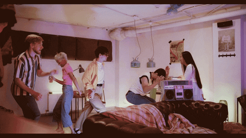
Ideally, I would have liked to have found a scene of school dance, or something similar with adults, that showcased multiple couples' slow dancing. Then freeze all of them but one couple. That was hard to find so I used the video I have. I still feel like it works. It gives the feeling that when you're with someone you care about you are free to let loose and it feels like it is just you and your partner lost in the moment.
Dia De Los Muertos

In the holiday tradition, people will build an altar, complete with candles past loved ones photos, and favorite things. So for my cinemagraph, I decided to use the element of candles. This will showcase movement and fit in with the overall theme of the holiday. In the future, I will be making things myself I would have liked the video to look more like a traditional Dia De Los Muertos altar.
Easter
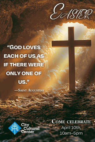
For Easter, I wanted to try animating one of the images I had made from the previous month. I chose the cave with the cross to represent the resurrection. I wanted to create the illusion that clouds were going over the cave and letting beams of light through. In a lot of religious movies I've seen about the resurrection/crucifixion, there is usually a storm going on in the crucifixion scene. This gives the impression of God's anger to what is being done. I wanted to bring that into my animation. The clouds are blowing away now that Jesus has been resurrected.
The Mechanics of Motion Graphics
Motion Graphics
Definition:
Motion Graphics is a digital technique that combines graphic design and animation to create the illusion of motion or rotation. It involves the use of text, images, shapes, and colors to convey information or tell a story through movement.
Animator’s Perspective:
From an animator’s perspective, motion graphics are a powerful tool for enhancing visual storytelling. This can be done in various media forms, such as films, advertisements, user interfaces, and more. They help capture the audience's attention and communicate complex ideas effectively. Maio (2023) defines animation as, a method of photographing successive imagery like models, drawings, and puppets to give the illusion of movement. The different types of animation are traditional, rotoscoping, anime, cutout, 3D animation, stop motion, and motion graphics.
Social Media Perspective:
Another perspective on motion graphics is that they are essential for creating dynamic and engaging content for online platforms like social media, websites, and mobile applications. They can boost user engagement and improve brand recognition through creative and interactive visuals. In Designity, (2023), they tell us how motion graphics are especially useful in engaging people on social media. You must capture the viewer’s attention and keep them interested throughout the animation. The best way to do this is through bold colors, text, and eye-popping imagery. They could be promos with logos, websites, tag lines, or call-to-action requests. Announcements and greetings, like holiday greetings, product announcements, and brand updates. They can even be used in tutorials and explainer videos, highlighting important steps with easy-to-follow visuals. It is important to make sure your brand name is prominently displayed. This will help draw in new viewers when shared across social media.
Synthesis:
By comparing these two perspectives, we can see that motion graphics serve as a versatile medium for conveying information and engaging with audiences across different platforms. They blend artistry with technology, to deliver impactful messages in a visually compelling manner. This makes them an integral part of modern communication strategies.
The difference between Animation and Motion Graphics
Definition:
Animation involves creating moving images from drawings, computer-generated graphics, or objects, typically used in storytelling, entertainment, and education. On the other hand, Motion Graphics are used for informational purposes.
Film Perspective:
One perspective distinguishes animation as a broader term encompassing various forms of moving images, including traditional hand-drawn animation, 3D animation, and stop motion. It is predominantly used in the entertainment industry for creating cartoons, films, and video games. According to Silveira (2023), motion graphics started in the 40’s through the experimental work of Oskar Fischinger and Norman Mclaren. In the 50’s it was brought mainstream by the likes of Saul Bass, Maurice Binder, and Pablo Ferro. This started with the use of opening credits in movies. Fast forward 84 years and motion graphics and animations are all around us on TVs, billboards, mobile devices, and even cars. Animation is a key tool used to set the emotional tone of a scene and is great at telling a story.
Motion Graphic Perspective:
Motion Graphics, in contrast, is characterized by its focus on graphic design elements like typography, shapes, and patterns in motion. It is often used in advertising, branding, title sequences, and explainer videos to convey information concisely and creatively. Ellis (2019) informs us that, animation is a broad term used to discuss any moving element. All motion graphics are animations, but not all animations are motion graphics. Animation is used to tell a story. In contrast, motion graphics are used to communicate information quickly and easily.
Synthesis:
While animation and motion graphics both involve creating moving visuals, they differ in their approaches and applications. Animation is more narrative-driven and encompasses a wide range of styles and techniques, while Motion Graphics is more design-oriented, emphasizing the use of graphical elements to convey messages efficiently in various contexts.
Language of Motion Graphics
Definition:
The Language of Motion Graphics refers to the visual and narrative techniques used in motion design to communicate ideas, evoke emotions, and engage viewers effectively. It involves principles of design, animation, timing, and storytelling to create compelling visual experiences.
Graphic Design Perspective:
From a graphic design perspective, the Language of Motion Graphics is about using visual hierarchy, color theory, typography, and movement principles to guide the viewer's attention, convey a message clearly, and create a seamless flow of information. It focuses on creating a cohesive and visually appealing sequences that resonate with the audience. According to the Creative Bloq Staff (2014), The language of motion doesn’t broaden a graphic designer’s skillset, it evolves them completely. Photography becomes cinematography. Illustration becomes animation. Skills like layout and print rhythm, morph into something closer to understanding the rhythmic structures of music. . Motion helps to capture the minds and emotions of the user in a way print never could. The ability to manipulate movement, time and spacing helps to create a mood and tone print never could. With screens everywhere these days designers are just scratching the surface of what all it is capable of.
Sound Design Perspective:
Another perspective highlights the importance of sound design and music in enhancing the language of motion graphics. Audio elements play a significant role in setting the mood, emphasizing key points, and establishing a rhythm that complements the visual storytelling, making the overall experience more immersive and engaging. Sensebite (2014) states, several key benefits of mastering marrying audio with your Motion graphic elements. It can enhance storytelling by setting the scene and mood of a piece while adding a layer of realism that will capture the audience’s attention and keep them engaged. It also can increase the overall production value of a piece, by making projects more professional. Lastly, it improves comprehension by providing emphasis to important information.
Synthesis:
By combining these perspectives, we understand that the Language of Motion Graphics encompasses a range of visual and auditory elements that work together harmoniously to communicate effectively. It involves a strategic blend of design principles, animation techniques, and sound elements to create a cohesive and impactful visual language that resonates with the audience.
Works Cited
Creative Bloq Staff. (2014, January 6). Discover the language of motion design. Creative Bloq. https://www.creativebloq.com/graphic-design/discover-language-motion-design-11410269
Designity. (2023, July 21). Motion Graphics for Social Media: A How-to Guide - Designity. https://www.designity.com/blog/motion-graphics-for-social-media-a-how-to-guide
Ellis, M. (2019, April 8). Motion graphics vs. animation: What’s the difference? 99designs. https://99designs.com/blog/video-animation/motion-graphics-vs-animation/
Maio, A. (2023, May 7). VIDEO: Ultimate Guide to Animation — Types and Styles. StudioBinder. https://www.studiobinder.com/blog/what-is-animation-definition/
Sensebite. (2014, January 6). The role of sound design in motion graphics—How audio enhances video experience. https://www.sensebite.in/blog/how-audio-enhances-video-experience
Silveira, F. (2023, August 3). What is Motion Graphics? | MOWE Studio. Mowe. https://mowe.studio/what-is-motion-graphics/
Design Challenge
For this week we had to create a static and dynamic logo for the holidays we have worked on the past few months.
Static Logos
Easter
Dia de los Muertos
Valentine's Day
Dynamic Logos
We then needed to take our logos into Adobe After Effects and create dynamic logos by adding movement to our designs.
Easter
My logo for Easter is a simple 3D cross. It’s a symbol everyone can easily recognize. I added the Text Happy Easter and He is Risen, to capitalize on Jesus resurrection. I made the cross purple because purple is seen as a royal color. For the animation aspect, I Made my text rotate around the cross. I wanted the cross to move as well but didn’t want it to go upside down, so I set it to spin on its Y-axis. I also added falling palms. This is to represent the palms people laid at Jesus feet on his way to Calvary.
Dia de los Muertos
My logo for Dia de los Muertos is the classic calaveras, or Sugar Skull. Sugar Skulls are a popular offering used during Dia de los Muertos. They represent the sweetness of life while tying into the pre-Columbian skull motifs. Dia De lor Muertos is all about celebrating life so I chose bright colors to represent that aspect. For my animation I chose to make the words rotate around the logo. Then I created a marigold petal to have falling in the background. Marigolds are thought to attract the souls of the departed to the ofrendas prepared for them, due to their bright colors and potent fragrance.
Valentine's Day
For Valentine’s Day, I created a cute little balloon logo. It’s a gift given to loved ones but is not as played out commercially as flowers or chocolates. I chose pink and red as they are traditional Valentine colors. For the animation I wanted to do something a little more. I wanted it to also match the balloon effect I was going for so I made it inflate through out the animation. I also added a sound effect that matched the timing of the inflation effect. The background is a white stucco ceiling. Once the logo inflated 100%, I set it to burst, like it hit the ceiling.
MDM570 Week 4
Month in Review
Animated Quote With Voice Over
MDM 615
Week 1
Design Rationale
Role of Affiliation in Teen's Self-Esteem
In designing the program for teens with developmental disabilities focusing on the need for affiliation, it is essential to understand the significance of this need. Affiliation is a fundamental human need that encompasses the desire for social connections, relationships, and a sense of belonging. For teens with developmental disabilities, the need for affiliation plays a crucial role in their emotional well-being, self-esteem, and overall quality of life.
Consumer-Centric Design: Focusing on Affiliation
When considering how the need for affiliation connects with the psychographic of teens with developmental disabilities seeking a sense of belonging and social connection, it becomes evident that addressing this need is vital for their overall development. These teens often face challenges in forming friendships and feeling included in social activities. By tailoring the program to meet their need for affiliation, we can create a supportive environment where they can interact with peers who share similar experiences, fostering a sense of community and acceptance.
Program Features Addressing the Need for Affiliation
The features of the program, including peer support groups, mentorship programs, community outreach initiatives, interest-based clubs, online platforms for connection, and collaborative projects, directly align with addressing the need for affiliation among teens with developmental disabilities. Each feature is designed to promote social interaction, foster relationships, and create opportunities for meaningful connections within a supportive and inclusive community. By integrating these features into the program, we aim to fulfill the need for affiliation, providing a space where these teens can feel valued, connected, and supported in their journey towards building lasting relationships.
Creating a Program for Sustainable Relationships
This rationale addresses Consumer-based reasoning by focusing on the target audience’s specific need for affiliation and how the program caters to fulfilling this need. The alignment between the psychographic characteristics of the audience and the features of the program demonstrates a consumer-centric approach in designing a solution that resonates with the audience’s desires and aspirations. By prioritizing the need for affiliation and designing features that directly cater to this need, the program aims to create a meaningful impact on the social and emotional well-being of teens with developmental disabilities.
Week 2 Voice & Tone
Week 3 Look & Feel
Week 4 Vision Board
MDM 620
Week 1
Crafting a logo goes beyond mere aesthetics; it embodies an organization's essence. For the pro-diversity group "Friendly Faces," dedicated to aiding developmentally disabled teens, a logo holds immense significance. In this narrative, we delve into the rationale behind three unique logo concepts, each aiming to reflect inclusivity, warmth, and unity.
Concept 1 – Friendship Bracelet
The first concept portrays a friendship bracelet adorned with diverse colored strings, with the words "Friendly" and "Faces" elegantly placed. This design symbolizes inclusivity and unity, mirroring the intertwining threads of the bracelet with diverse individuals coming together. By omitting specific faces, the logo encourages interpretation, emphasizing a sense of belonging for all. The design exudes warmth and approachability, extending an invitation for all to engage with the supportive environment. Its youthful appeal resonates with the target demographic of teens, aligning seamlessly with their experiences. The logo's memorability and versatility shine through the combination of colors, ensuring easy adaptation across various platforms.
Concept 2 – Abstract Dancing People
The second concept features a circular arrangement of abstract, different-colored dancing figures, with the words "Friendly Faces" alongside. This design symbolizes unity and movement, reflecting harmony and cooperation akin to dancers in sync. It captures the essence of joy, celebration, and inclusivity, emphasizing that everyone has a place in the group. The bold typography of the stacked words leaves a lasting impression, enhancing the group's visibility. The design's adaptability allows for seamless integration across different mediums, from business cards to digital platforms, although maintaining clarity while retaining the abstract representation poses a challenge.
Concept 3 – Interlocking Puzzle Pieces
The third concept of the "Friendly Faces" logo features different colored puzzle pieces interlocking to create a unified whole, with the words "Friendly" positioned above and "Faces" below. This design aims to symbolize collaboration and problem-solving, reflecting the essence of the group's mission where despite differences, individuals come together harmoniously. The visual metaphor of diverse puzzle pieces contributing to a larger picture emphasizes the importance of each individual's unique contribution. The playful tone conveyed by the interlocking puzzle pieces adds a lighthearted touch, commonly recognized as a symbol for many developmentally disabled groups. However, a challenge lies in ensuring that the abstract elements within the puzzle pieces remain distinct to avoid confusion with existing symbols used by similar organizations.
Summary
Upon evaluation, the Abstract Dancing Circle concept stands out as the most compelling choice, characterized by its dynamic composition, celebration of diversity, and impactful typography, ensuring memorability. This design will not only represent "Friendly Faces" in their mission but also serve as a beacon of inclusivity and support, embodying the core values of the organization. In essence, designing a logo for a pro-diversity group transcends aesthetics to encapsulate values, aspirations, and community spirit, with the "Friendly Faces" logo poised to inspire positive change through its inclusive design approach.
Abstract Dancing People Vector
Below is a vector version to better illustrate my idea. I'm really bad at doing rough sketches.
Week 2
Creative Expressions: Logo Choices for a Prodiversity Teen Group
In the realm of branding and visual identity, the logo plays a crucial role in conveying the essence and values of a brand to its audience. The selection of a logo design for a prodiversity group for teens catering to developmentally disabled individuals and their allies requires a thoughtful evaluation of diverse design options. This essay will provide a comprehensive analysis of six logo design options for this group, considering their unique characteristics, strengths, weaknesses, and alignment with the brand's purpose and desired message.
Brand Overview
What is it? A prodiversity group for teens.
Who is it for? Developmentally disabled teens and their allies.
Purpose of the brand: To create a friendly, open group that fosters a sense of value and inclusion for developmentally disabled teens.
Desired Message: Friendly Faces is a welcoming group that promotes inclusion and diversity.
Logo Design Options
Commencing with Option 1: Abstract Dancing People in a Circle, this design embodies unity, inclusivity, and diversity through its representation of dancing people in a circle. The evolution of shapes and colors symbolizes the diverse nature of the group, while the stacked name "Friendly Faces" conveys a sense of togetherness and simplicity, aligning with the brand's purpose of creating a welcoming and inclusive environment for all members.
Transitioning to Option 2: Puzzle Pieces, this design symbolizes the coming together of diverse individuals to form a cohesive whole. While promoting diversity and unity, a potential weakness lies in the risk of being associated with other similar logos. However, the interlocking puzzle pieces and the stacked name underneath communicate a message of inclusivity and collaboration, resonating with the brand's core values.
Moving on to Option 3: 3 Abstract People of Different Sizes, this design signifies the unique characteristics and contributions of individuals within the group. The formation of a half-circle creates a sense of completion and unity, while the simplicity and visual appeal of the design reinforce the brand's message of inclusivity and acceptance.
Exploring Option 4: Word Mark, this text-based design focuses on the brand name itself, with variations in font styles to add dynamism. While this option may lack standalone strength, it can be effectively paired with other logos to enhance its impact, aligning with the brand's purpose of fostering connections and support among members.
Proceeding to Option 5: Word Mark with Friendship Bracelet Accent Line, this design introduces a unique element with a friendship bracelet accent line, symbolizing unity and individuality. The use of different colored threads promotes diversity and inclusivity, while the personalized touch adds a sense of warmth and belonging to the brand's identity.
Concluding with Option 6: Hands, this design undergoes a transformation from stick figures to realistic 3D depictions, symbolizing support, unity, and collaboration within the group. The formation of a pyramid with the brand name underneath conveys strength, inclusivity, and interconnectedness, aligning effectively with the brand's purpose and desired message.
Strategic Analysis
In analyzing these logo design options, it is essential to consider their visual aesthetics, symbolism, and alignment with the brand's values and target audience. Each design choice should embody the brand's essence, promote inclusivity, and resonate with both developmentally disabled teens and their allies, fostering a sense of value, belonging, and acceptance within the group.
Conclusion
This essay provides a strategic analysis of the logo design options for a prodiversity group for teens, emphasizing the importance of thoughtful design selection in creating a visual identity that encapsulates the brand's values and messaging. By evaluating the strengths and weaknesses of each design choice, brands can make informed decisions that authentically represent their mission, promote inclusivity, and empower their community to embrace diversity and unity.
Week 3
Crafting an Inclusive Visual Identity for Friendly Faces
In developing the design solutions for Friendly Faces, a prodiversity group for developmentally disabled teens and their allies, each decision was meticulously crafted to resonate with the brand's essence and effectively convey its message of inclusivity and value. The rationale behind these decisions is rooted in a thorough analysis from Step 1, which provided critical insights into what resonates visually and emotionally with the target audience.
Understanding Design Choices through Iterative Evaluation
Step 1 involved exploring various design options to ascertain which concepts effectively communicated the brand's core values. This phase allowed for rapid prototyping and evaluation of multiple designs simultaneously, facilitating a comprehensive understanding of what design elements—such as symbols, colors, and typography—most effectively captured the essence of Friendly Faces.
Design Solutions: Visualizing Unity and Inclusivity
Step 2 presents two distinct design solutions, each carefully chosen based on their ability to elevate the brand and convey a powerful message:
Abstract Dancing People in a Circle
This design was selected because it embodies unity, inclusivity, and diversity through its representation of dancing figures encircling each other. The evolution of shapes and colors symbolizes the diverse nature of the group, showcasing a dynamic yet harmonious community. The stacked typography of "Friendly Faces" underneath reinforces a sense of togetherness and approachability. This design choice is compelling as it visually communicates the brand's mission to foster a welcoming and inclusive environment for all members, resonating strongly with the desired message.
Puzzle Pieces
The puzzle pieces design metaphorically represents diversity and unity, portraying how different individuals come together to form a cohesive whole. Despite the risk of being associated with similar logos, the interlocking puzzle pieces symbolize collaboration and inclusivity, which are fundamental to Friendly Faces. The stacked name placement ensures clarity and reinforces the brand's commitment to diversity and cooperation. This design was chosen for its ability to visually communicate the group's purpose and values effectively.
These designs stand out from other options due to their clear and impactful representation of inclusivity, diversity, and unity—key pillars of Friendly Faces. They are visually appealing yet straightforward, ensuring they are easily recognizable and memorable.
Strengths of Selected Designs: Elevating Brand Presence
Each design decision made in Step 2 was informed by insights gained from Step 1, where rigorous evaluation and ranking of concepts occurred. By leveraging this iterative process, the selected designs not only align with the brand's purpose but also elevate it by creating a visual identity that authentically reflects Friendly Faces' mission.
In conclusion, these design solutions are strategically crafted to convey the best possible representation of Friendly Faces, ensuring they resonate deeply with the target audience and effectively communicate the brand's commitment to inclusivity and diversity. Through their thoughtful execution and alignment with the brand's core values, these designs are poised to elevate Friendly Faces' visibility and impact, fostering a strong sense of community and acceptance among all members.
Week 4
MDM650 Week 1: Media Choices and Planning
Design Research
During the initial phase, we took a comprehensive approach by gathering insights from various sources to guide our design choices. As highlighted in the article (Developmental disability improvement: Marketing for good: Promoting developmental disability services in the digital age, 2024), FasterCapital brought attention to the overlooked market of individuals with disabilities, providing valuable insights essential for understanding our target audience at Friendly Faces. Also, the article (Effective strategies for marketing social clubs, 2024) emphasized that enhancing digital presence, utilizing storytelling, and fostering collaboration are key elements for boosting outreach and engagement.
Challenges and Solutions
We plan to address web design challenges by implementing a strategic approach prioritizing responsive web design for a seamless user experience across various devices. We will do this by, optimizing loading speeds to boost user engagement while ensuring secure hosting to minimize risks for the organization and its users. We will adhere to inclusivity guidelines for accessible design, provide multiple contact options for easy communication with visitors, leverage social media platforms for increased visibility and engagement, and uphold ethical standards and legal compliance by implementing ethical and transparent guidelines. Collaboration was instrumental in refining design decisions through peer feedback, leading to a deeper understanding of user needs and effective audience engagement strategies.
Learning new skills included: Gaining knowledge of user-friendly design for various audiences and applying responsive and accessible design principles, using social media and content marketing for reaching out, and incorporating ethical aspects into brand development. The combination of research findings, collaborative input, and newly acquired abilities led to a well-thought-out design for the Friendly Faces brand.
Media Asset Selection
Media assets were chosen to align with brand objectives and resonate with the audience. The curve from the Friendly Faces logo was intentionally integrated into the Letterhead Package design for visual consistency and brand recognition. Concept sketches captured the brand's essence inspired by the Vision Board and Brand Guide, ensuring cohesive communication of brand values across all assets. This design approach aimed to maintain consistency, strengthen brand recognition, and deliver a unified brand experience to the audience. By choosing our swag items, we aimed to provide teens with practical products that they would use regularly. Our selection included shirts, canvas bags for convenient carrying, and Pop Sockets featuring our logo. These items were chosen to be both functional and stylish, ensuring that they not only serve a purpose but also showcase our brand effectively.
Conclusion
The meticulous selection and integration of media assets, guided by psychographic insights and brand objectives, aimed at ensuring a cohesive brand experience for Friendly Faces. Production schedule planning effectively managed tasks within the timeframe, while concept sketches visualized brand attributes across all media assets, inspired by the Vision Board and Brand Guide. The comprehensive approach to design research, systematic handling of challenges, emphasis on user experience and ethical compliance, collaborative decision-making, integration of competencies, and meticulous media asset selection and integration all culminated in a thoughtful design process aligned with Friendly Faces' mission of supporting developmentally disabled teens and promoting affiliation.
References:
Developmental disability improvement: Marketing for good: Promoting developmental disability services in the digital age. (n.d.). FasterCapital. Retrieved from https://fastercapital.com/content/Developmental-disability-improvement--Marketing-for-Good--Promoting-Developmental-Disability-Services-in-the-Digital-Age.html
Effective strategies for marketing your social clubs business. (n.d.). Retrieved from https://desygner.com/blog/industry/how-to-market-social-clubs-business
Week 2
An effective approach to designing media assets involves being rooted in research, problem-solving, and acquiring skills. The decisions made in Step 1 of the assignment are detailed in this rationale, drawing from various sources and experiences.
Influence of Research Sources:
Research played a crucial role in understanding current trends and best practices in media asset production, with a particular focus on creating branded merchandise to enhance brand recognition. Valuable data on consumer preferences and effective strategies for promotional products were gathered from resources like ManyPixels, Fable, and insights from HALO.
Branded merchandise is widely owned among Americans, emphasizing its enduring visibility and impact on brand recall (Djordjevic, 2024) This insight informed prioritizing practicality and everyday usability in the design process, ensuring resonance with daily routines.
The importance of refreshing software skills influenced the decision to update proficiency in motion graphics software (How to use animated logos to strengthen your brand identity, 2024). This was pivotal in integrating motion elements into the media assets, enhancing visual appeal and engagement.
Development Process and Design Decisions:
The primary objective was to enhance brand recognition through compelling branded merchandise. The design process was structured as follows:
1. Problem Identification: The challenge was identified as creating merchandise that not only promotes the brand but also fosters emotional connections with the audience.
2. Research-Informed Design: Insights from HALO guided the selection of merchandise known for longevity and daily utility, such as branded drinkware and apparel (Himelstein, 2024). These items ensure prolonged exposure to the brand message, reinforcing brand recall effectively.
3. Visual Aid Example: A visual aid included in the project showcases the integration of motion graphics in the logo design, modernizing the brand image in line with current digital branding trends.
Acquisition of Competencies:
Through this project, skills in motion graphics and strategic design thinking were developed. Integrating motion into branding materials not only enhanced visual appeal but also increased engagement potential, critical in competitive markets.
Collaborative Opportunities:
Collaboration was integral to refining the project. Feedback from a more experienced peer helped elevate animation quality and refine the logo's visual impact, improving the final output to meet professional standards and effectively communicate the brand's identity.
Conclusion:
In conclusion, design decisions for this media asset production were guided by comprehensive research, strategic problem-solving, and skill enhancement. Leveraging insights from industry sources and collaborating effectively contributed to creating impactful branded merchandise that enhances brand recognition and fosters audience engagement. This experience not only advanced technical skills but also deepened understanding of effective design strategies in contemporary branding practices.
Sources:
Djordjevic, D. (2024, May 12). How merchandise helps brand recognition. Many Pixels. https://www.manypixels.co/blog/print-design/merchandise-brand-recognition
Himelstein, C. (2024, April 12). Quick tips to enhance your brand’s reach with company merchandise. HALO. https://halo.com/boost-your-brand-with-company-merchandise/
How to use animated logos to strengthen your brand identity. (2024, July 11). Fable. https://www.fable.app/blog/how-to-use-animated-logos-to-strengthen-your-brand-identity
Week 3
Designing Effective Outdoor Advertising
Research Sources and Information
The design decisions for this week’s media asset production were informed by a comprehensive review of industry-specific sources. Sources such as James (2022) provided essential insights into effective pole banner design strategies. The article emphasized the importance of high-quality imagery and creating a clear focal point to enhance visibility and aesthetic appeal. Furthermore, it highlighted that pole banners serve primarily as promotional tools for holidays and events, targeting educational institutions, governmental offices, and community organizations due to their strategic location and contextual relevance (James, 2022).
Additionally, insights from Luckey (2022) contributed significantly to the development of bus shelter advertisements. The article stressed the need for a concise message, eye-catching designs, and a compelling call to action to maximize engagement and effectiveness. Practical tips included the use of QR codes for performance measurement and the importance of targeting specific demographics to ensure message resonance and impact (Luckey, 2022).
Solving Problems
The development process for this week’s STEP1 content involved a structured approach to address the design challenge of creating effective bus stop and pole banner advertisements. Initially, brainstorming sessions were conducted to generate ideas that aligned with the insights gleaned from the research sources. Visual aids, including sketches and digital mock-ups, were instrumental in illustrating design decisions such as color schemes, typography choices, and layout compositions. Iterative feedback loops were crucial in refining the designs to ensure alignment with project objectives and target audience expectations.
Collaboration
Collaboration opportunities were actively pursued throughout the project timeline. Peer feedback sessions facilitated constructive critiques that guided revisions and improvements to the designs. Additionally, feedback from members of the target audience provided invaluable insights into their preferences and expectations, prompting adjustments to enhance message clarity and visual impact.
Acquiring Competencies
Through the completion of this week’s coursework, significant learning outcomes were achieved. New skills in visual communication and strategic design were acquired, enabling the creation of compelling media assets tailored to specific advertising contexts. Strategies such as audience segmentation and performance measurement through digital analytics and QR code integration were incorporated into the design process, enriching the overall effectiveness and measurability of the advertisements.
Conclusion
In conclusion, the design decisions made for this assignment were carefully informed by a synthesis of industry research and practical application of design principles. By integrating insights from authoritative sources such as James (2022) and Luckey (2022), the solutions effectively addressed the unique challenges posed by bus stop and pole banner advertisements. The iterative design process, supported by collaborative feedback and continuous learning, ensured that the final deliverables met both aesthetic standards and strategic objectives. This approach not only enhanced the visual appeal and engagement potential of the media assets but also underscored the importance of rationale-driven design decisions in achieving effective communication outcomes in advertising contexts.
Sources
James, N. (2022, April 27). A complete guide to pole banners | Signs.com. Signs.Com Blog. https://www.signs.com/blog/a-complete-guide-to-pole-banners/
Luckey, T. (2022, June 9). Bus shelter ads: Everything you need to know • The Louisville Cardinal. The Louisville Cardinal. https://www.louisvillecardinal.com/2022/06/bus-shelter-ads-everything-you-need-to-know/
Week 4
MDM 640 Week 1
Measuring ROI in Designing Brand Communications
Measuring the Return on Investment (ROI) of design work has become crucial for businesses to justify their creative expenditures and optimize their brand communications. As noted by InVision (n.d.), a significant 66% of CEOs do not fully grasp the role of senior designers, highlighting the need for designers to quantify their value using measurable metrics rather than relying solely on qualitative assessments.
One effective qualitative method for testing design prototypes is usability testing. This approach involves observing users as they interact with a product or design, providing insights into user behavior and preferences (LinkedIn Learning, n.d.). Usability testing helps uncover potential issues that may not be immediately apparent to designers or developers, ensuring that the final product meets user needs effectively.
On the quantitative side, A/B testing stands out as a powerful tool for measuring the effectiveness of design elements. This method involves comparing two versions of a design to determine which performs better in terms of user engagement and conversion rates (GraphicsZoo, n.d.). By creating multiple content versions and analyzing the results, designers can fine-tune their strategies to align with specific buyer personas and optimize conversion rates.
Implementing these testing methods before launching finished media assets into the marketplace can significantly impact a company's bottom line. As Brafton (n.d.) points out, poor graphic design can lead to a loss of trust and engagement from consumers, while effective design can enhance lead generation and conversion rates. By measuring the ROI of design work, businesses can make data-driven decisions that improve user experience, increase customer retention, and ultimately contribute to overall business success.
References:
Brafton. (n.d.). Looking for ROI? Get your graphics game on point. https://www.brafton.com/blog/creation/looking-for-roi-get-your-graphics-game-on-point/
GraphicsZoo. (n.d.). Importance of A/B testing in graphic design. https://www.graphicszoo.com/article/importance-of-a-b-testing-in-graphic-design
InVision. (n.d.). How to estimate the ROI of design work. https://www.invisionapp.com/inside-design/estimate-roi-design-work/
LinkedIn Learning. (n.d.). UX foundations: Making the case for usability testing. https://www.linkedin.com/learning/ux-foundations-making-the-case-for-usability-testing/welcome?u=50813145
WEEK 2
The Importance of Unbiased Design: Testing Visual Elements for Optimal User Experience
Avoiding Assumptions and Cognitive Biases in Design
Avoiding assumptions and cognitive biases is crucial when making design choices, as these can lead to misinterpretations of user needs and preferences. Cognitive biases, such as confirmation bias or the halo effect, can skew a designer's perception, leading them to favor certain design elements without objective evidence of their effectiveness. This can result in designs that do not resonate with the target audience, ultimately impacting user engagement and brand perception negatively. By avoiding assumptions, designers ensure that their choices are based on actual user data and feedback rather than preconceived notions or personal preferences (Nielsen Norman Group, n.d.).
Testing First Impressions and Fast vs. Slow Thinking
Testing first impressions and understanding fast and slow thinking are essential components of in-person visual design evaluations. These evaluations often employ methods like the 5-second test to capture users' immediate reactions to a design. This test involves showing participants a visual design for a brief period (typically five seconds) to gauge their initial impressions. This approach is effective for assessing the overall visual style and whether it aligns with the intended brand traits. Additionally, first-click tests can be used to understand how users interact with a design when they have a specific goal in mind. Both methods help designers identify potential issues with visual hierarchy and usability that might not be apparent through longer, more detailed evaluations (Mannotra, 2023).
Conducting In-Person Visual Design Evaluations
In-person visual design evaluations provide valuable insights into how users perceive and interact with a design. By observing users' reactions and collecting feedback, designers can identify discrepancies between their intentions and users' perceptions. This process helps in refining the design to better align with user expectations and brand goals. It also allows designers to test different design variations, ensuring that the final product resonates well with the target audience and effectively communicates the desired brand message.
References:
Nielsen Norman Group. (n.d.). How to Test Visual Design. Retrieved from https://www.nngroup.com/articles/testing-visual-design/
Mannotra, V. (2023, March 13). How to Test Visual Design. BrowserStack. Retrieved from https://www.browserstack.com/guide/how-to-test-visual-design
Week 3
Harnessing A/B Testing for UX Excellence
A/B testing stands out as a beacon of innovation, guiding designers through the murky waters of user preferences. Like a masterful conductor, it orchestrates a symphony of data, harmonizing user needs with design elements. This methodical approach isn't just a tool; it's a transformative force in the UX landscape.
The Art of A/B Testing
A/B testing, in its essence, is the art of comparison. It's the designer's way of asking, "Which is better?" But unlike subjective musings, it provides concrete, quantifiable answers. Each design element is put on trial, with users as the jury, rendering their verdict through clicks, conversions, and engagement.
The process unfolds like a well-choreographed dance. The designer identifies the element to test, creates variations, and users interact, leaving behind a trail of valuable data (Stockwell, n.d.).
Unlocking Insights Through Data
As the test progresses, a symphony of data begins to play. Quantitative notes ring out clear and strong – conversion rates, click-through percentages. But listen closely, and you'll hear the subtle strings of qualitative data – user feedback and motivations. Together, they create a rich, nuanced melody of user behavior (Osinusi, n.d.).
This harmonious blend is the true power of A/B testing. It's not just about numbers; it's about understanding the 'why' behind user actions. It's the difference between knowing users prefer a blue button and understanding that blue reminds them of trust and stability.
Iterative Design: The Path to Improvement
Armed with these insights, designers embark on a dance of iteration. Each step is a refinement, each twirl a new feature, each leap a bold redesign. It's a perpetual waltz of improvement, with data as the rhythm and user satisfaction as the melody.
Consider a struggling e-commerce site discovering that users respond better to product images with people using the items. It's a small change, but like a butterfly effect, it ripples through the user experience, boosting engagement and sales (Demers, 2020).
A/B Testing: A Philosophy of Continuous Enhancement
In conclusion, A/B testing isn't just a methodology; it's a philosophy. It's the belief that design can always be better, that user needs are ever-evolving, and that data is the compass guiding us through this dynamic landscape. For the UX designer, it's more than a tool – it's a trusted companion on the journey to digital excellence, turning the base metal of assumptions into the gold of user-centered design.
References:
Demers, E. (2020, September 5). The Art of “Frankenstein-ing”: When and how to combine designs through rapid A/B testing. Medium. https://uxdesign.cc/the-art-of-frankenstein-ing-when-and-how-to-combine-designs-through-rapid-a-b-testing-7ac97cedad05
Osinusi, K. (n.d.). A Guide to Measuring the User Experience | Toptal®. Toptal Design Blog. Retrieved August 23, 2024, from https://www.toptal.com/designers/ux/measuring-the-user-experience
Stockwell, A. (n.d.). Welcome | LinkedIn Learning. LinkedIN LEARNING. Retrieved August 23, 2024, from https://www.linkedin.com/learning/ux-foundations-research/welcome-14217812?u=50813145
Self Evaluation
Vision Board
Brand Playbook
WEEK 4
Measuring Design Effectiveness: A Framework for User Experience Improvement
Selecting an Appropriate Framework
Among the various frameworks for measuring design effectiveness, Google's HEART framework stands out as particularly suitable for evaluating the user experience of my thesis project. This framework, proposed by Google's research team in 2010, offers a comprehensive approach to assessing user experience on a large scale.
The HEART Framework
The HEART framework encompasses five key categories: Happiness, Engagement, Adoption, Retention, and Task Success. Each category provides valuable insights into different aspects of user interaction and satisfaction with a product or service (UX Design, n.d.). This multifaceted approach allows for a nuanced understanding of user interaction and satisfaction, making it ideal for improving design effectiveness.
Interpreting and Applying Data
Data collected through the HEART framework should be interpreted holistically, considering the interplay between different metrics. For instance, high task success rates coupled with low retention might indicate that while the design is functional, it lacks engaging elements that keep users coming back. Such insights can guide targeted improvements in the user experience, focusing on areas that need the most attention.
Comparison with Case Study Framework
In contrast, the case study likely employed a more traditional Customer Satisfaction Score (CSAT) to measure design effectiveness. CSAT directly assesses overall customer satisfaction with a product or service using a rating scale. While useful, this approach may not provide the depth of insights offered by the HEART framework, as it often provides only a snapshot of customer satisfaction without deeper insights into long-term user behavior or engagement (FullStory, n.d.).
Relevance to Brand Development
The choice of framework is crucial for future brand development. While CSAT offers a snapshot of current satisfaction, the HEART framework provides a more comprehensive view of user engagement over time. This broader perspective is invaluable for brands looking to build long-term user loyalty and continuously improve their product offerings based on user behavior and preferences.
References:
Anderson, W. (2021). 10 frameworks to help you measure success in design. UX Design. https://uxdesign.cc/how-to-measure-success-in-design-f63f96a0c541
FullStory. (2023). 6 KPI Metrics in Measuring Customer Experience (CX). FullStory Blog. https://www.fullstory.com/blog/6-key-metrics-measuring-customer-experience/
Reflecting on the Development of the Brand Playbook
The development of the Brand Playbook reflects a process of continuous improvement and self-awareness. Weekly self-evaluations based on established criteria helped track progress and identify areas for enhancement. These regular check-ins guided the playbook's development by highlighting strengths and weaknesses.
Critical Examination and Refinement
The self-evaluation process ensured each component aligned with the overall brand strategy, prompting regular updates and refinements. The established criteria provided a clear framework for assessment, focusing on specific aspects that needed attention.
Structured Feedback Process
Peer evaluations using a structured form ensured consistency and actionable feedback. This approach encouraged comprehensive input on various aspects of the Brand Playbook, contributing significantly to its improvement.
Conclusion
The Brand Playbook's development exemplifies continuous improvement and self-awareness, facilitated by regular self-evaluations and structured peer feedback. The process ensured a cohesive and polished final product, aligning with the overall brand strategy. The use of structured feedback and evaluation underscores the importance of these elements in achieving an effective brand strategy.
MDM690
Week 1
Thinking
I delved into the psychological impact of visual elements on the target audience, considering how colors, typography, and symbolism can evoke emotions and convey meaning. This exploration gave me a deeper understanding of their importance in branding, enabling me to craft a more effective and resonant visual identity for the brand.
Feeling
I felt a mix of emotions, with excitement and creativity sparking new ideas, but also uncertainty and self-doubt creeping in. This tension drove me to experiment and seek feedback, pushing me to refine my approach and validate my design decisions, ultimately fueling my growth and learning as a creative problem-solver.
Doing
I researched and gathered inspiration, experimented with design options, and sought feedback from peers and mentors. I used design tools to create a cohesive brand identity, learning the importance of attention to detail and seeking guidance to achieve a high-quality outcome. This process helped me develop a memorable and inclusive brand identity.
https://jshmjd87.wixsite.com/thesis/research
Week 2
Thinking
This week, I'm thinking that I'm starting to get the hang of presenting my thesis. I'm becoming more proficient at articulating my research and ideas, and the clarity and coherence of my presentation are improving. I'm considering how to further refine my delivery and effectively convey my key findings and arguments.
Feeling
This week, I'm feeling overwhelmed and stressed, struggling to cope with a series of difficult events. The loss of my grandma still weighs heavily on my heart, and my dad's hospitalization has added to my anxiety. The unexpected flood of raw sewage in the basement has pushed me to emotional exhaustion.
Doing
This week, I'm juggling multiple responsibilities. Professionally, I'm conducting research to validate my design decisions and ensure a solid foundation for my project. Personally, I'm dealing with the aftermath of the basement flood, cleaning up and restoring the space. I'm also traveling back and forth to the hospital to support my dad.
https://jshmjd87.wixsite.com/thesis/solving-problems
Week 3
Thinking
As I worked through this stage of the thesis development process, my thought process was dominated by self-doubt and anxiety about meeting deadlines. I constantly worried that I wouldn't be able to complete everything on time. However, as I delved deeper into the process, new ideas and understandings began to emerge. I realized the importance of breaking down the task into manageable chunks and creating a detailed timeline. This helped me to stay focused and make steady progress. Despite initial doubts, I discovered that I was capable of producing high-quality work under pressure.
Feeling
I experienced overwhelming emotions, ranging from anxiety to frustration. At times, I felt like I was drowning in a sea of tasks and deadlines. These emotions affected my work, making it challenging to concentrate and maintain motivation. However, I recognized that I needed to manage my emotions to ensure the continued development of my thesis presentation. I took breaks, practiced self-care, and reminded myself that it's normal to feel overwhelmed. By acknowledging and addressing my emotions, I was able to regain control and make progress
Doing
To ensure that this stage of the thesis development process was completed to a high degree of professionalism, I took several actions. I created a detailed timeline, set realistic goals, and prioritized tasks. I also established a routine, dedicating specific times of the day to working on my thesis. Additionally, I sought guidance from my peers, which helped me to stay on track and address any challenges that arose. It took discipline, perseverance, and a willingness to ask for help when needed to get everything done. By taking these actions, I was able to produce high-quality work and make significant progress on my thesis.
https://jshmjd87.wixsite.com/thesis/collaboration
Week 4
Thinking
As I worked through this stage of the thesis development process, my thought process was clouded by personal concerns and exhaustion. Despite these challenges, I managed to break down the project into manageable tasks, which helped me stay focused. Through this process, I gained a deeper understanding of the scope and complexity of my thesis project. New ideas emerged as I delved deeper into my research, and I began to see connections between different concepts that I hadn't noticed before.
Feeling
This week was emotionally draining, with my dad's hospitalization and my own exhaustion from the thesis project taking a toll on my mental health. I felt overwhelmed, anxious, and uncertain about my future after graduation. These emotions affected my work, making it harder to concentrate and stay motivated. However, I recognized that I needed to push through these feelings to meet my deadlines. I'm concerned that these emotions may continue to impact my work, but I'm determined to find ways to manage them and stay focused on my goals.
Doing
To ensure that this stage of the thesis development process was completed to a high degree of professionalism, I took several actions. I created a detailed schedule and stuck to it, breaking down larger tasks into smaller, manageable chunks. I also sought support from my peers and instructors, asking for feedback and guidance when needed. Additionally, I made time for self-care, taking breaks to rest and recharge. Despite the challenges I faced, I was able to complete my tasks on time and to a satisfactory standard. It took discipline, perseverance, and a willingness to ask for help when needed.
https://jshmjd87.wixsite.com/thesis/acquiring-competencies
MDM691 Week 1
Dream Job Description
https://jobs.disneycareers.com/job/washington/senior-photo-editor-national-geographic/391/69918229984
Job ID 10101292
Location Washington, DC, United States
Business Disney Entertainment Television
Date posted Sep. 13, 2024
Job Summary:
The Senior Photo Editor for National Geographic develops, pitches, and produces compelling visual stories across platforms, including NationalGeographic.com and our app, our print magazines, with a focus on social media production. Leveraging an extensive global network of photographers and passion for diverse approaches, you will produce and assign stories that are evocative and rich in detail and collaborate with the social team in curating photography for our accounts. Your dedication to researching imagery will be evident in your meticulous and passionate approach to finding the perfect visual elements to accompany any story. As you collaborate with photographers, writers, text editors, producers, and designers, you will leverage diverse talents to create powerful multiplatform visual storytelling that is the cornerstone of National Geographic.
Your refined taste, editorial judgement, and innovative approach will redefine our visual storytelling, with an emphasis on pushing boundaries in the digital space and setting new standards for multiplatform visual journalism. By mentoring entry and mid-level visual editors, you will help cultivate a highly effective team that creates content across platforms that connects with our audiences and yields expert, sophisticated stories aligned with National Geographic's focus on subjects like archaeology, wildlife, science and health, technology, and beyond. Your passion for photography will embody our commitment to excellence in visual storytelling. Through the power of photography, you will inspire and illuminate the wonders of our world.
What You Will Do:
• Pitch thoroughly developed ideas in a well-structured written format, with a clear central theme and a strong hook, leveraging data and an understanding of the preferences and behaviors of our audiences across platforms.
• Assign, direct, produce, and acquire a wide range of photographic stories for use across platforms, including digital, social, and print, working with guidelines for operational excellence and prioritization.
• Collaborate with the social team on curating images for our accounts, telling stories across platforms, communicating with photographers, and identifying new opportunities for our accounts.
• Manage a variety of editorial projects, including newsstand-only single-topic issues and recurring franchises for digital, social, and print, by collaborating and communicating with all teams involved—video producers, text editors, writers, designers, interactive, cartographers—to ensure the production of the holistically conceived stories that are compelling and effective
• Manage deliverables, assets, and workflows, e.g. accurate caption information, verifying credit lines, archiving, and transmitting images, working with pre-press on color correction, checking image veracity, and making images available for use across platforms.
• Provide field support to photographers, including securing visas, permits, releases, letters of introduction, and specialized equipment, as well as clearing them through Disney onboarding and compliance practices.
• Contribute to our newsletters as needed.
•
Required Qualifications & Skills:
• Minimum of five years of experience as a photo editor, with a deep focus on editorial and documentary work.
• Highly calibrated understanding of what makes a great breakthrough story in this era saturated with content.
• Awareness of and adaptability to changing industry trends and technologies, especially social.
• Excellent visual taste and writing skills.
• Ability to work effectively and positively in a fast-paced environment, achieving strategic team goals through multitasking, quick responsiveness, and problem-solving.
• Outstanding communication and interpersonal skills, capable of collaborating effectively with cross-functional teams – including social, design, video, TV and film, and National Geographic Society.
• Self-motivated with the ability to exercise independent judgment and work with minimal supervision.
• Strong project management skills with the ability to maintain visual excellence within timelines and set budgets.
Preferred Qualifications:
• Experience with social media platforms
• Software experience: Filemaker, Asana, Slack, Air Table; Keynote, Lightroom, Photo Mechanic, Photo Supreme, Photoshop
Education:
• Bachelor’s Degree
Preferred Education:
• Photojournalism degree
The hiring range for this position in Washington DC is $92,800 – $124,400 per year. The base pay actually offered will take into account internal equity and also may vary depending on the candidate’s geographic region, job-related knowledge, skills, and experience among other factors. A bonus and/or long-term incentive units may be provided as part of the compensation package, in addition to the full range of medical, financial, and/or other benefits, dependent on the level and position offered.
Cover Letter
Resume
Personal Brand Statement
"Crafting Visual Stories That Connect"
Week 2
The Importance of Moral Reasoning and Ethics in Media Design
In today's digital landscape, ethical practices in media design are crucial for building trust with consumers and fostering a sustainable brand image. Wally Snyder, in his article "Making the Case For Enhanced Advertising Ethics," underscores the need for ethical advertising practices to build consumer trust and brand loyalty.
Consequences of Unethical Practices
Unethical advertising practices can lead to consumer distrust and damage to a brand's reputation. For instance, deceptive advertising to children is a significant ethical concern. The case study "Ethics and Advergaming: Concerns of Marketing to Youth" by V. Cicchirillo (2014) illustrates the vulnerability of children to advergaming, a form of advertising that uses video games to promote products. This study emphasizes the need for clear distinctions between advertising and entertainment content, aligning with Snyder's argument for enhanced advertising ethics.
Moreover, lack of transparency in online advertising can also erode consumer trust. The case study "FTC Clarifies Native and Online Ad Obligations" by A.L. Friel and F.A. Bohorquez, Jr. (2015) highlights the importance of clear disclosures about the commercial nature of online content, which aligns with Snyder's call for enhanced ethics in advertising.
Questionable Use of Social Media in Marketing
The case study "Consumer Attitudes Toward Relevant Online Behavioral Advertising: Crucial Evidence in the Data Privacy Debates" by M. Sableman, H. Shoenberger, and E. Thorson (2013) explores consumer attitudes towards online behavioral advertising, highlighting concerns about privacy and data collection. This study discusses the ethical implications of targeting consumers based on their online activities and the need for transparency and control over data use.
Impact on Brand Development and Sustainability
Ethical practices in media design can significantly impact the development and sustainability of a brand. As Snyder (2011) notes, consumers value high ethics in companies and are willing to pay for it. Ethical advertising practices can build consumer trust and brand loyalty, while unethical practices can lead to consumer distrust and damage to a brand's reputation. Minette Drumwright's chapter on "Ethical Issues in Marketing, Advertising, and Sales" further emphasizes the importance of ethical marketing practices, highlighting the need for transparency, fairness, and respect for consumer autonomy.
Conclusion
Moral reasoning and ethics in media design are crucial for building trust with consumers and fostering a sustainable brand image. Unethical practices can lead to consumer distrust and damage to a brand's reputation, while ethical practices can build consumer trust and brand loyalty. The case studies discussed in this essay underscore the importance of ethical advertising practices, particularly in the context of children's advertising, online transparency, and social media advertising.
References
Cicchirillo, V. (2014). Ethics and Advergaming: Concerns of Marketing to Youth.
Friel, A.L., & Bohorquez, F.A., Jr. (2015). FTC Clarifies Native and Online Ad Obligations.
Sableman, M., Shoenberger, H., & Thorson, E. (2013). Consumer Attitudes Toward Relevant
Online Behavioral Advertising: Crucial Evidence in the Data Privacy Debates.
Drumwright, M. (2016). Ethical Issues in Marketing, Advertising, and Sales.
Snyder, W. (2011). Making the Case for Enhanced Advertising Ethics.
WEEK 3
Legal Precautions for Media Designers: Understanding Copyright Issues
When creating work that incorporates images, media designers can encounter various legal problems, primarily related to copyright infringement. These issues can arise from using images created by the designer or acquired from other sources, including photographers and illustrators. The U.S. Copyright Office highlights that copyright law protects a wide range of creative works, including photographs and illustrations, and that using these works without permission can lead to legal consequences (U.S. Copyright Office, n.d.).
To avoid these problems, media designers should ensure they have the necessary permissions or licenses to use images from other sources. This can involve obtaining explicit consent from the copyright holder or purchasing a license that allows for the intended use. For images created by the designer, understanding the principles of copyright ownership is crucial. As Weaver (2015) notes, creators automatically own the copyright to their work upon its creation, unless it is a work-for-hire, in which case the employer owns the copyright.
Moreover, AIGA (2009) emphasizes the importance of clear agreements between designers and clients regarding copyright and usage rights. By establishing these agreements upfront, designers can protect their rights and avoid potential legal disputes. By taking these precautions, media designers can ensure that their work does not infringe on the rights of others and that their own rights are protected.
Protecting Media Design Work from Unauthorized Use
Media designers can protect their work from being used in other projects by their clients or by other designers without their intention by understanding and utilizing copyright laws. According to the U.S. Copyright Office, visual and graphic artists should be aware that their work is protected by copyright law as soon as it is fixed in a tangible form (U.S. Copyright Office, n.d.). This means that designers should explicitly state the terms of use for their work, including any limitations or restrictions on its use.
Designers can also use contracts to specify the scope of work and the rights granted to clients (AIGA, 2009). For example, a contract can stipulate that the client is only allowed to use the design work for a specific purpose or project, and that any other use requires the designer's permission.
Additionally, designers can take steps to register their work with the U.S. Copyright Office, which provides additional protections and remedies in case of infringement (U.S. Copyright Office, n.d.). By taking these steps, media designers can protect their work and maintain control over its use.
Addressing Copyright Issues in Requests for Proposal (RFPs)
When responding to a Request for Proposal (RFP) as a visual or graphic artist, it is crucial to address several copyright issues to protect both your creative work and your professional interests. First, artists should ensure that any preliminary work or concepts submitted as part of the RFP process are protected by copyright. This involves clearly stating in the proposal that all submitted materials are copyrighted and that the client does not have rights to use them without explicit permission (U.S. Copyright Office, n.d.).
Additionally, artists should be aware of the potential for their work to be used without compensation or proper attribution. To mitigate this risk, it is advisable to include terms in the proposal that outline how the client may use the submitted materials, specifying any limitations on usage until a formal agreement is reached (Weaver, 2015). This can prevent misunderstandings and unauthorized use of the artist's intellectual property.
Furthermore, understanding the client's expectations regarding ownership and rights is essential. Artists should negotiate terms that clarify whether the client will receive full ownership of the work upon completion or if the artist retains certain rights, such as the ability to use the work in their portfolio or for self-promotion (AIGA, 2009). By addressing these copyright issues proactively, artists can safeguard their creative rights while fostering clear communication with potential clients.
References:
AIGA. (2009). A Client's Guide to Design. AIGA. https://www.aiga.org/sites/default/files/2021-03/Design-Business-and-Ethics.pdf
U.S. Copyright Office. (n.d.). What Visual and Graphic Artists Should Know about Copyright. Retrieved October 20, 2024, from https://www.copyright.gov/engage/visual-artists/
Weaver, B. (2015). Creative Truth. Routledge. https://learning.oreilly.com/library/view/creative-truth/9781317541554/
Week 4
Experience Map